 calendar-heatmap
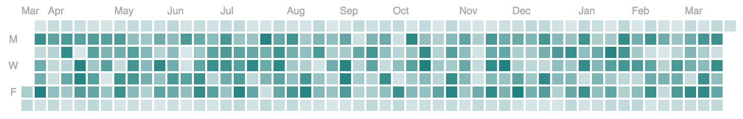
A d3 heatmap for representing time series data similar to github's contribution chart
Top Related Projects

Cal-Heatmap is a javascript charting library to create a time-series calendar heatmap

:bar_chart: Embed your GitHub calendar everywhere.
Quick Overview
Calendar-heatmap is a D3.js plugin that creates a calendar heatmap visualization, similar to GitHub's contribution graph. It allows users to display time-series data in a visually appealing calendar format, with color intensity representing data values.
Pros
- Easy to integrate with existing D3.js projects
- Customizable appearance and behavior through various options
- Responsive design that adapts to different screen sizes
- Supports tooltips for displaying additional information
Cons
- Requires D3.js as a dependency, which may increase project size
- Limited to calendar-based visualizations
- May require additional styling for optimal appearance in some projects
- Documentation could be more comprehensive
Code Examples
- Basic usage:
var chartData = d3.timeDays(new Date(2016, 0, 1), new Date(2016, 11, 31)).map(function (dateElement) {
  return {
    date: dateElement,
    count: Math.random() * 50
  };
});

var heatmap = calendarHeatmap()
  .data(chartData)
  .selector('#chart')
  .colorRange(['#D8E6E7', '#218380'])
  .tooltipEnabled(true)
  .onClick(function (data) {
    console.log('onClick callback. Data:', data);
  });

heatmap();  // render the chart
- Customizing date range and colors:
var heatmap = calendarHeatmap()
  .data(chartData)
  .selector('#chart')
  .startDate(new Date(2016, 0, 1))
  .endDate(new Date(2016, 11, 31))
  .colorRange(['#FFA500', '#FF4500', '#8B0000'])
  .tooltipEnabled(true);

heatmap();
- Using custom tooltip content:
var heatmap = calendarHeatmap()
  .data(chartData)
  .selector('#chart')
  .tooltipEnabled(true)
  .tooltipUnit('commits')
  .tooltipFormatter(function (data) {
    return 'Date: ' + data.date.toDateString() + '<br>' +
           'Commits: ' + data.count;
  });

heatmap();
Getting Started
- Include D3.js and calendar-heatmap in your HTML:
<script src="https://d3js.org/d3.v5.min.js"></script>
<script src="path/to/calendar-heatmap.js"></script>
- Create a container element in your HTML:
<div id="chart"></div>
- Initialize and render the chart in your JavaScript:
var chartData = // ... your data here ...

var heatmap = calendarHeatmap()
  .data(chartData)
  .selector('#chart')
  .colorRange(['#D8E6E7', '#218380'])
  .tooltipEnabled(true);

heatmap();
Competitor Comparisons
Cal-Heatmap is a javascript charting library to create a time-series calendar heatmap
Pros of cal-heatmap
- More customizable with a wide range of options for appearance and behavior
- Supports multiple data visualization types beyond just heatmaps
- Active development with regular updates and improvements
Cons of cal-heatmap
- Steeper learning curve due to more complex API and configuration options
- Larger file size and potentially higher performance overhead
- Requires more setup code to achieve basic functionality
Code Comparison
calendar-heatmap:
var heatmap = new CalendarHeatmap()
  .data(data)
  .selector('#calendar')
  .colorRange(['#D8E6E7', '#218380'])
  .tooltipEnabled(true)
  .onClick(function (data) {
    console.log('onClick callback. Data:', data);
  });
heatmap();
cal-heatmap:
var cal = new CalHeatMap();
cal.init({
  itemSelector: "#calendar",
  domain: "month",
  subDomain: "day",
  data: data,
  start: new Date(2023, 0),
  cellSize: 15,
  range: 12,
  legendColors: ["#D8E6E7", "#218380"]
});
Both libraries offer similar core functionality for creating calendar heatmaps, but cal-heatmap provides more advanced features and customization options at the cost of increased complexity. calendar-heatmap is simpler to use for basic heatmaps, while cal-heatmap is better suited for more complex visualizations and data representations.
:bar_chart: Embed your GitHub calendar everywhere.
Pros of github-calendar
- Simpler implementation, easier to integrate into existing projects
- Provides a more GitHub-like appearance, closely mimicking the official contribution graph
- Includes additional features like tooltips and click events
Cons of github-calendar
- Less customizable in terms of colors and styling options
- Limited to displaying GitHub-style contribution graphs
- May require more setup for non-GitHub data sources
Code Comparison
calendar-heatmap:
var chart = calendarHeatmap()
  .data(data)
  .selector('.calendar')
  .colorRange(['#D8E6E7', '#218380'])
  .tooltipEnabled(true)
  .onClick(function (data) {
    console.log('onClick callback. Data:', data);
  });
chart();
github-calendar:
GitHubCalendar(".calendar", "your-username", {
  responsive: true,
  tooltips: true,
  global_stats: false,
  onClickDay: function(date, count) {
    console.log(`${date} has ${count} contributions`);
  }
});
Both libraries offer similar functionality for creating contribution-style heatmaps. calendar-heatmap provides more flexibility in data input and customization, while github-calendar focuses on replicating the GitHub contribution graph with a simpler setup process. The choice between the two depends on the specific use case and desired level of customization.
Convert  designs to code with AI

Introducing Visual Copilot: A new AI model to turn Figma designs to high quality code using your components.
Try Visual CopilotREADME
This project is not actively maintained
Calendar Heatmap
A heatmap representing time series data, inspired by GitHub's contribution chart.
Configuration
| Property | Usage | Default | Required |
|---|---|---|---|
| data | Chart data | none | yes |
| selector | DOM selector to attach the chart to | body | no |
| width | Chart width (grid + legend) | 750 | no |
| height | Chart height (grid) | 110 | no |
| cellSize | Day cell size in pixels (before padding) | 11 | no |
| cellPadding | Gap between day cells in pixels | 2 | no |
| fitWidth | Auto-resize cell size to fit the provided width | false | no |
| minCellSize | Minimum cell size when fitWidth is true | 6 | no |
| maxCellSize | Maximum cell size when fitWidth is true | 18 | no |
| legendWidth | Legend area width | 150 | no |
| legendSteps | Number of legend swatches | 4 | no |
| legendGap | Gap between legend swatches | 2 | no |
| legendOffset | Vertical spacing between grid and legend | 8 | no |
| max | Maximum count | max found in data | no |
| startDate | Date to start heatmap at | 1 year ago | no |
| dateParser | Custom function to parse date inputs | new Date(...) | no |
| weekStart | Week start day ('sunday' or 'monday') | 'sunday' | no |
| colorRange | Minimum and maximum chart gradient colors | ['#D8E6E7', '#218380'] | no |
| tooltipEnabled | Option to render a tooltip | true | no |
| formatters | Formatting hooks for labels, tooltip, legend, and aria labels | {} | no |
| labels | Control visibility and spacing for day/month labels | {} | no |
| legendEnabled | Option to render a legend | true | no |
| onClick | callback function on day click events (see example below) | null | no |
| onHover | callback function on day hover events | null | no |
| onLeave | callback function on day mouse leave events | null | no |
| onFocus | callback function on day focus events | null | no |
| onBlur | callback function on day blur events | null | no |
| accessibilityTable | Render an accessible, screen-reader-only table of all values | true | no |
| ariaLabel | Accessible chart label | 'Calendar heatmap' | no |
| ariaDescription | Accessible chart description | auto-generated | no |
Installation
npm install @goujon/calendar-heatmap
Usage
1: Import calendar-heatmap and its styles
import calendarHeatmap from '@goujon/calendar-heatmap';
import '@goujon/calendar-heatmap/calendar-heatmap.css';
2: Format the data so each array item has a date and count property.
As long as new Date() can parse the date string it's ok, or provide a custom dateParser. Note - all data should be rolled up into daily bucket granularity.
3: Configure the chart and render it
// chart data example
var chartData = [{
  date: valid Javascript date object,
  count: Number
}];
var chart1 = calendarHeatmap()
              .data(chartData)
              .selector('#chart-one')
              .colorRange(['#D8E6E7', '#218380'])
              .tooltipEnabled(true)
              .onClick(function (data) {
                console.log('onClick callback. Data:', data);
              });
chart1();  // render the chart
accessibility (recommended)
var chart1 = calendarHeatmap()
              .data(chartData)
              .selector('#chart-one')
              .ariaLabel('Team activity heatmap')
              .ariaDescription('Daily activity for the last 12 months.')
              .formatters({
                ariaLabel: function (date, count) {
                  return date.toDateString() + ': ' + count + ' contributions';
                }
              });
chart1();
custom tooltip formatting
var chart1 = calendarHeatmap()
              .data(chartData)
              .formatters({
                tooltip: function (date, count) {
                  var unit = count === 1 ? 'contribution' : 'contributions';
                  return count + ' ' + unit + ' on ' + date.toDateString();
                }
              });
chart1();  // render the chart
responsive sizing + labels
var chart1 = calendarHeatmap()
              .data(chartData)
              .width(700)
              .fitWidth(true)
              .minCellSize(7)
              .maxCellSize(12)
              .labels({
                day: { interval: 1, start: 0 },
                month: { padding: 14 }
              });
chart1();
Pull Requests and issues
...are very welcome!
Build (TypeScript)
npm run build
Tests
npm run test
Releases
This repo uses Changesets for versioning and publishing.
npm run changeset
npm run version
npm run release
Monorepo Layout
This repository is a workspace with two packages:
packages/calendar-heatmap(@goujon/calendar-heatmap)packages/react-calendar-heatmap(@goujon/react-calendar-heatmap)
React Package (Preview)
npm install @goujon/react-calendar-heatmap
import { CalendarHeatmap } from '@goujon/react-calendar-heatmap';
import '@goujon/calendar-heatmap/calendar-heatmap.css';
Demo
npm run demo
This starts a local dev server and opens the showcase page.
Top Related Projects
Cal-Heatmap is a javascript charting library to create a time-series calendar heatmap
:bar_chart: Embed your GitHub calendar everywhere.
Convert designs to code with AI
Introducing Visual Copilot: A new AI model to turn Figma designs to high quality code using your components.
Try Visual Copilot