



Semi-UI
A modern, comprehensive, flexible design system and UI library. Connect DesignOps & DevOps. Quickly build beautiful React apps.
 semi-design
🚀A modern, comprehensive, flexible design system and React UI library. 🎨 Provide more than 3000+ Design Tokens, easy to build your design system. Make Semi Design to Any Design. 🧑🏻💻 Design to Code in one click
An enterprise-class UI design language and React UI library
Material UI: Comprehensive React component library that implements Google's Material Design. Free forever.
Chakra UI is a component system for building SaaS products with speed ⚡️
A utility-first CSS framework for rapid UI development.
Storybook is the industry standard workshop for building, documenting, and testing UI components in isolation
Bootstrap components built with React
Semi Design is a modern, comprehensive design system and React component library developed by ByteDance's Douyin Frontend team. It offers a wide range of customizable UI components and design tokens, enabling developers to create consistent and visually appealing user interfaces for web applications.
import { Button } from '@douyinfe/semi-ui';

function MyComponent() {
  return <Button>Click me</Button>;
}
import { Form, Button } from '@douyinfe/semi-ui';

function MyForm() {
  const { Input } = Form;

  return (
    <Form onSubmit={values => console.log(values)}>
      <Input field="username" label="Username" rules={[{ required: true, message: 'Please enter your username' }]} />
      <Input field="password" label="Password" type="password" rules={[{ required: true, message: 'Please enter your password' }]} />
      <Button htmlType="submit">Submit</Button>
    </Form>
  );
}
import { Modal, Button } from '@douyinfe/semi-ui';
import { useState } from 'react';

function MyModal() {
  const [visible, setVisible] = useState(false);

  return (
    <>
      <Button onClick={() => setVisible(true)}>Open Modal</Button>
      <Modal
        title="Example Modal"
        visible={visible}
        onOk={() => setVisible(false)}
        onCancel={() => setVisible(false)}
      >
        <p>This is the content of the modal</p>
      </Modal>
    </>
  );
}
To start using Semi Design in your React project, follow these steps:
npm install @douyinfe/semi-ui
import React from 'react';
import { Button } from '@douyinfe/semi-ui';

function App() {
  return (
    <div>
      <h1>Welcome to my app!</h1>
      <Button>Click me</Button>
    </div>
  );
}

export default App;
import '@douyinfe/semi-ui/dist/css/semi.min.css';
Now you're ready to use Semi Design components in your React application!
An enterprise-class UI design language and React UI library
Semi Design:
import { Button } from '@douyinfe/semi-ui';

function App() {
  return <Button theme="solid">Click me</Button>;
}
Ant Design:
import { Button } from 'antd';

function App() {
  return <Button type="primary">Click me</Button>;
}
Semi Design is a newer project developed by ByteDance (TikTok's parent company), focusing on modern design principles and flexibility. It offers a fresh approach to UI components with a focus on customization and performance.
Ant Design, maintained by Ant Group, is a more established and widely adopted UI library. It provides a comprehensive set of components and has been battle-tested in numerous large-scale applications.
Both libraries offer React-based UI components, but Semi Design may be more suitable for projects requiring a modern look and greater customization, while Ant Design excels in providing a complete enterprise-level solution with extensive documentation and community support.
Material UI: Comprehensive React component library that implements Google's Material Design. Free forever.
Material-UI:
import { Button, TextField } from '@mui/material';

<Button variant="contained" color="primary">
  Click me
</Button>
<TextField label="Enter text" variant="outlined" />
Semi Design:
import { Button, Input } from '@douyinfe/semi-ui';

<Button theme="solid" type="primary">
  Click me
</Button>
<Input placeholder="Enter text" />
Both libraries offer similar component APIs, but Material-UI provides more customization options out of the box. Semi Design's API is generally simpler and more straightforward, which can lead to faster development for some projects.
While Material-UI has a larger ecosystem and more resources, Semi Design offers a fresh alternative with a focus on simplicity and performance. The choice between the two depends on project requirements, design preferences, and development team familiarity.
Chakra UI is a component system for building SaaS products with speed ⚡️
Semi Design:
import { Button } from '@douyinfe/semi-ui';

function App() {
  return <Button>Click me</Button>;
}
Chakra UI:
import { Button } from '@chakra-ui/react';

function App() {
  return <Button>Click me</Button>;
}
Both libraries offer similar component usage, but Chakra UI provides more prop options for customization:
<Button colorScheme="blue" size="lg" variant="outline">
  Click me
</Button>
Semi Design focuses on predefined styles:
<Button type="primary" size="large">
  Click me
</Button>
Overall, Chakra UI offers more flexibility and customization options, while Semi Design provides a more opinionated and streamlined approach to UI development. The choice between the two depends on project requirements and developer preferences.
A utility-first CSS framework for rapid UI development.
Semi Design (React component):
import { Button } from '@douyinfe/semi-ui';

function App() {
  return <Button>Click me</Button>;
}
Tailwind CSS (HTML with utility classes):
<button class="bg-blue-500 hover:bg-blue-700 text-white font-bold py-2 px-4 rounded">
  Click me
</button>
Semi Design focuses on providing pre-built React components with consistent styling, while Tailwind CSS offers utility classes for building custom designs. Semi Design is more suitable for rapid development with a consistent look, whereas Tailwind CSS provides greater flexibility for unique designs at the cost of more verbose HTML.
Storybook is the industry standard workshop for building, documenting, and testing UI components in isolation
Semi-design component usage:
import { Button } from '@douyinfe/semi-ui';

function App() {
  return <Button>Click me</Button>;
}
Storybook story example:
import { Button } from './Button';

export default {
  title: 'Example/Button',
  component: Button,
};

export const Primary = () => <Button primary>Button</Button>;
Semi-design is a React-based UI library with a focus on simplicity and ease of use. It provides a set of pre-built components that can be quickly integrated into projects.
Storybook, on the other hand, is a development environment for UI components. It allows developers to build, test, and document components in isolation, supporting various frameworks and libraries.
While Semi-design offers a more straightforward approach for React developers, Storybook provides a more flexible and powerful toolset for component-driven development across different technologies.
Bootstrap components built with React
Semi Design:
import { Button } from '@douyinfe/semi-ui';

function App() {
  return <Button theme="solid">Click me</Button>;
}
react-bootstrap:
import Button from 'react-bootstrap/Button';

function App() {
  return <Button variant="primary">Click me</Button>;
}
Both libraries offer similar component-based approaches, but Semi Design provides a more modern and customizable design system, while react-bootstrap closely follows Bootstrap's conventions.
 designs to code with AI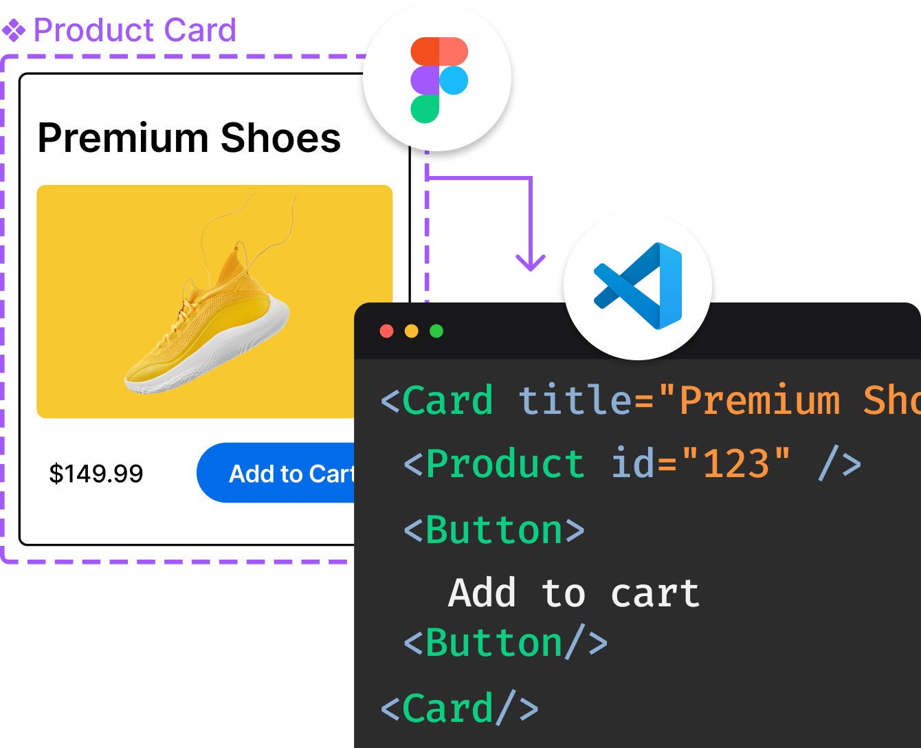
Introducing Visual Copilot: A new AI model to turn Figma designs to high quality code using your components.
Try Visual Copilot
A modern, comprehensive, flexible design system and UI library. Connect DesignOps & DevOps. Quickly build beautiful React apps.






English | ç®ä½ä¸æ
npm install @douyinfe/semi-ui
yarn add @douyinfe/semi-ui
pnpm add @douyinfe/semi-ui
Here is a quick example to get you started, it's all you need:
import React from 'react';
import { createRoot } from 'react-dom/client';
import { Button, Form } from '@douyinfe/semi-ui';

const App = () => (
    <Form>
        <Form.Input field='name' initValue='semi design'></Form.Input>
        <Button htmlType='submit'>submit</Button>
    </Form>
);

const root = createRoot(document.querySelector('#app'));

root.render(<App />);
Semi UI Doc Site has hundreds of editable examples and live preview, welcome to play with those examples.
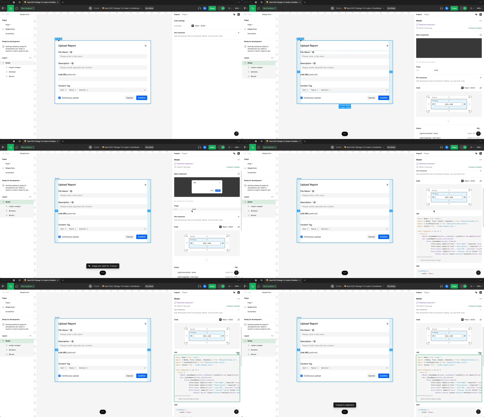
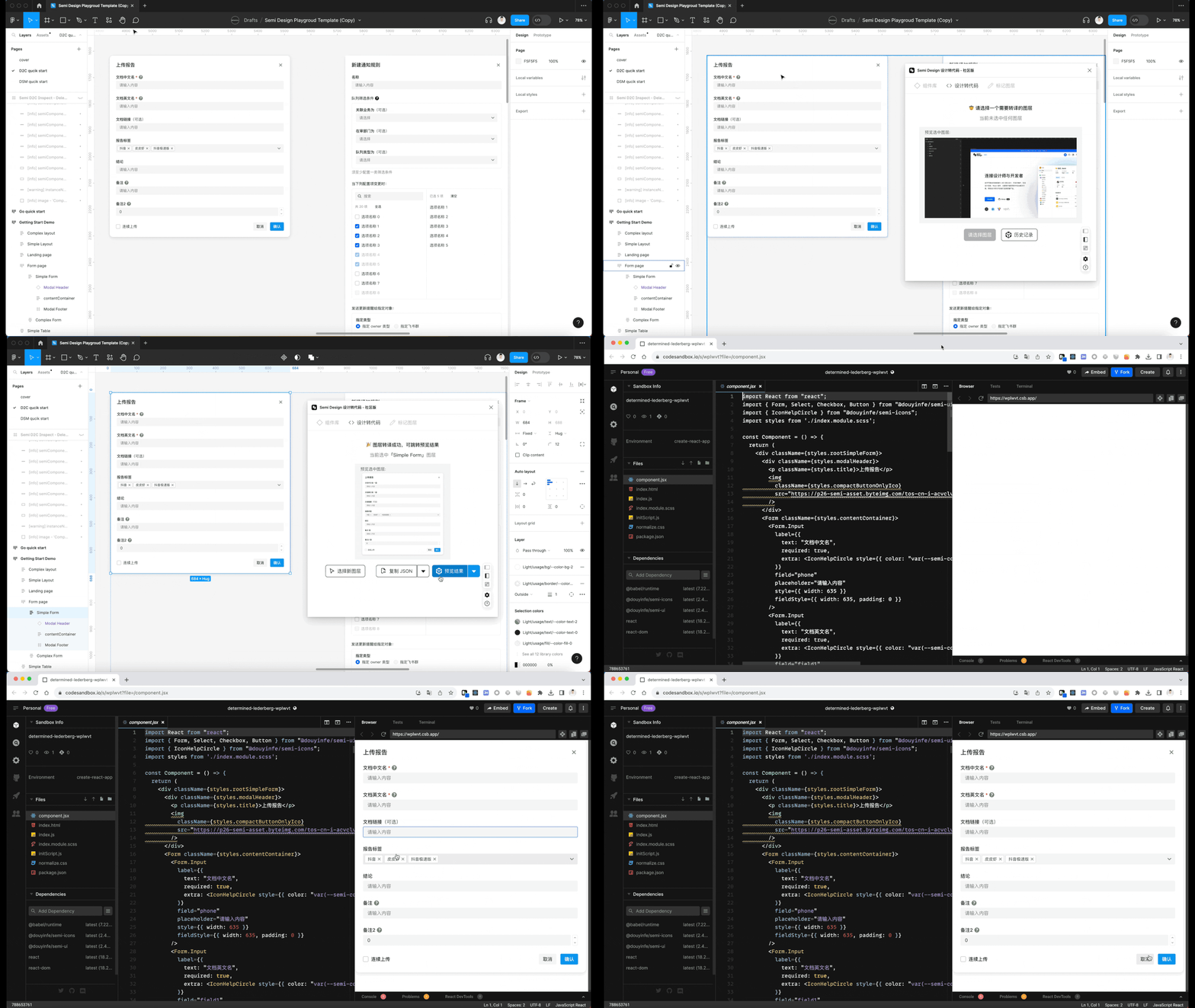
Install Semi Figma Plugin. Translate Figma to real code in seconds. Support multiple output formats: JSX + SCSS / Emotion/Tailwind, or JSON Schema DSL
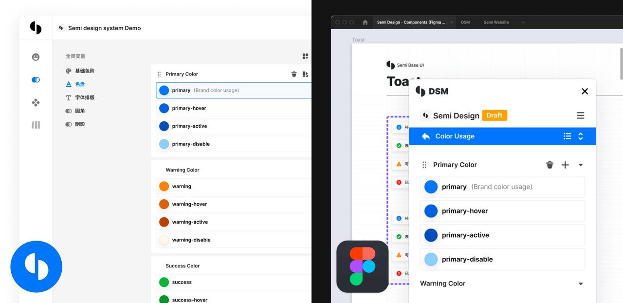
Define your own design system based on Semi UI with DSM in one click, Provide more than 3000 tokens for you to configure every detail. Sync between Figma and Code always.
Semi UI supports all major modern browsers.
 chrome |  firefox |  safari |  IE/Edge |  Electron |
|---|---|---|---|---|
| latest 2 versions | latest 2 versions | latest 2 versions | Edge | latest 2 versions |
Join User Group on Feishu / Lark

Thanks to Chromatic for providing the visual testing platform that helps us review UI changes and catch visual regressions.

Thanks to Cypress for providing E2E testing.


Thanks to VisActor for providing the data visualization solution.
Thanks to all the people who already contributed!
Read the contributing guide to learn about our development process, how to propose bug fixes and improvements, and how to build and test your changes to Semi UI.
See CONTRIBUTING documentation.
Semi UI is MIT Licensed
An enterprise-class UI design language and React UI library
Material UI: Comprehensive React component library that implements Google's Material Design. Free forever.
Chakra UI is a component system for building SaaS products with speed ⚡️
A utility-first CSS framework for rapid UI development.
Storybook is the industry standard workshop for building, documenting, and testing UI components in isolation
Bootstrap components built with React
designs to code with AIIntroducing Visual Copilot: A new AI model to turn Figma designs to high quality code using your components.
Try Visual Copilot
