 devportfolio
A modern, minimalist portfolio template built with Astro and Tailwind CSS. Perfect for developers looking to showcase their skills, experience, and projects in a clean, professional way.
Top Related Projects
⚡️ A minimal portfolio template for Developers
My self coded personal website build with React.js
Fourth iteration of my personal website built with Gatsby
Vertical timeline for React.js
Quick Overview
DevPortfolio is a lightweight, customizable portfolio template for developers. It's designed to be easily customized and deployed, allowing developers to showcase their projects and skills with minimal setup. The template is built using HTML, CSS, and JavaScript, making it accessible for developers of all skill levels.
Pros
- Easy to customize and deploy
- Responsive design that works well on various devices
- Clean and modern aesthetic
- Includes sections for projects, skills, and experience
Cons
- Limited advanced features compared to more complex portfolio solutions
- Requires manual updates for content changes
- May look similar to other portfolios using the same template without significant customization
Getting Started
- Fork the repository on GitHub
- Clone your forked repository to your local machine
- Open
index.htmlin a text editor and update the content with your information - Customize the styles in
css/styles.cssif desired - Add your project images to the
imagesfolder - Commit and push your changes to GitHub
- Enable GitHub Pages in your repository settings to deploy your portfolio
For a quick preview, you can simply open index.html in your web browser after making changes.
Competitor Comparisons
⚡️ A minimal portfolio template for Developers
Pros of simplefolio
- More modern and visually appealing design
- Includes dark mode functionality
- Better mobile responsiveness
Cons of simplefolio
- Less customization options out-of-the-box
- Requires more setup and configuration
- Heavier reliance on JavaScript
Code Comparison
simplefolio:
import initScrollReveal from "./utils/scrollReveal";
import initTiltEffect from "./utils/tiltAnimation";
import { targetElements, defaultProps } from "./data/scrollRevealConfig";

initScrollReveal(targetElements, defaultProps);
initTiltEffect();
devportfolio:
$(document).ready(function() {
    $('a.smoothscroll').on('click', function(e) {
        e.preventDefault();
        var target = this.hash,
        $target = $(target);
        $('html, body').stop().animate({
            'scrollTop': $target.offset().top
        }, 800, 'swing', function() {
            window.location.hash = target;
        });
    });
});
The code comparison shows that simplefolio uses more modern JavaScript practices with imports and modular structure, while devportfolio relies on jQuery for functionality. This reflects the overall difference in approach between the two projects, with simplefolio being more contemporary but potentially more complex to set up and customize.
My self coded personal website build with React.js
Pros of Portfolio
- More modern and visually appealing design with animations and interactive elements
- Built with React, offering a more dynamic and responsive user experience
- Includes additional sections like blogs and testimonials for a more comprehensive portfolio
Cons of Portfolio
- More complex setup and deployment process due to React framework
- Potentially slower load times compared to the lightweight DevPortfolio
- Requires more technical knowledge to customize and maintain
Code Comparison
DevPortfolio (HTML):
<section id="about">
  <div class="container">
    <h2 class="heading">About Me</h2>
    <p>Lorem ipsum dolor sit amet, consectetur adipiscing elit.</p>
  </div>
</section>
Portfolio (React):
const About = () => {
  return (
    <Container fluid className="about-section">
      <Container>
        <Row style={{ justifyContent: "center", padding: "10px" }}>
          <Col md={7} style={{ justifyContent: "center", paddingTop: "30px", paddingBottom: "50px" }}>
            <h1 style={{ fontSize: "2.1em", paddingBottom: "20px" }}>
              Know Who <strong className="purple">I'M</strong>
            </h1>
            <Aboutcard />
          </Col>
          <Col md={5} style={{ paddingTop: "120px", paddingBottom: "50px" }} className="about-img">
            <img src={laptopImg} alt="about" className="img-fluid" />
          </Col>
        </Row>
      </Container>
    </Container>
  );
};
Fourth iteration of my personal website built with Gatsby
Pros of v4
- More modern and visually appealing design
- Utilizes Gatsby for improved performance and SEO
- Includes a dark mode feature
Cons of v4
- More complex setup and configuration
- Requires knowledge of React and Gatsby
- Less customizable for users without coding experience
Code Comparison
v4 (React/Gatsby):
const IndexPage = ({ data }) => (
  <Layout location={location}>
    <Hero data={data.hero.edges} />
    <About data={data.about.edges} />
    <Jobs data={data.jobs.edges} />
    <Featured data={data.featured.edges} />
    <Projects data={data.projects.edges} />
    <Contact data={data.contact.edges} />
  </Layout>
);
devportfolio (HTML/CSS/JS):
<div id="lead">
    <div id="lead-content">
        <h1>Ryan Fitzgerald</h1>
        <h2>Software Engineer</h2>
        <a href="#" class="btn-rounded-white">Download Resume</a>
    </div>
    <!-- Lead overlay -->
    <div id="lead-overlay"></div>
    <!-- Lead down -->
    <div id="lead-down">
        <span>
            <i class="fa fa-chevron-down" aria-hidden="true"></i>
        </span>
    </div>
</div>
The code comparison shows that v4 uses a more component-based approach with React and Gatsby, while devportfolio uses traditional HTML structure with separate CSS and JavaScript files. v4's approach allows for better code organization and reusability, but requires more advanced development skills.
Vertical timeline for React.js
Pros of react-vertical-timeline
- Focused on creating vertical timelines, offering a specialized and polished solution
- Built with React, providing better integration for React-based projects
- Offers more customization options for timeline elements
Cons of react-vertical-timeline
- Limited to timeline functionality, less versatile for full portfolio creation
- Requires more setup and configuration compared to the all-in-one devportfolio
- May have a steeper learning curve for developers new to React
Code Comparison
devportfolio (HTML):
<section id="experience">
  <h2 class="heading">Experience</h2>
  <div id="experience-timeline">
    <div data-date="September 2015 – September 2016">
      <h3>Employer Name</h3>
      <h4>Job Title</h4>
      <p>Lorem ipsum dolor sit amet, consectetur adipiscing elit.</p>
    </div>
  </div>
</section>
react-vertical-timeline (JSX):
import { VerticalTimeline, VerticalTimelineElement } from 'react-vertical-timeline-component';

<VerticalTimeline>
  <VerticalTimelineElement
    className="vertical-timeline-element--work"
    date="2011 - present"
    iconStyle={{ background: 'rgb(33, 150, 243)', color: '#fff' }}
  >
    <h3 className="vertical-timeline-element-title">Creative Director</h3>
    <h4 className="vertical-timeline-element-subtitle">Miami, FL</h4>
    <p>Creative Direction, User Experience, Visual Design, Project Management, Team Leading</p>
  </VerticalTimelineElement>
</VerticalTimeline>
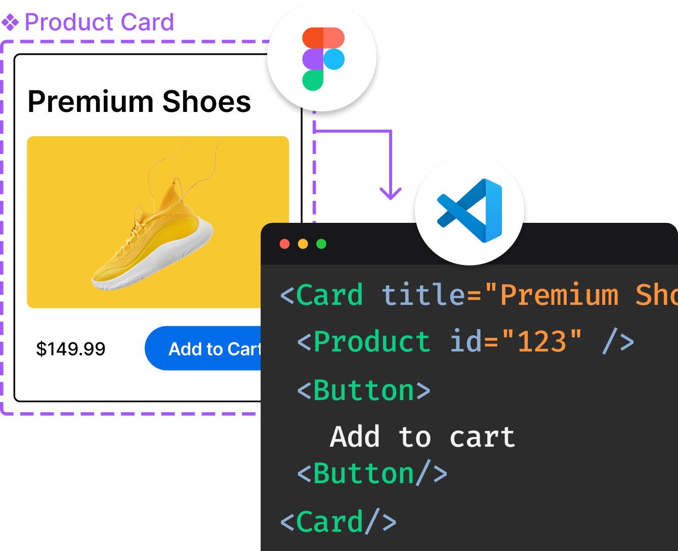
Convert  designs to code with AI

Introducing Visual Copilot: A new AI model to turn Figma designs to high quality code using your components.
Try Visual CopilotREADME
DevPortfolio Template
A modern, minimalist portfolio template built with Astro and Tailwind CSS. Perfect for developers looking to showcase their skills, experience, and projects in a clean, professional way.
This was completely rebuilt from the ground up from V1. This template was built to be entirely ready to go with a quick config edit (see below) but also provides the ability to easily extend in whatever way you want.
This template also comes with CLAUDE.md and .cursor/rules files for easy integration with your existing AI workflows.
ð¬ Connect & Share!
For questions and updates, feel free to reach out on X (Twitter).
If you've built and published your personal site with this template, I'd love to see it! Send me a DM ð
Preview
To view a live preview of the site, click here.
Built With
- Astro - Static site generator for modern web apps
- Tailwind CSS v4 - Utility-first CSS framework
- Tabler Icons - Free and open source icons
- TypeScript - For type-safe configuration
Updating the Template
Configuration
The template is designed to be easily customizable through the src/config.ts file. This single file controls:
- Personal Information: Name, title, description
- Accent Color: Primary color theme (changing this will change the accent color site wide)
- Social Links: Email, LinkedIn, Twitter, GitHub (all optional)
- About Section: Personal bio/description
- Skills: List of technical skills
- Projects: Project showcase with descriptions and links
- Experience: Work history with bullet points
- Education: Educational background and achievements
If skills, projects, experience, or education are removed from the config, those sections will be hidden entirely.
Example structures
Here's what the config data structure looks like for each section:
Basic Information
name: "Your Name",
title: "Your Job Title",
description: "Brief site description",
accentColor: "#1d4ed8", // Hex color for theme
Social Links (all optional)
social: {
  email: "your-email@example.com",
  linkedin: "https://linkedin.com/in/yourprofile",
  twitter: "https://twitter.com/yourprofile",
  github: "https://github.com/yourusername",
}
About Section
aboutMe: "A paragraph describing yourself, your background, interests, and what you're passionate about. This appears in the About section of your portfolio."
Skills
skills: ["JavaScript", "React", "Node.js", "Python", "AWS", "Docker"]
Projects
projects: [
  {
    name: "Project Name",
    description: "Brief description of what the project does and its impact",
    link: "https://github.com/yourusername/project",
    skills: ["React", "Node.js", "AWS"], // Technologies used
  }
]
Experience
experience: [
  {
    company: "Company Name",
    title: "Your Job Title",
    dateRange: "Jan 2022 - Present",
    bullets: [
      "Led development of microservices architecture serving 1M+ users",
      "Reduced API response times by 40% through optimization",
      "Mentored team of 5 junior developers",
    ],
  }
]
Education
education: [
  {
    school: "University Name",
    degree: "Bachelor of Science in Computer Science",
    dateRange: "2014 - 2018",
    achievements: [
      "Graduated Magna Cum Laude with 3.8 GPA",
      "Dean's List all semesters",
      "President of Computer Science Club"
    ]
  }
]
Icons
The template uses Tabler Icons for all icons. If you wish to add more icons and have it look consistent with what's already there, you can browse through their extensive icon library.
Project Structure
devportfolio/
âââ public/
â âââ favicon.svg # Site favicon
âââ src/
â âââ components/ # Astro components
â â âââ About.astro # About section
â â âââ Education.astro # Education section
â â âââ Experience.astro # Work experience section
â â âââ Footer.astro # Site footer
â â âââ Header.astro # Navigation header
â â âââ Hero.astro # Hero/intro section
â â âââ Projects.astro # Projects showcase
â âââ pages/
â â âââ index.astro # Main page layout
â âââ styles/
â â âââ global.css # Global styles
â âââ config.ts # Site configuration
âââ astro.config.mjs # Astro configuration
âââ package.json # Project dependencies
âââ tailwind.config.js # Tailwind configuration
âââ tsconfig.json # TypeScript configuration
Local Development
If you'd like to run it locally:
git clone https://github.com/RyanFitzgerald/devportfolio.git
cd devportfolio
npm install
After that, start up the Astro dev server with:
npm run dev
Deployment
The template can be deployed to any static hosting service easily (and in most cases, completely free). Here are some options:
- To deploy with Netlify, click here.
- To deploy with Vercel, click here.
- To deploy with GitHub Pages, click here.
- To deploy with Cloudflare Pages, click here.
- To deploy with Render, click here.
Want to deploy somewhere else? Find more guides here.
Changelog
To view the changelog, see CHANGELOG.md.
License
This project is fully and completely MIT. See LICENSE.md.
Questions?
Feel free to reach out on X (Twitter) if you have any questions or need help.
Top Related Projects
⚡️ A minimal portfolio template for Developers
My self coded personal website build with React.js
Fourth iteration of my personal website built with Gatsby
Vertical timeline for React.js
Convert  designs to code with AI

Introducing Visual Copilot: A new AI model to turn Figma designs to high quality code using your components.
Try Visual Copilot