 goey-toast
A gooey, morphing toast component built on Sonner with Framer Motion animations
Quick Overview
Error generating quick overview
Convert  designs to code with AI
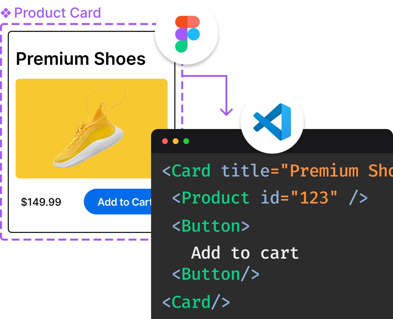
Introducing Visual Copilot: A new AI model to turn Figma designs to high quality code using your components.
Try Visual CopilotREADME
gooey-toast
Features
- Organic blob morph animation (pill → blob → pill)
- Five toast types: default, success, error, warning, info
- Promise toasts with loading → success/error transitions
- Action buttons with optional success label morph-back
- Description body supporting strings and React components
- Configurable display duration and bounce intensity
- Custom fill color, border color, and border width
- CSS class overrides via
classNamesprop - 6 positions with automatic horizontal mirroring for right-side positions
- Center positions with symmetric morph animation
- Hover pause: hovering an expanded toast pauses the dismiss timer
- Hover re-expand: hovering a collapsed pill re-expands the toast
- Pre-dismiss collapse animation
- In-place toast updates via
gooeyToast.update() - Dismiss by type filter:
gooeyToast.dismiss({ type: 'error' }) - Dark mode and RTL layout support
- Animation presets: smooth, bouncy, subtle, snappy
- Timestamp display on expanded toasts with optional
showTimestamptoggle - Close button with configurable position (
top-left/top-right) - Countdown progress bar with hover-pause and re-expand
- Keyboard dismiss (Escape) and swipe-to-dismiss on mobile
- Toast queue with configurable overflow strategy
- Dismiss callbacks:
onDismissandonAutoClose
Installation
npm install goey-toast
shadcn/ui
npx shadcn@latest add https://goey-toast.vercel.app/r/goey-toaster.json
This installs a thin wrapper component at components/ui/goey-toaster.tsx and auto-installs the goey-toast and framer-motion packages.
AI Agents (Skill)
goey-toast ships a bundled Agent Skill (SKILL.md) so coding agents (Claude Code, Cursor, etc.) know how to install and use it correctly â the required <GooeyToaster /> mount, the styles.css import, and the full API.
Install from the skills.sh registry:
npx skills add anl331/goey-toast
Or copy the skill into your project from the package itself:
npx goey-toast add-skill            # -> .claude/skills/goey-toast/SKILL.md
npx goey-toast add-skill --agents   # also append an AGENTS.md pointer
npx goey-toast add-skill --dir .cursor/skills/goey-toast
Peer Dependencies
goey-toast requires the following peer dependencies:
npm install react react-dom framer-motion
| Package | Version |
|---|---|
| react | >= 18.0.0 |
| react-dom | >= 18.0.0 |
| framer-motion | >= 10.0.0 |
CSS Import (Required)
You must import the goey-toast stylesheet for the component to render correctly:
import 'goey-toast/styles.css'
Add this import once in your app's entry point (e.g., main.tsx or App.tsx). Without it, toasts will appear unstyled.
Quick Start
import { GooeyToaster, gooeyToast } from 'goey-toast'
import 'goey-toast/styles.css'

function App() {
  return (
    <>
      <GooeyToaster position="bottom-right" />
      <button onClick={() => gooeyToast.success('Saved!')}>
        Save
      </button>
    </>
  )
}
API Reference
gooeyToast Methods
gooeyToast(title, options?)              // default (neutral)
gooeyToast.success(title, options?)      // green
gooeyToast.error(title, options?)        // red
gooeyToast.warning(title, options?)      // yellow
gooeyToast.info(title, options?)         // blue
gooeyToast.promise(promise, data)        // loading -> success/error
gooeyToast.update(id, options)           // update an existing toast in-place
gooeyToast.dismiss(idOrFilter?)          // dismiss one, by type, or all toasts
gooeyToast.update(id, options)
Updates an existing toast in-place without removing and re-creating it.
const id = gooeyToast('Uploading...', {
  icon: <SpinnerIcon />,
})

// Later, update the toast
gooeyToast.update(id, {
  title: 'Upload complete',
  type: 'success',
  description: '3 files uploaded.',
  icon: null, // clears the custom icon
})
GooeyToastUpdateOptions:
| Option | Type | Description |
|---|---|---|
title | string | New title text |
description | ReactNode | New body content |
type | GooeyToastType | Change the toast type/color |
action | GooeyToastAction | New action button |
icon | ReactNode | null | Custom icon (pass null to clear) |
gooeyToast.dismiss(idOrFilter?)
Dismiss a single toast by ID, all toasts of a given type, or all toasts at once.
// Dismiss a specific toast
gooeyToast.dismiss(toastId)

// Dismiss all error toasts
gooeyToast.dismiss({ type: 'error' })

// Dismiss multiple types
gooeyToast.dismiss({ type: ['error', 'warning'] })

// Dismiss all toasts
gooeyToast.dismiss()
GooeyToastOptions
Options passed as the second argument to gooeyToast() and type-specific methods.
| Option | Type | Description |
|---|---|---|
description | ReactNode | Body content (string or component) |
action | GooeyToastAction | Action button configuration |
icon | ReactNode | Custom icon override |
duration | number | Display duration in ms |
id | string | number | Unique toast identifier |
classNames | GooeyToastClassNames | CSS class overrides |
fillColor | string | Background color of the blob |
borderColor | string | Border color of the blob |
borderWidth | number | Border width in px (default 1.5) |
timing | GooeyToastTimings | Animation timing overrides |
spring | boolean | Enable spring/bounce animations (default true) |
bounce | number | Spring intensity from 0.05 (subtle) to 0.8 (dramatic), default 0.4 |
showTimestamp | boolean | Show/hide timestamp in toast header/body (default true) |
showProgress | boolean | Show countdown progress bar |
onDismiss | (id) => void | Called when toast is dismissed (any reason) |
onAutoClose | (id) => void | Called only on timer-based auto-dismiss |
preset | AnimationPresetName | Animation preset ('smooth', 'bouncy', 'subtle', 'snappy') |
GooeyToastAction
| Property | Type | Required | Description |
|---|---|---|---|
label | string | Yes | Button text |
onClick | () => void | Yes | Click handler |
successLabel | string | No | Label shown after click (morphs back to pill) |
GooeyToastTimings
Fine-tune animation speeds per toast.
| Property | Type | Default | Description |
|---|---|---|---|
displayDuration | number | 4000 | Milliseconds toast stays expanded |
GooeyToastClassNames
Override styles for any part of the toast.
| Key | Target |
|---|---|
wrapper | Outer container |
content | Content area |
header | Icon + title row |
title | Title text |
icon | Icon wrapper |
description | Body text |
actionWrapper | Button container |
actionButton | Action button |
GooeyToasterProps
Props for the <GooeyToaster /> component.
| Prop | Type | Default | Description |
|---|---|---|---|
position | 'top-left' | 'top-center' | 'top-right' | 'bottom-left' | 'bottom-center' | 'bottom-right' | 'bottom-right' | Toast position |
duration | number | -- | Default display duration in ms |
gap | number | 14 | Gap between stacked toasts (px) |
offset | number | string | '24px' | Distance from screen edge |
theme | 'light' | 'dark' | 'light' | Color theme |
toastOptions | Partial<ExternalToast> | -- | Default options passed to Sonner |
spring | boolean | true | Enable spring/bounce animations globally |
bounce | number | 0.4 | Spring intensity: 0.05 (subtle) to 0.8 (dramatic) |
preset | AnimationPresetName | -- | Animation preset for all toasts |
closeOnEscape | boolean | true | Dismiss most recent toast on Escape key |
closeButton | boolean | 'top-left' | 'top-right' | false | Show close button on hover |
showProgress | boolean | false | Show countdown progress bar on all toasts |
maxQueue | number | Infinity | Maximum queued toasts |
queueOverflow | 'drop-oldest' | 'drop-newest' | 'drop-oldest' | Queue overflow strategy |
dir | 'ltr' | 'rtl' | 'ltr' | Layout direction |
swipeToDismiss | boolean | true | Enable swipe-to-dismiss on mobile |
showTimestamp | boolean | true | Show/hide timestamp on all toasts globally |
GooeyPromiseData<T>
Configuration for gooeyToast.promise().
| Property | Type | Required | Description |
|---|---|---|---|
loading | string | Yes | Title shown during loading |
success | string | ((data: T) => string) | Yes | Title on success (static or derived from result) |
error | string | ((error: unknown) => string) | Yes | Title on error (static or derived from error) |
description | object | No | Per-phase descriptions (see below) |
action | object | No | Per-phase action buttons (see below) |
classNames | GooeyToastClassNames | No | CSS class overrides |
fillColor | string | No | Background color of the blob |
borderColor | string | No | Border color of the blob |
borderWidth | number | No | Border width in px |
timing | GooeyToastTimings | No | Animation timing overrides |
spring | boolean | No | Enable spring/bounce animations (default true) |
bounce | number | No | Spring intensity: 0.05 (subtle) to 0.8 (dramatic), default 0.4 |
onDismiss | (id: string | number) => void | No | Called when toast is dismissed (any reason) |
onAutoClose | (id: string | number) => void | No | Called only on timer-based auto-dismiss |
description sub-fields:
| Key | Type |
|---|---|
loading | ReactNode |
success | ReactNode | ((data: T) => ReactNode) |
error | ReactNode | ((error: unknown) => ReactNode) |
action sub-fields:
| Key | Type |
|---|---|
success | GooeyToastAction |
error | GooeyToastAction |
Usage Examples
Description
gooeyToast.error('Payment failed', {
  description: 'Your card was declined. Please try again.',
})
Custom React Component as Description
gooeyToast.success('Deployment complete', {
  description: (
    <div style={{ display: 'flex', flexDirection: 'column', gap: 10 }}>
      <div>
        <span>Environment:</span> <strong>Production</strong>
      </div>
      <div>
        <span>Branch:</span> <strong>main @ 3f8a2c1</strong>
      </div>
    </div>
  ),
})
Action Button with Success Label
gooeyToast.info('Share link ready', {
  description: 'Your link has been generated.',
  action: {
    label: 'Copy to Clipboard',
    onClick: () => navigator.clipboard.writeText(url),
    successLabel: 'Copied!',
  },
})
Promise Toast
gooeyToast.promise(saveData(), {
  loading: 'Saving...',
  success: 'Changes saved',
  error: 'Something went wrong',
  description: {
    success: 'All changes have been synced.',
    error: 'Please try again later.',
  },
  action: {
    error: {
      label: 'Retry',
      onClick: () => retry(),
    },
  },
})
Custom Styling
gooeyToast.success('Styled!', {
  fillColor: '#1a1a2e',
  borderColor: '#333',
  borderWidth: 2,
  classNames: {
    wrapper: 'my-wrapper',
    title: 'my-title',
    description: 'my-desc',
    actionButton: 'my-btn',
  },
})
Display Duration
gooeyToast.success('Saved', {
  description: 'Your changes have been synced.',
  timing: { displayDuration: 5000 },
})
Disabling Spring Animations
Disable bounce/spring animations for a cleaner, more subtle look:
// Per-toast: disable spring for this toast only
gooeyToast.success('Saved', {
  description: 'Your changes have been synced.',
  spring: false,
})

// Globally: disable spring for all toasts
<GooeyToaster spring={false} />
When spring is false, all spring-based animations (landing squish, blob squish, morph transitions, pill resize, header squish) use smooth ease-in-out curves instead. Error shake animations still work regardless of this setting.
Bounce Intensity
Control how dramatic the spring effect feels with a single bounce value:
// Subtle, barely-there spring
gooeyToast.success('Saved', { bounce: 0.1 })

// Default feel
gooeyToast.success('Saved', { bounce: 0.4 })

// Jelly mode
gooeyToast.success('Saved', { bounce: 0.8 })

// Set globally via GooeyToaster
<GooeyToaster bounce={0.6} />
The bounce value (0.05 to 0.8) controls spring stiffness, damping, and squish magnitude together so you get a consistent feel from one number.
Dark Mode
<GooeyToaster theme="dark" />
RTL Support
<GooeyToaster dir="rtl" />
Animation Presets
Four built-in presets: smooth, bouncy, subtle, snappy. Apply per-toast or globally:
gooeyToast.success('Saved', { preset: 'bouncy' })

// Or globally
<GooeyToaster preset="smooth" />
Progress Bar
Show a countdown progress bar on toasts:
gooeyToast.success('Saved', { showProgress: true })

// Or enable globally
<GooeyToaster showProgress />
Keyboard Shortcuts
Press Escape to dismiss the most recent toast. Enabled by default; disable with closeOnEscape={false}.
Swipe to Dismiss
On mobile, swipe toasts to dismiss them. Enabled by default; disable with swipeToDismiss={false}.
Close Button
Show a close button on hover. Position it top-left (default) or top-right:
<GooeyToaster closeButton />
<GooeyToaster closeButton="top-left" />
<GooeyToaster closeButton="top-right" />
The close button inherits the toast's border and fill color styling. Hidden during the loading phase of promise toasts.
Hiding Timestamps
// Per-toast: hide timestamp for this toast only
gooeyToast.success('Saved', { showTimestamp: false })

// Globally: hide timestamp for all toasts
<GooeyToaster showTimestamp={false} />
Exports
// Components
export { GooeyToaster } from 'goey-toast'

// Toast function
export { gooeyToast } from 'goey-toast'

// Animation presets
export { animationPresets } from 'goey-toast'

// Types
export type {
  GooeyToastOptions,
  GooeyPromiseData,
  GooeyToasterProps,
  GooeyToastAction,
  GooeyToastClassNames,
  GooeyToastTimings,
  GooeyToastUpdateOptions,
  DismissFilter,
  AnimationPreset,
  AnimationPresetName,
} from 'goey-toast'
Browser Support
goey-toast works in all modern browsers that support:
- CSS Modules
- SVG path animations
- ResizeObserver
framer-motion(Chrome, Firefox, Safari, Edge)
See Also
- gooey-search-tabs â A morphing search bar with animated tab navigation for React. Live Demo
License
Convert designs to code with AI
Introducing Visual Copilot: A new AI model to turn Figma designs to high quality code using your components.
Try Visual Copilot