Top Related Projects
Generation of diagrams like flowcharts or sequence diagrams from text in a similar manner as markdown
Bring data to life with SVG, Canvas and HTML. :bar_chart::chart_with_upwards_trend::tada:
📊 Interactive JavaScript Charts built on SVG
Open-source JavaScript charting library behind Plotly and Dash
Highcharts JS, the JavaScript charting framework
Quick Overview
Chart.js is a popular open-source JavaScript library for creating responsive and interactive charts on web pages. It provides a simple yet flexible way to visualize data using various chart types, with a focus on performance and ease of use.
Pros
- Easy to use with a gentle learning curve
- Responsive and mobile-friendly charts
- Extensive customization options
- Good performance, even with large datasets
Cons
- Limited advanced chart types compared to some other libraries
- Customization can become complex for highly specific requirements
- Documentation can be unclear for some advanced features
- Limited built-in animation options
Code Examples
Creating a basic bar chart:
const ctx = document.getElementById('myChart').getContext('2d');
new Chart(ctx, {
    type: 'bar',
    data: {
        labels: ['Red', 'Blue', 'Yellow', 'Green', 'Purple', 'Orange'],
        datasets: [{
            label: '# of Votes',
            data: [12, 19, 3, 5, 2, 3],
            backgroundColor: [
                'rgba(255, 99, 132, 0.2)',
                'rgba(54, 162, 235, 0.2)',
                'rgba(255, 206, 86, 0.2)',
                'rgba(75, 192, 192, 0.2)',
                'rgba(153, 102, 255, 0.2)',
                'rgba(255, 159, 64, 0.2)'
            ],
            borderColor: [
                'rgba(255, 99, 132, 1)',
                'rgba(54, 162, 235, 1)',
                'rgba(255, 206, 86, 1)',
                'rgba(75, 192, 192, 1)',
                'rgba(153, 102, 255, 1)',
                'rgba(255, 159, 64, 1)'
            ],
            borderWidth: 1
        }]
    },
    options: {
        scales: {
            y: {
                beginAtZero: true
            }
        }
    }
});
Creating a line chart with multiple datasets:
const ctx = document.getElementById('myChart').getContext('2d');
new Chart(ctx, {
    type: 'line',
    data: {
        labels: ['January', 'February', 'March', 'April', 'May', 'June', 'July'],
        datasets: [{
            label: 'Dataset 1',
            data: [65, 59, 80, 81, 56, 55, 40],
            fill: false,
            borderColor: 'rgb(75, 192, 192)',
            tension: 0.1
        }, {
            label: 'Dataset 2',
            data: [28, 48, 40, 19, 86, 27, 90],
            fill: false,
            borderColor: 'rgb(255, 99, 132)',
            tension: 0.1
        }]
    },
    options: {
        responsive: true,
        plugins: {
            title: {
                display: true,
                text: 'Chart.js Line Chart'
            }
        }
    }
});
Creating a doughnut chart with custom colors:
const ctx = document.getElementById('myChart').getContext('2d');
new Chart(ctx, {
    type: 'doughnut',
    data: {
        labels: ['Red', 'Blue', 'Yellow'],
        datasets: [{
            label: 'My First Dataset',
            data: [300, 50, 100],
            backgroundColor: [
                'rgb(255, 99, 132)',
                'rgb(54, 162, 235)',
                'rgb(255, 205, 86)'
            ],
            hoverOffset: 4
        }]
    }
});
Getting Started
- Include Chart.js in your project:
<script src="https://cdn.jsdelivr.net/npm/chart
Competitor Comparisons
Generation of diagrams like flowcharts or sequence diagrams from text in a similar manner as markdown
Pros of mermaid
- Specializes in creating diagrams and flowcharts from text-based descriptions
- Supports a wide variety of diagram types (sequence, flowchart, gantt, etc.)
- Integrates well with Markdown and documentation tools
Cons of mermaid
- Less suitable for traditional data visualization and charts
- Steeper learning curve for complex diagrams
- Limited customization options compared to Chart.js
Code Comparison
mermaid:
graph TD
    A[Start] --> B{Is it?}
    B -->|Yes| C[OK]
    B -->|No| D[End]
Chart.js:
new Chart(ctx, {
    type: 'bar',
    data: {
        labels: ['Red', 'Blue', 'Yellow'],
        datasets: [{
            data: [12, 19, 3]
        }]
    }
});
mermaid excels at creating diagrams and flowcharts from text descriptions, making it ideal for documentation and process visualization. Chart.js, on the other hand, is better suited for creating interactive and customizable data visualizations like charts and graphs. While mermaid offers a wider range of diagram types, Chart.js provides more flexibility in styling and interactivity for traditional chart types. The choice between the two depends on the specific visualization needs of the project.
Bring data to life with SVG, Canvas and HTML. :bar_chart::chart_with_upwards_trend::tada:
Pros of D3
- Highly flexible and customizable, allowing for complex and unique visualizations
- Powerful data manipulation capabilities with its data-driven approach
- Large ecosystem with numerous extensions and plugins
Cons of D3
- Steeper learning curve due to its low-level nature
- Requires more code to create basic charts compared to Chart.js
- Performance can be an issue with large datasets or complex visualizations
Code Comparison
D3 example:
const svg = d3.select("body").append("svg")
    .attr("width", 400)
    .attr("height", 300);

svg.selectAll("rect")
    .data(data)
    .enter()
    .append("rect")
    .attr("x", (d, i) => i * 40)
    .attr("y", d => 300 - d * 10)
    .attr("width", 35)
    .attr("height", d => d * 10);
Chart.js example:
const ctx = document.getElementById('myChart').getContext('2d');
const chart = new Chart(ctx, {
    type: 'bar',
    data: {
        labels: ['A', 'B', 'C', 'D'],
        datasets: [{
            data: [10, 20, 30, 40]
        }]
    }
});
D3 offers more control but requires more code, while Chart.js provides a simpler API for common chart types.
📊 Interactive JavaScript Charts built on SVG
Pros of ApexCharts.js
- More interactive features like zooming, panning, and tooltips
- Wider variety of chart types, including candlestick and heatmap
- Better support for real-time data updates
Cons of ApexCharts.js
- Larger file size, which may impact page load times
- Steeper learning curve due to more complex API
- Less extensive documentation compared to Chart.js
Code Comparison
Chart.js:
new Chart(ctx, {
    type: 'bar',
    data: {
        labels: ['Red', 'Blue', 'Yellow'],
        datasets: [{
            label: 'My Dataset',
            data: [12, 19, 3]
        }]
    }
});
ApexCharts.js:
new ApexCharts(document.querySelector("#chart"), {
    chart: {
        type: 'bar'
    },
    series: [{
        name: 'My Dataset',
        data: [12, 19, 3]
    }],
    xaxis: {
        categories: ['Red', 'Blue', 'Yellow']
    }
}).render();
Both libraries offer powerful charting capabilities, but ApexCharts.js provides more advanced features at the cost of complexity and file size. Chart.js is simpler to use and has a smaller footprint, making it suitable for basic charting needs. The choice between them depends on the specific requirements of your project.
Open-source JavaScript charting library behind Plotly and Dash
Pros of Plotly.js
- More extensive and diverse chart types, including 3D plots and scientific visualizations
- Interactive features like zooming, panning, and hover tooltips are built-in
- Supports WebGL rendering for improved performance with large datasets
Cons of Plotly.js
- Larger file size and potentially slower initial load times
- Steeper learning curve due to more complex API and configuration options
- May be overkill for simple charting needs
Code Comparison
Chart.js:
new Chart(ctx, {
    type: 'bar',
    data: {
        labels: ['Red', 'Blue', 'Yellow'],
        datasets: [{
            label: 'My Dataset',
            data: [12, 19, 3]
        }]
    }
});
Plotly.js:
Plotly.newPlot('myDiv', [{
    x: ['Red', 'Blue', 'Yellow'],
    y: [12, 19, 3],
    type: 'bar'
}]);
Both libraries offer straightforward ways to create basic charts, but Plotly.js provides more customization options and advanced features for complex visualizations. Chart.js is generally easier to use for simple charts, while Plotly.js excels in creating interactive and feature-rich data visualizations.
Highcharts JS, the JavaScript charting framework
Pros of Highcharts
- More extensive and feature-rich, offering a wider variety of chart types and customization options
- Better support for large datasets and real-time data updates
- Stronger cross-browser compatibility, especially for older browsers
Cons of Highcharts
- Commercial license required for most use cases, which can be costly
- Steeper learning curve due to its extensive API and configuration options
- Larger file size, potentially impacting page load times
Code Comparison
Chart.js:
new Chart(ctx, {
    type: 'bar',
    data: {
        labels: ['Red', 'Blue', 'Yellow'],
        datasets: [{
            label: 'My Dataset',
            data: [12, 19, 3]
        }]
    }
});
Highcharts:
Highcharts.chart('container', {
    chart: { type: 'bar' },
    xAxis: { categories: ['Red', 'Blue', 'Yellow'] },
    series: [{
        name: 'My Dataset',
        data: [12, 19, 3]
    }]
});
Both libraries offer similar basic functionality, but Highcharts provides more detailed configuration options out of the box. Chart.js has a simpler API, making it easier to get started with basic charts, while Highcharts offers more advanced features for complex visualizations.
Convert  designs to code with AI

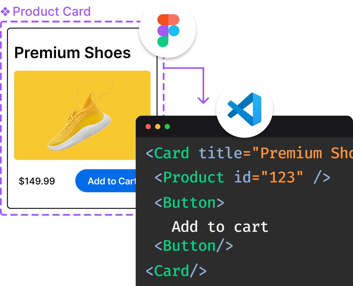
Introducing Visual Copilot: A new AI model to turn Figma designs to high quality code using your components.
Try Visual CopilotREADME
Simple yet flexible JavaScript charting for designers & developers
Documentation
All the links point to the new version 4 of the lib.
- Introduction
- Getting Started
- General
- Configuration
- Charts
- Axes
- Developers
- Popular Extensions
- Samples
In case you are looking for an older version of the docs, you will have to specify the specific version in the url like this: https://www.chartjs.org/docs/2.9.4/
Contributing
Instructions on building and testing Chart.js can be found in the documentation. Before submitting an issue or a pull request, please take a moment to look over the contributing guidelines first. For support, please post questions on Stack Overflow with the chart.js tag.
License
Chart.js is available under the MIT license.
Top Related Projects
Generation of diagrams like flowcharts or sequence diagrams from text in a similar manner as markdown
Bring data to life with SVG, Canvas and HTML. :bar_chart::chart_with_upwards_trend::tada:
📊 Interactive JavaScript Charts built on SVG
Open-source JavaScript charting library behind Plotly and Dash
Highcharts JS, the JavaScript charting framework
Convert  designs to code with AI

Introducing Visual Copilot: A new AI model to turn Figma designs to high quality code using your components.
Try Visual Copilot


