 ui
ui
Open-source components, blocks, and AI agents designed to speed up your workflow. Import them seamlessly into your favorite tools through Registry and MCPs.
Quick Overview
Error generating quick overview
Convert  designs to code with AI

Introducing Visual Copilot: A new AI model to turn Figma designs to high quality code using your components.
Try Visual CopilotREADME
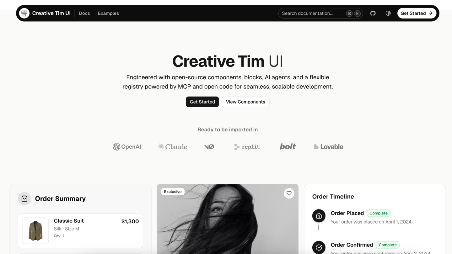
Creative Tim UI
Creative Tim UI is a comprehensive component library built on top of shadcn/ui to help you build modern web applications faster.
Overview
Creative Tim UI provides pre-built, customizable React components and blocks designed for building beautiful, production-ready web applications. The CLI makes it easy to add these components to your Next.js project.
Installation
You can use the Creative Tim UI CLI directly with npx, or install it globally:
# Use directly (recommended)
npx @creative-tim/ui@latest add <component-name>

# Or using shadcn cli
npx shadcn@latest add https://creative-tim.com/ui/r/all.json
Prerequisites
Before using Creative Tim UI, ensure your Next.js project meets these requirements:
- Node.js 18 or later
- shadcn/ui initialized in your project (npx shadcn@latest init)
- Tailwind CSS configured
Usage
Install All Components
Install all available Creative Tim UI components at once:
npx @creative-tim/ui@latest add all
This command will:
- Set up shadcn/ui if not already configured
- Install all Creative Tim UI components to your configured components directory
- Add necessary dependencies to your project
Install Specific Components
Install individual components using the components add command:
npx @creative-tim/ui@latest add <component-name>
Examples:
# Install the orb component
npx @creative-tim/ui@latest add card
Alternative: Use with shadcn CLI
You can also install components using the standard shadcn/ui CLI:
# Install all components
npx shadcn@latest add https://creative-tim.com/ui/r/all.json

# Install a specific component
npx shadcn@latest add https://creative-tim.com/ui/r/button.json
All available components can be found here or explore a list of example blocks here.
Blocks
Explore our collection of ready-to-use blocks organized by category. Each block is fully customizable and can be added to your project with a single command.
Application UI
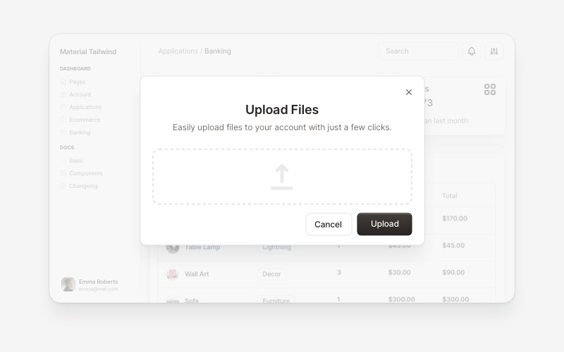
Modals 5 Blocks |
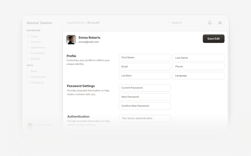
Account 7 Blocks |
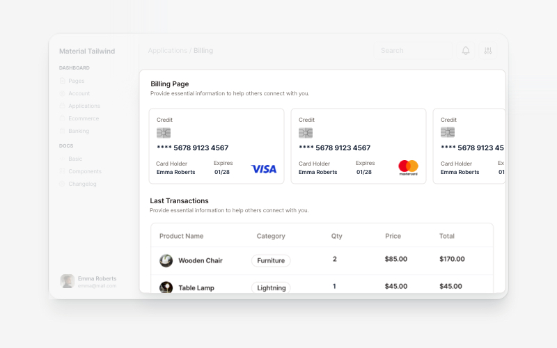
Billing 5 Blocks |
Marketing

Testimonial Sections 17 Blocks |
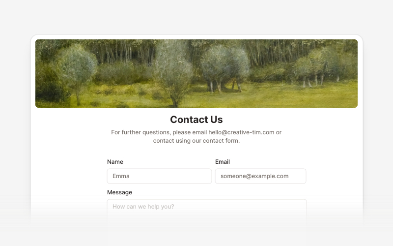
Contact Sections 15 Blocks |
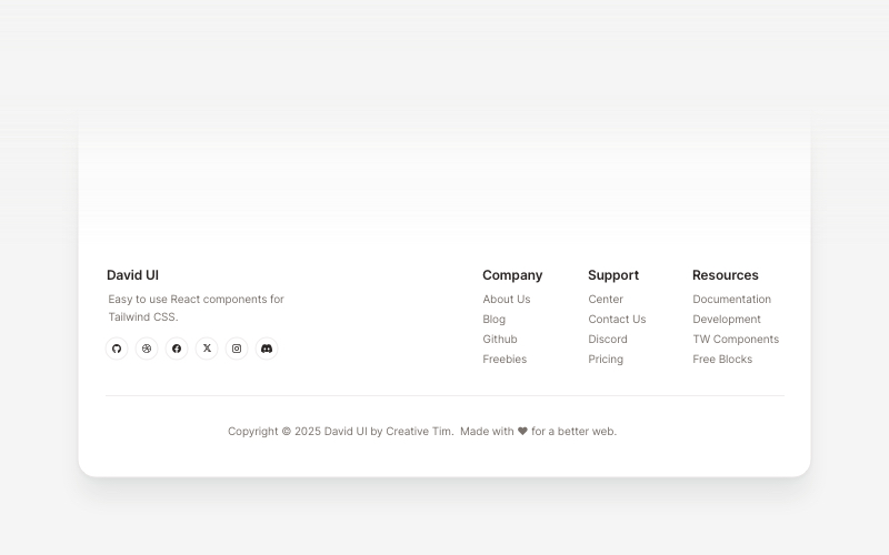
Footers 16 Blocks |
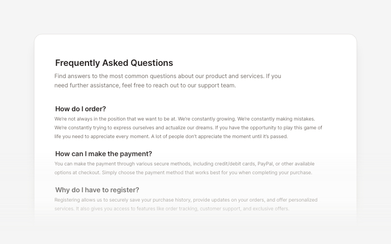
FAQs 6 Blocks |
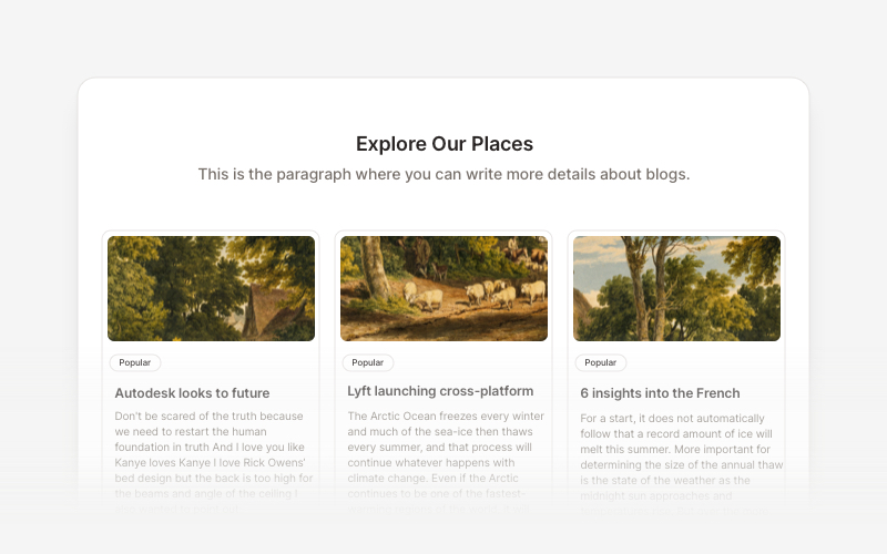
Blog 15 Blocks |
Ecommerce UI
Ready-to-use blocks for product listings, shopping carts, and checkout flows.
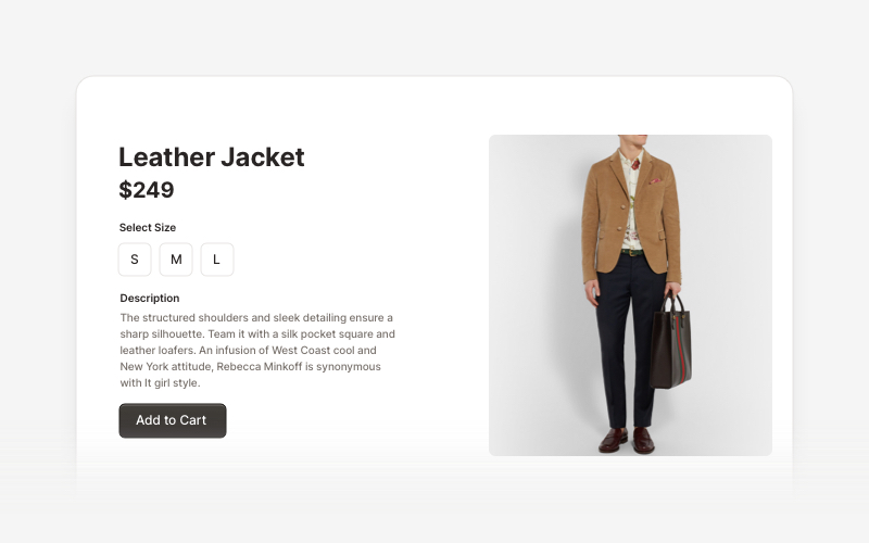
Ecommerce Sections 14 Blocks |
Web 3.0
Innovative sections built for decentralized applications, blockchain projects, and crypto platforms.
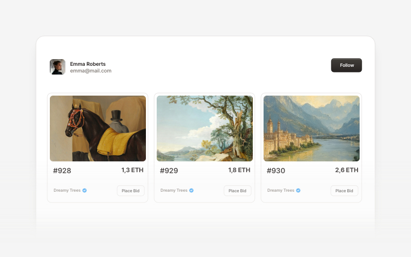
Web 3.0 Cards 5 Blocks |
Contributing
If you'd like to contribute to Creative Tim UI, please follow these steps:
- Fork the repository
- Create a new branch
- Make your changes to the components in the registry.
- Open a PR to the main branch.
Please read the contributing guide.
Copyrights and Licenses
Creative Tim UI is built upon the incredible work of the open source community:
- shadcn/ui - The documentation structure, registry system, and foundational (atomic) components are from the open source work in shadcn/ui. MIT License
- Material Tailwind by Creative Tim - The blocks and component designs are inspired by and based on Material Tailwind Framework. MIT License
- Eleven Labs UI - General inspiration for the documentation structure and approach of blocks. MIT License
- Geist Font by Vercel - The beautiful typeface used throughout the interface. SIL Open Font License 1.1
We are grateful to these projects for making their work available under open source licenses.
License
Licensed under the MIT license.
Made with love by Creative Tim.
Convert designs to code with AI
Introducing Visual Copilot: A new AI model to turn Figma designs to high quality code using your components.
Try Visual Copilot