
Top Related Projects

A utility-first CSS framework for rapid UI development.

Chakra UI is a component system for building SaaS products with speed ⚡️

Material UI: Comprehensive React component library that implements Google's Material Design. Free forever.

An enterprise-class UI design language and React UI library

Storybook is the industry standard workshop for building, documenting, and testing UI components in isolation

Fast, expressive styling for React. Server components, client components, streaming SSR, React Native—one API.
Quick Overview
HeroUI is a comprehensive UI component library and design system for React applications. It aims to provide developers with a set of high-quality, customizable components that can be easily integrated into modern web projects, enhancing both the development experience and the end-user interface.
Pros
- Extensive collection of pre-built, customizable React components
- Consistent design language across all components, promoting a cohesive user experience
- Responsive and accessible components out of the box
- Well-documented API and usage guidelines
Cons
- Learning curve for developers new to the library's conventions and API
- Potential performance overhead for smaller projects that don't require a full-featured UI library
- Limited flexibility for highly custom designs that deviate significantly from the library's aesthetic
- Dependency on React ecosystem, which may not be suitable for all projects
Code Examples
- Using a basic Button component:
import { Button } from '@heroui/react';

function MyComponent() {
  return (
    <Button variant="primary" onClick={() => console.log('Clicked!')}>
      Click me
    </Button>
  );
}
- Creating a responsive layout with Grid:
import { Grid, GridItem } from '@heroui/react';

function ResponsiveLayout() {
  return (
    <Grid columns={{ base: 1, md: 2, lg: 3 }} gap={4}>
      <GridItem>Content 1</GridItem>
      <GridItem>Content 2</GridItem>
      <GridItem>Content 3</GridItem>
    </Grid>
  );
}
- Implementing a form with validation:
import { Form, Input, Button } from '@heroui/react';

function LoginForm() {
  const handleSubmit = (values) => {
    console.log('Form submitted:', values);
  };

  return (
    <Form onSubmit={handleSubmit}>
      <Input name="email" type="email" label="Email" required />
      <Input name="password" type="password" label="Password" required />
      <Button type="submit">Log In</Button>
    </Form>
  );
}
Getting Started
To start using HeroUI in your React project, follow these steps:
-
Install the package:
npm install @heroui/react -
Import and use components in your React application:
import React from 'react'; import { Button, Card, Text } from '@heroui/react'; function App() { return ( <Card> <Text>Welcome to HeroUI!</Text> <Button>Get Started</Button> </Card> ); } export default App; -
(Optional) Import the default theme or create a custom theme:
import { ThemeProvider, defaultTheme } from '@heroui/react';

function Root() {
  return (
    <ThemeProvider theme={defaultTheme}>
      <App />
    </ThemeProvider>
  );
}
Competitor Comparisons
A utility-first CSS framework for rapid UI development.
Pros of Tailwind CSS
- Larger community and ecosystem with extensive documentation
- More flexible and customizable with a utility-first approach
- Better performance due to smaller file sizes after purging unused styles
Cons of Tailwind CSS
- Steeper learning curve for developers new to utility-first CSS
- Can lead to longer class names and potentially cluttered HTML
Code Comparison
Tailwind CSS:
<button class="bg-blue-500 hover:bg-blue-700 text-white font-bold py-2 px-4 rounded">
  Button
</button>
HeroUI:
<button class="btn btn-primary">
  Button
</button>
Summary
Tailwind CSS offers more flexibility and customization options, making it suitable for a wide range of projects. It has a larger community and ecosystem, which can be beneficial for finding resources and solutions. However, it may have a steeper learning curve compared to HeroUI.
HeroUI provides a more traditional component-based approach, which can be easier to adopt for developers familiar with frameworks like Bootstrap. It may offer a quicker setup for common UI elements but might be less flexible for highly custom designs.
The choice between the two depends on project requirements, team expertise, and desired level of customization.
Chakra UI is a component system for building SaaS products with speed ⚡️
Pros of Chakra UI
- More mature and widely adopted, with a larger community and ecosystem
- Extensive documentation and examples, making it easier for developers to get started
- Built-in support for dark mode and color mode switching
Cons of Chakra UI
- Larger bundle size, which may impact initial load times for applications
- Steeper learning curve due to its extensive API and component library
- More opinionated design system, which may require more customization for unique designs
Code Comparison
Chakra UI:
import { Box, Button, Text } from '@chakra-ui/react'

function Example() {
  return (
    <Box>
      <Text>Hello, Chakra UI!</Text>
      <Button colorScheme="blue">Click me</Button>
    </Box>
  )
}
HeroUI:
import { Box, Button, Text } from '@heroui/react'

function Example() {
  return (
    <Box>
      <Text>Hello, HeroUI!</Text>
      <Button variant="primary">Click me</Button>
    </Box>
  )
}
Both libraries offer similar component-based approaches, with Chakra UI using colorScheme for button styling and HeroUI using variant. Chakra UI's extensive theming system allows for more granular control over component styles, while HeroUI aims for simplicity with predefined variants.
Material UI: Comprehensive React component library that implements Google's Material Design. Free forever.
Pros of Material-UI
- Extensive component library with a wide range of pre-built UI elements
- Large and active community, providing robust support and frequent updates
- Comprehensive documentation and examples for easy implementation
Cons of Material-UI
- Steeper learning curve due to its extensive API and customization options
- Larger bundle size, which may impact initial load times for applications
- Opinionated design system that may require more effort to customize for unique branding
Code Comparison
Material-UI:
import { Button, TextField } from '@mui/material';

<Button variant="contained" color="primary">
  Click me
</Button>
<TextField label="Enter text" variant="outlined" />
HeroUI:
import { Button, Input } from '@heroui/react';

<Button variant="primary">Click me</Button>
<Input placeholder="Enter text" />
Summary
Material-UI offers a more comprehensive set of components and extensive customization options, backed by a large community. However, it may have a steeper learning curve and larger bundle size. HeroUI, while less information is available, appears to offer a simpler API with potentially easier implementation but may have fewer pre-built components and customization options.
An enterprise-class UI design language and React UI library
Pros of Ant Design
- Extensive component library with 60+ UI elements
- Robust documentation and community support
- Highly customizable with a powerful theming system
Cons of Ant Design
- Larger bundle size due to comprehensive feature set
- Steeper learning curve for beginners
- Opinionated design system may not fit all project styles
Code Comparison
Ant Design button example:
import { Button } from 'antd';

const MyComponent = () => (
  <Button type="primary">Click me</Button>
);
HeroUI button example:
import { Button } from '@heroui/react';

const MyComponent = () => (
  <Button variant="primary">Click me</Button>
);
Key Differences
- Ant Design uses
typeprop for button variants, while HeroUI usesvariant - Ant Design has a more extensive API with additional props and customization options
- HeroUI focuses on simplicity and ease of use, with a smaller component set
- Ant Design provides more built-in functionality, while HeroUI encourages composing components
Conclusion
Ant Design offers a comprehensive UI toolkit suitable for large-scale applications, while HeroUI provides a lightweight alternative focused on simplicity and flexibility. The choice between the two depends on project requirements, team expertise, and design preferences.
Storybook is the industry standard workshop for building, documenting, and testing UI components in isolation
Pros of Storybook
- Mature and widely adopted project with extensive documentation and community support
- Supports multiple frameworks and libraries (React, Vue, Angular, etc.)
- Offers advanced features like addons, testing utilities, and design system tools
Cons of Storybook
- Steeper learning curve due to its extensive feature set
- Can be overkill for smaller projects or teams
- Requires more setup and configuration compared to simpler alternatives
Code Comparison
HeroUI:
import { Button } from 'heroui';

const MyComponent = () => (
  <Button variant="primary">Click me</Button>
);
Storybook:
import { Button } from './Button';

export default {
  title: 'Components/Button',
  component: Button,
};

export const Primary = () => <Button variant="primary">Click me</Button>;
Summary
Storybook is a powerful and versatile tool for developing UI components in isolation, offering support for multiple frameworks and advanced features. However, it may be more complex for smaller projects. HeroUI, while less information is available, appears to be a simpler UI component library that might be easier to integrate for basic use cases but may lack the extensive ecosystem and features of Storybook.
Fast, expressive styling for React. Server components, client components, streaming SSR, React Native—one API.
Pros of styled-components
- More mature and widely adopted project with extensive documentation
- Supports dynamic styling based on props and themes
- Offers better performance through automatic critical CSS extraction
Cons of styled-components
- Steeper learning curve for developers new to CSS-in-JS
- Requires additional setup and configuration in projects
- Can lead to larger bundle sizes in some cases
Code Comparison
styled-components:
const Button = styled.button`
  background-color: ${props => props.primary ? 'blue' : 'white'};
  color: ${props => props.primary ? 'white' : 'blue'};
  padding: 10px 20px;
  border: 2px solid blue;
`;
HeroUI:
<Button
  className="bg-blue-500 text-white px-4 py-2 border-2 border-blue-500"
>
  Click me
</Button>
styled-components offers a more dynamic approach to styling with props, while HeroUI relies on utility classes for styling components. styled-components provides a more flexible and programmatic way to create styled elements, whereas HeroUI focuses on rapid development using pre-defined utility classes.
Convert  designs to code with AI
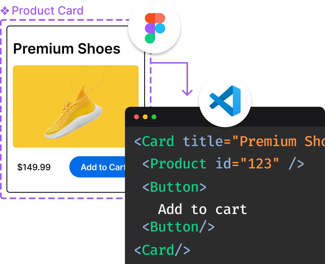
Introducing Visual Copilot: A new AI model to turn Figma designs to high quality code using your components.
Try Visual CopilotREADME


Why HeroUI?
HeroUI (previously NextUI) is a production-ready React component library that combines the accessibility rigor of React Aria with the utility-first styling of Tailwind CSS v4. It ships a clean compound component API (Card.Header, Card.Content, Select.Item, â¦), requires no <Provider> wrapper, and works out of the box with React 19 and Next.js.
- Accessible by default â Built on React Aria for WCAG-compliant keyboard, focus, and screen-reader behavior
- Tailwind CSS v4 â Modern engine, no CSS-in-JS runtime, smaller output, faster builds
- Compound components â Composable API (
Card.Header,Card.Content) instead of deeply nested props - Zero boilerplate â No Provider wrapper needed (unlike Chakra, MUI)
- AI-native â MCP server,
llms.txt, and agent skills so AI assistants understand your components - Battle-tested â Previously known as NextUI, trusted by thousands of production apps
Packages
| Package | Description |
|---|---|
@heroui/react | Full component bundle |
@heroui/styles | Styles / theme only |
| Individual packages | e.g. @heroui/button, @heroui/modal â tree-shakeable per-component imports |
Getting Started
Visit heroui.com/docs/react/getting-started/quick-start to get started with HeroUI.
npm install @heroui/react
Who Is This For?
HeroUI is a good fit if you are building:
- SaaS applications â forms, tables, overlays, and notifications out of the box
- Dashboards & admin panels â data-dense layouts with consistent design tokens
- E-commerce storefronts â performant, accessible, SEO-friendly components
- Marketing sites & landing pages â polished UI without a heavyweight runtime
- Any React / Next.js project that values design quality and accessibility
AI-Powered Development
HeroUI is built for the AI-assisted development workflow.
| Tool | What it does |
|---|---|
MCP Server (@heroui/react-mcp) | Components that understand your theme â install the server in Cursor, Claude Code, Windsurf, or any MCP-compatible editor |
| llms.txt | Available at heroui.com/llms.txt â structured context for LLMs about every component |
| Agent Skills | Run npx heroui-cli agents-md to install skills for Cursor, Claude Code, and more |
Works with Cursor, Claude Code, Windsurf, GitHub Copilot, and any tool that supports MCP or llms.txt.
Compared To
| Library | How HeroUI differs |
|---|---|
| shadcn/ui | HeroUI is batteries-included with a consistent design system; shadcn is copy-paste-customize |
| MUI | HeroUI is lighter, Tailwind-native, no CSS-in-JS runtime overhead |
| Chakra UI | HeroUI uses React Aria (stronger a11y primitives) and Tailwind v4 (better perf) |
| Mantine | HeroUI has AI tooling (MCP, llms.txt), Tailwind-first styling |
Documentation
- Latest (v3): heroui.com
- v2: v2.heroui.com
Storybook
Visit storybook-v3.heroui.com to view the storybook for all components.
Roadmap
Visit herouiv3.featurebase.app/roadmap to view the roadmap for HeroUI v3.
Figma
Visit the HeroUI Figma Kit (v3) to view the design kit.
Community
We're excited to see the community adopt HeroUI, raise issues, and provide feedback. Whether it's a feature request, bug report, or a project to showcase, please get involved!
Contributing
Contributions are always welcome!
See CONTRIBUTING.md for ways to get started.
Please adhere to this project's CODE_OF_CONDUCT.
License
Top Related Projects
A utility-first CSS framework for rapid UI development.
Chakra UI is a component system for building SaaS products with speed ⚡️
Material UI: Comprehensive React component library that implements Google's Material Design. Free forever.
An enterprise-class UI design language and React UI library
Storybook is the industry standard workshop for building, documenting, and testing UI components in isolation
Fast, expressive styling for React. Server components, client components, streaming SSR, React Native—one API.
Convert designs to code with AI
Introducing Visual Copilot: A new AI model to turn Figma designs to high quality code using your components.
Try Visual Copilot