 react-data-table-component
A responsive table library with built-in sorting, pagination, selection, expandable rows, and customizable styling.
Top Related Projects

🤖 Headless UI for building powerful tables & datagrids for TS/JS - React-Table, Vue-Table, Solid-Table, Svelte-Table

MUI X: Build complex and data-rich applications using a growing list of advanced React components, like the Data Grid, Date and Time Pickers, Charts, and more!

Feature-rich and customizable data grid React component
🤖 Headless UI for building powerful tables & datagrids for TS/JS - React-Table, Vue-Table, Solid-Table, Svelte-Table

Next Generation of react-bootstrap-table
Quick Overview
React Data Table Component is a highly customizable and feature-rich data table library for React applications. It provides a wide range of functionality, including sorting, filtering, pagination, and row selection, making it a versatile tool for building complex data-driven interfaces.
Pros
- Highly Customizable: The library offers extensive customization options, allowing developers to tailor the table's appearance and behavior to their specific needs.
- Performant: The library uses efficient techniques, such as virtualization, to ensure smooth performance even with large datasets.
- Accessibility-Focused: The library prioritizes accessibility, providing features like keyboard navigation and screen reader support.
- Extensive Feature Set: The library includes a wide range of features, including sorting, filtering, pagination, and row selection, making it a comprehensive solution for data table needs.
Cons
- Learning Curve: The library's extensive customization options and feature set can make it challenging for beginners to get started, especially if they are new to React.
- Dependency on External Libraries: The library relies on several external libraries, which can increase the overall project's complexity and dependency management.
- Limited Documentation: While the library has good documentation, some users may find it lacking in certain areas, particularly for more advanced use cases.
- Performance Concerns with Large Datasets: While the library is generally performant, it may struggle with extremely large datasets, especially on older or less powerful devices.
Code Examples
Rendering a Basic Data Table
import React from 'react';
import DataTable from 'react-data-table-component';

const data = [
  { id: 1, name: 'John Doe', email: 'john.doe@example.com' },
  { id: 2, name: 'Jane Smith', email: 'jane.smith@example.com' },
  { id: 3, name: 'Bob Johnson', email: 'bob.johnson@example.com' },
];

const columns = [
  { name: 'ID', selector: row => row.id },
  { name: 'Name', selector: row => row.name },
  { name: 'Email', selector: row => row.email },
];

const MyDataTable = () => {
  return <DataTable columns={columns} data={data} />;
};

export default MyDataTable;
Enabling Sorting and Filtering
import React from 'react';
import DataTable from 'react-data-table-component';

const data = [
  { id: 1, name: 'John Doe', email: 'john.doe@example.com' },
  { id: 2, name: 'Jane Smith', email: 'jane.smith@example.com' },
  { id: 3, name: 'Bob Johnson', email: 'bob.johnson@example.com' },
];

const columns = [
  { name: 'ID', selector: row => row.id, sortable: true },
  { name: 'Name', selector: row => row.name, sortable: true },
  { name: 'Email', selector: row => row.email, sortable: true },
];

const MyDataTable = () => {
  return (
    <DataTable
      columns={columns}
      data={data}
      sortable
      pagination
      fixedHeader
      fixedHeaderScrollHeight="300px"
    />
  );
};

export default MyDataTable;
Handling Row Selection
import React, { useState } from 'react';
import DataTable from 'react-data-table-component';

const data = [
  { id: 1, name: 'John Doe', email: 'john.doe@example.com' },
  { id: 2, name: 'Jane Smith', email: 'jane.smith@example.com' },
  { id: 3, name: 'Bob Johnson', email: 'bob.johnson@example.com' },
];

const columns = [
  { name: 'ID', selector: row => row.id },
  { name: 'Name', selector: row => row.name },
  { name: 'Email', selector: row => row.email },
Competitor Comparisons
🤖 Headless UI for building powerful tables & datagrids for TS/JS - React-Table, Vue-Table, Solid-Table, Svelte-Table
Pros of TanStack Table
- Framework-agnostic, supporting React, Vue, Solid, and more
- Highly flexible and customizable with a headless UI approach
- Better performance for large datasets due to virtualization support
Cons of TanStack Table
- Steeper learning curve due to its flexibility and headless nature
- Requires more setup and configuration for basic use cases
- Less out-of-the-box styling and UI components
Code Comparison
react-data-table-component:
import DataTable from 'react-data-table-component';

const MyComponent = () => (
  <DataTable
    columns={columns}
    data={data}
    pagination
    selectableRows
  />
);
TanStack Table:
import { useTable, usePagination, useRowSelect } from '@tanstack/react-table';

const MyComponent = () => {
  const table = useTable(
    { columns, data },
    usePagination,
    useRowSelect
  );
  return (
    <table {...table.getTableProps()}>
      {/* Render table content */}
    </table>
  );
};
The code comparison shows that react-data-table-component provides a more declarative API with built-in features, while TanStack Table requires more manual setup but offers greater flexibility in how the table is rendered and behaves.
MUI X: Build complex and data-rich applications using a growing list of advanced React components, like the Data Grid, Date and Time Pickers, Charts, and more!
Pros of MUI X
- Comprehensive suite of advanced components, including data grid, date pickers, and charts
- Seamless integration with Material-UI design system
- Extensive documentation and community support
Cons of MUI X
- Steeper learning curve due to complex API and extensive features
- Some advanced features require a paid license
- Larger bundle size compared to lightweight alternatives
Code Comparison
react-data-table-component:
import DataTable from 'react-data-table-component';

const columns = [
  { name: 'Title', selector: row => row.title },
  { name: 'Year', selector: row => row.year },
];

<DataTable columns={columns} data={data} />
MUI X:
import { DataGrid } from '@mui/x-data-grid';

const columns = [
  { field: 'title', headerName: 'Title', width: 150 },
  { field: 'year', headerName: 'Year', width: 100 },
];

<DataGrid rows={data} columns={columns} />
Summary
MUI X offers a more comprehensive set of components and integrates well with Material-UI, but comes with a steeper learning curve and potential licensing costs. react-data-table-component provides a simpler, lightweight solution focused specifically on data tables. The choice between the two depends on project requirements, budget, and desired level of customization.
Feature-rich and customizable data grid React component
Error generating comparison
🤖 Headless UI for building powerful tables & datagrids for TS/JS - React-Table, Vue-Table, Solid-Table, Svelte-Table
Pros of TanStack Table
- Framework-agnostic, supporting React, Vue, Solid, and more
- Highly flexible and customizable with a headless UI approach
- Better performance for large datasets due to virtualization support
Cons of TanStack Table
- Steeper learning curve due to its flexibility and headless nature
- Requires more setup and configuration for basic use cases
- Less out-of-the-box styling and UI components
Code Comparison
react-data-table-component:
import DataTable from 'react-data-table-component';

const MyComponent = () => (
  <DataTable
    columns={columns}
    data={data}
    pagination
    selectableRows
  />
);
TanStack Table:
import { useTable, usePagination, useRowSelect } from '@tanstack/react-table';

const MyComponent = () => {
  const table = useTable(
    { columns, data },
    usePagination,
    useRowSelect
  );
  return (
    <table {...table.getTableProps()}>
      {/* Render table content */}
    </table>
  );
};
The code comparison shows that react-data-table-component provides a more declarative API with built-in features, while TanStack Table requires more manual setup but offers greater flexibility in how the table is rendered and behaves.
Next Generation of react-bootstrap-table
Pros of react-bootstrap-table2
- More comprehensive documentation with detailed examples
- Built-in support for Bootstrap styling
- Wider range of features, including cell editing and expandable rows
Cons of react-bootstrap-table2
- Larger bundle size due to additional features
- Steeper learning curve for complex configurations
- Less frequent updates and maintenance
Code Comparison
react-bootstrap-table2:
import BootstrapTable from 'react-bootstrap-table-next';

const columns = [{
  dataField: 'id',
  text: 'Product ID'
}, {
  dataField: 'name',
  text: 'Product Name'
}];

<BootstrapTable keyField='id' data={ products } columns={ columns } />
react-data-table-component:
import DataTable from 'react-data-table-component';

const columns = [
  { name: 'Title', selector: row => row.title },
  { name: 'Year', selector: row => row.year },
];

<DataTable columns={columns} data={data} />
Both libraries offer similar basic functionality for creating data tables in React applications. react-bootstrap-table2 provides more built-in features and Bootstrap integration, making it suitable for projects already using Bootstrap or requiring advanced table functionality. However, this comes at the cost of a larger bundle size and potentially more complex setup.
react-data-table-component offers a simpler API and smaller bundle size, making it easier to integrate and customize for projects with specific needs. It may be a better choice for lightweight applications or those not requiring extensive table features.
Convert  designs to code with AI
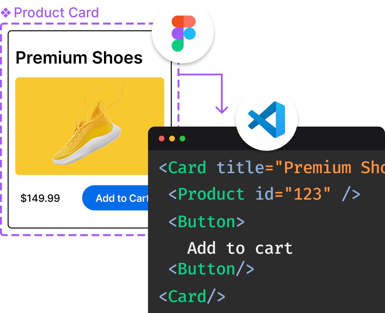
Introducing Visual Copilot: A new AI model to turn Figma designs to high quality code using your components.
Try Visual CopilotREADME



React Data Table Component





A simple but flexible React data table. Working table in 10 lines. Sorting, selection, pagination, expandable rows, and theming are opt-in props. No atomic HTML table knowledge required.
react-data-table-component sits between "render everything yourself" headless toolkits and full "configure-the-grid" frameworks. It's for cases where the table is a means, not the product: admin panels, dashboards, internal tools, MVPs. If you need an Excel clone or a 100k-row analytics grid, there are better-suited libraries for that.
Quick start
import DataTable from 'react-data-table-component';

const columns = [
  { name: 'Title', selector: row => row.title, sortable: true },
  { name: 'Year', selector: row => row.year, sortable: true },
  { name: 'Director', selector: row => row.director },
];

export default function Movies() {
  return <DataTable columns={columns} data={data} pagination />;
}
Key Features
- Sorting, row selection, expandable rows, and pagination (all opt-in props)
- Themeable via CSS variables; deeply customizable via
customStyles - Accessible (
role,aria-sort,aria-selected, keyboard navigation) - Responsive (x-scroll / flex)
- TypeScript types bundled
- SSR-safe; ships
"use client"for Next.js App Router (import directly into a Server Component file) - Headless hooks exported for full markup/style control when you outgrow the defaults
Documentation Website
The documentation contains information about installation, usage and contributions.
Supporting React Data Table Component
React Data Table Component has been actively maintained since 2018 and is downloaded  times a week. If your team ships products with it, your support keeps it maintained, bug-free, and moving forward.
Sponsor the project
Sponsoring puts your company logo in front of the developers who use it every week: in the README, the docs site, and every release. It's the right move if your team depends on this library and you want it to keep improving.
| Tier | Price/month | Perk |
|---|---|---|
| â Supporter | $5 | Your name in the README supporters list |
| ð Backer | $20 | Name + link in README + listed in the Backers section on reactdatatable.com |
| ð¥ Bronze | $100 | Visibility: small logo in README + docs site footer, and sponsor credit in every release's notes |
| ð¥ Silver | $200 | Everything in Bronze + medium logo in the docs sidebar + priority issue queue: sponsor issues go to the front of the backlog, first response within 2 business days |
| ð¥ Gold | $500 | Everything in Silver + hero logo on reactdatatable.com + top README placement + written support commitments: 12-month patch window for the previous major, security advisories before public disclosure, one compliance questionnaire per year, direct email channel (async, business hours). Limited to 3. |
These are honest, written commitments from a solo maintainer: async and business hours. No fake 24/7 SLA.


Enterprise support
Need commercial support, an SLA, or help with a major version upgrade? I offer direct consulting and priority support arrangements for teams that depend on react-data-table-component in production. Reach out via the support page.
Need help?
Open a GitHub issue. Priority support is available for teams that sponsor the project.
Sponsors
Become a Gold Sponsor and your logo goes here.
Backers
Thank you to our recurring backers:
- Rich Tillman
- Simon Schick
Contributors
Top Related Projects
🤖 Headless UI for building powerful tables & datagrids for TS/JS - React-Table, Vue-Table, Solid-Table, Svelte-Table
MUI X: Build complex and data-rich applications using a growing list of advanced React components, like the Data Grid, Date and Time Pickers, Charts, and more!
Feature-rich and customizable data grid React component
🤖 Headless UI for building powerful tables & datagrids for TS/JS - React-Table, Vue-Table, Solid-Table, Svelte-Table
Next Generation of react-bootstrap-table
Convert designs to code with AI
Introducing Visual Copilot: A new AI model to turn Figma designs to high quality code using your components.
Try Visual Copilot