
Top Related Projects

The library for web and native user interfaces.

Material UI: Comprehensive React component library that implements Google's Material Design. Free forever.

An enterprise-class UI design language and React UI library

Bootstrap components built with React

A utility-first CSS framework for rapid UI development.

🐉 Vue Component Framework
Quick Overview
PrimeReact is a rich set of open-source UI components for React applications. It offers a comprehensive library of flexible and customizable components, ranging from basic input elements to complex data visualization tools. PrimeReact is designed to help developers create modern, responsive, and feature-rich web applications with ease.
Pros
- Extensive collection of over 80 UI components
- Consistent and customizable theming system
- Regular updates and active community support
- Seamless integration with React applications
Cons
- Learning curve for developers new to the library
- Large bundle size if importing all components
- Some advanced features may require premium templates
- Documentation can be overwhelming due to the vast number of components
Code Examples
- Creating a basic button:
import { Button } from 'primereact/button';

const MyComponent = () => {
    return <Button label="Click Me" icon="pi pi-check" />;
};
- Implementing a data table with sorting and filtering:
import { DataTable } from 'primereact/datatable';
import { Column } from 'primereact/column';

const MyDataTable = ({ data }) => {
    return (
        <DataTable value={data} paginator rows={10} filterDisplay="row">
            <Column field="name" header="Name" filter sortable />
            <Column field="category" header="Category" filter sortable />
            <Column field="price" header="Price" filter sortable />
        </DataTable>
    );
};
- Creating a dropdown menu:
import { Dropdown } from 'primereact/dropdown';
import { useState } from 'react';

const MyDropdown = () => {
    const [selectedCity, setSelectedCity] = useState(null);
    const cities = [
        { name: 'New York', code: 'NY' },
        { name: 'Rome', code: 'RM' },
        { name: 'London', code: 'LDN' },
        { name: 'Paris', code: 'PRS' }
    ];

    return (
        <Dropdown
            value={selectedCity}
            onChange={(e) => setSelectedCity(e.value)}
            options={cities}
            optionLabel="name"
            placeholder="Select a City"
        />
    );
};
Getting Started
To start using PrimeReact in your project:
-
Install PrimeReact and its peer dependencies:
npm install primereact primeicons react-transition-group -
Import the default theme in your main application file:
import "primereact/resources/themes/lara-light-indigo/theme.css"; import "primereact/resources/primereact.min.css"; import "primeicons/primeicons.css"; -
Start using PrimeReact components in your React application:
import { Button } from 'primereact/button';

function App() {
  return (
    <div>
      <h1>Hello PrimeReact</h1>
      <Button label="Click Me" />
    </div>
  );
}
Competitor Comparisons
The library for web and native user interfaces.
Error generating comparison
Material UI: Comprehensive React component library that implements Google's Material Design. Free forever.
Pros of Material-UI
- Larger community and ecosystem, with more third-party extensions and resources
- More comprehensive documentation and examples
- Better TypeScript support and type definitions
Cons of Material-UI
- Steeper learning curve due to its extensive API and customization options
- Larger bundle size, which may impact initial load times for applications
Code Comparison
Material-UI:
import { Button, TextField } from '@mui/material';

<Button variant="contained" color="primary">
  Click me
</Button>
<TextField label="Enter your name" variant="outlined" />
PrimeReact:
import { Button } from 'primereact/button';
import { InputText } from 'primereact/inputtext';

<Button label="Click me" />
<InputText placeholder="Enter your name" />
Both libraries offer similar components, but Material-UI provides more customization options out of the box. PrimeReact's API is generally simpler and more straightforward, which can lead to faster development for some projects.
While Material-UI has a larger community and more resources, PrimeReact offers a comprehensive set of components that may be sufficient for many applications. The choice between the two often depends on specific project requirements, team familiarity, and design preferences.
An enterprise-class UI design language and React UI library
Pros of Ant Design
- Larger community and more widespread adoption, leading to better support and resources
- More comprehensive component library with a wider range of UI elements
- Stronger focus on enterprise-level applications and complex user interfaces
Cons of Ant Design
- Steeper learning curve due to its extensive API and configuration options
- Less flexibility in customization compared to PrimeReact's more modular approach
- Heavier bundle size, which may impact initial load times for smaller applications
Code Comparison
Ant Design button example:
import { Button } from 'antd';

const MyComponent = () => (
  <Button type="primary">Click me</Button>
);
PrimeReact button example:
import { Button } from 'primereact/button';

const MyComponent = () => (
  <Button label="Click me" className="p-button-primary" />
);
Both libraries offer similar basic functionality, but Ant Design uses a type prop for button styling, while PrimeReact uses a className approach. PrimeReact's method allows for more granular control over button appearance through CSS classes.
Bootstrap components built with React
Pros of React Bootstrap
- Lightweight and faster to load compared to PrimeReact
- Closer to native Bootstrap styling, making it easier for developers familiar with Bootstrap
- Larger community and more widespread adoption, potentially leading to better support and resources
Cons of React Bootstrap
- Fewer components and features compared to PrimeReact's extensive library
- Less customization options and theming capabilities out of the box
- May require additional libraries or custom components for more advanced UI elements
Code Comparison
React Bootstrap:
import { Button } from 'react-bootstrap';

<Button variant="primary">Click me</Button>
PrimeReact:
import { Button } from 'primereact/button';

<Button label="Click me" className="p-button-primary" />
Both libraries offer similar basic component usage, but PrimeReact often provides more built-in props for customization and functionality. React Bootstrap follows a more traditional Bootstrap approach, while PrimeReact has its own design system and component structure.
A utility-first CSS framework for rapid UI development.
Pros of Tailwind CSS
- Highly customizable and flexible utility-first CSS framework
- Smaller file sizes and better performance due to purging unused styles
- Rapid prototyping and development with pre-built utility classes
Cons of Tailwind CSS
- Steeper learning curve for developers used to traditional CSS frameworks
- Can lead to cluttered HTML with many utility classes
- Requires additional configuration for optimal performance
Code Comparison
Tailwind CSS:
<button class="bg-blue-500 hover:bg-blue-700 text-white font-bold py-2 px-4 rounded">
  Click me
</button>
PrimeReact:
import { Button } from 'primereact/button';

<Button label="Click me" className="p-button-primary" />
Summary
Tailwind CSS offers a utility-first approach with high customization and performance benefits, while PrimeReact provides pre-built React components with a more traditional styling approach. Tailwind CSS may require more initial setup and learning, but offers greater flexibility. PrimeReact provides a quicker start with ready-to-use components but may be less customizable. The choice between the two depends on project requirements, team expertise, and desired level of control over styling.
🐉 Vue Component Framework
Pros of Vuetify
- Larger community and ecosystem, with more third-party resources and extensions
- More comprehensive documentation and examples
- Built-in support for material design, providing a consistent look and feel
Cons of Vuetify
- Steeper learning curve due to its extensive feature set
- Larger bundle size, which may impact initial load times
- Less flexibility in customizing styles without overriding defaults
Code Comparison
Vuetify:
<template>
  <v-app>
    <v-btn color="primary">Click me</v-btn>
  </v-app>
</template>
PrimeReact:
import { Button } from 'primereact/button';

<Button label="Click me" className="p-button-primary" />
Both libraries offer component-based architectures, but Vuetify's approach is more tightly integrated with Vue's ecosystem, while PrimeReact provides a more flexible, framework-agnostic solution.
Vuetify's material design focus results in a more opinionated styling approach, whereas PrimeReact offers greater customization options out of the box. However, this also means that achieving a consistent look across an entire application may require more effort with PrimeReact.
In terms of performance, PrimeReact generally has a smaller footprint, which can lead to faster initial load times. Vuetify, while larger, offers more built-in functionality that may reduce the need for additional dependencies in complex applications.
Convert  designs to code with AI
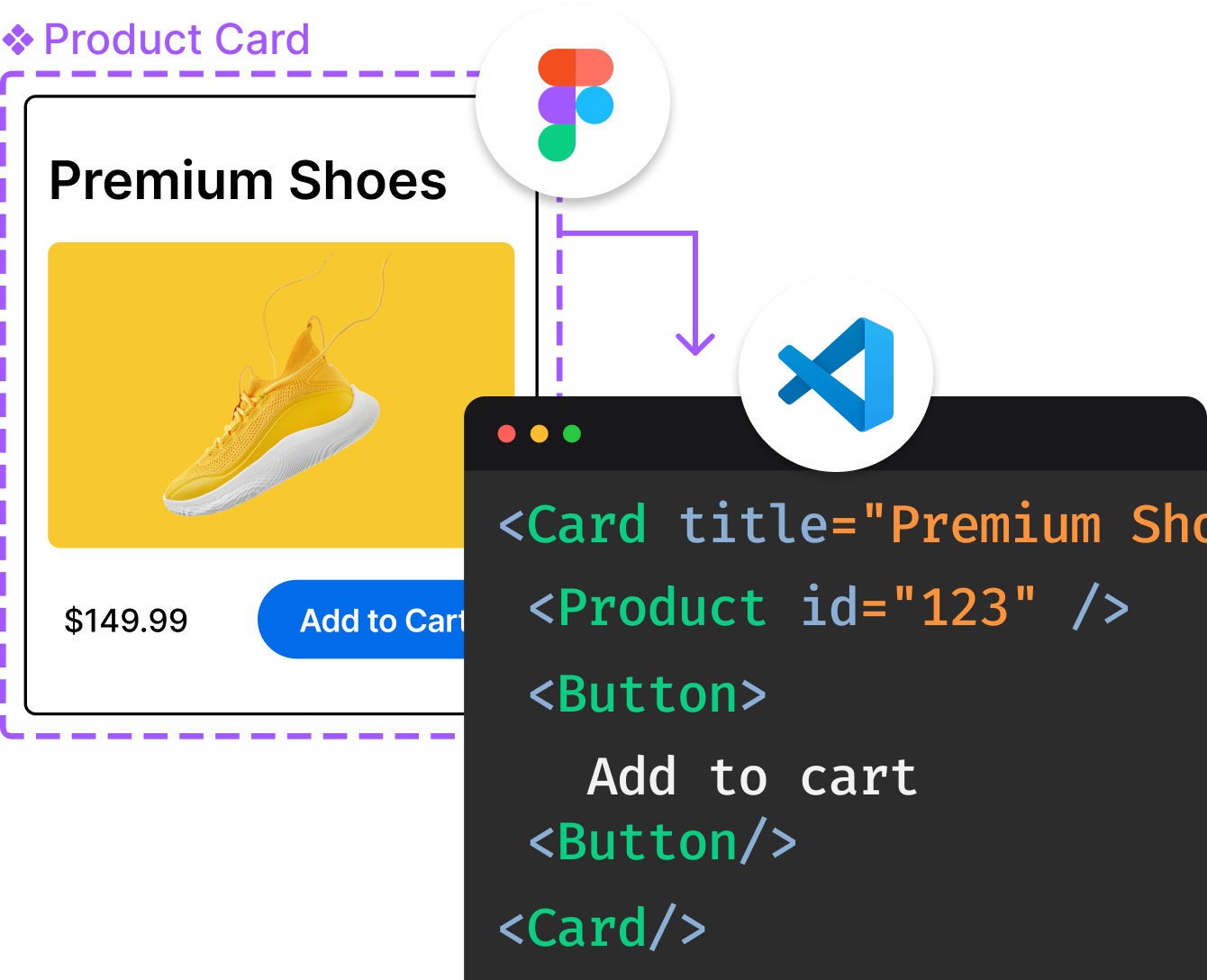
Introducing Visual Copilot: A new AI model to turn Figma designs to high quality code using your components.
Try Visual CopilotREADME
PrimeReact
The next chapter has begun.
After years as an open source library, PrimeReact enters its next chapter as part of PrimeUI, a sustainable foundation for the libraries you rely on.
This repository is now archived. It remains available, as a record of everything built here together.
What this means
Existing MIT versions remain MIT, forever. Every release published under the MIT license stays exactly as it is. Your existing projects are unaffected. Nothing is taken away.
Development continues at a new home. Active development, new releases, and everything ahead now live under PrimeUI.
â¡ï¸ Read the announcement: primeui.dev/nextchapter
â¡ï¸ The journey continues at: primereact.dev
Thank you
To everyone who used PrimeReact, filed an issue, opened a pull request, answered a question, or simply built something with it, thank you. This library reached hundreds of millions of downloads because of you.
This archive stays here as a thank you and a milestone. The next chapter is just beginning, and we hope you'll be part of it.
â The PrimeTek Team
Top Related Projects
The library for web and native user interfaces.
Material UI: Comprehensive React component library that implements Google's Material Design. Free forever.
An enterprise-class UI design language and React UI library
Bootstrap components built with React
A utility-first CSS framework for rapid UI development.
🐉 Vue Component Framework
Convert designs to code with AI
Introducing Visual Copilot: A new AI model to turn Figma designs to high quality code using your components.
Try Visual Copilot