
Top Related Projects

🐉 Vue Component Framework

Quasar Framework - Build high-performance VueJS user interfaces in record time

🎉 A Vue.js 3 UI Library made by Element team

A Vue.js 2.0 UI Toolkit for Web

Lightweight UI components for Vue.js based on Bulma
Quick Overview
PrimeVue is a rich set of open-source UI components for Vue.js applications. It offers a comprehensive suite of customizable, responsive, and accessible components that follow best practices in web development. PrimeVue is designed to streamline the process of building modern, feature-rich web applications with Vue.js.
Pros
- Extensive collection of over 90 UI components
- Fully customizable with built-in themes and a theme designer
- Excellent documentation and active community support
- Seamless integration with Vue 3 and TypeScript
Cons
- Learning curve for developers new to component libraries
- Some components may be overly complex for simple use cases
- Potential performance impact when using many components simultaneously
- Occasional breaking changes between major versions
Code Examples
- Basic Button Component:
<template>
  <Button label="Click me" @click="handleClick" />
</template>

<script setup>
import { Button } from 'primevue/button';

const handleClick = () => {
  console.log('Button clicked!');
};
</script>
- Data Table with Sorting and Filtering:
<template>
  <DataTable :value="products" :paginator="true" :rows="10" filterDisplay="menu" :filters="filters">
    <Column field="name" header="Name" sortable filter></Column>
    <Column field="category" header="Category" sortable filter></Column>
    <Column field="price" header="Price" sortable filter></Column>
  </DataTable>
</template>

<script setup>
import { ref } from 'vue';
import DataTable from 'primevue/datatable';
import Column from 'primevue/column';

const products = ref([/* ... product data ... */]);
const filters = ref({});
</script>
- Dialog Component:
<template>
  <Button label="Show Dialog" @click="visible = true" />
  <Dialog v-model:visible="visible" modal header="Dialog Header">
    <p>This is the dialog content.</p>
    <template #footer>
      <Button label="Close" @click="visible = false" />
    </template>
  </Dialog>
</template>

<script setup>
import { ref } from 'vue';
import Button from 'primevue/button';
import Dialog from 'primevue/dialog';

const visible = ref(false);
</script>
Getting Started
- Install PrimeVue and its peer dependencies:
npm install primevue primeicons
- Import and use PrimeVue in your main.js file:
import { createApp } from 'vue';
import PrimeVue from 'primevue/config';
import 'primevue/resources/themes/lara-light-blue/theme.css';
import 'primevue/resources/primevue.min.css';
import 'primeicons/primeicons.css';
import App from './App.vue';

const app = createApp(App);
app.use(PrimeVue);
app.mount('#app');
- Use PrimeVue components in your Vue components:
<template>
  <div>
    <h1>My PrimeVue App</h1>
    <Button label="Click me" />
  </div>
</template>

<script setup>
import Button from 'primevue/button';
</script>
Competitor Comparisons
🐉 Vue Component Framework
Pros of Vuetify
- Larger ecosystem with more components and integrations
- Material Design-based, offering a cohesive and modern look out-of-the-box
- Extensive documentation and community support
Cons of Vuetify
- Heavier bundle size due to comprehensive feature set
- Less flexibility in customizing design, as it's tied to Material Design principles
- Steeper learning curve for developers new to Material Design concepts
Code Comparison
Vuetify component usage:
<v-btn color="primary" @click="handleClick">
  Click me
</v-btn>
PrimeVue component usage:
<Button label="Click me" @click="handleClick" />
Both libraries offer a wide range of UI components for Vue applications. Vuetify is based on Material Design and provides a more opinionated structure, while PrimeVue offers more flexibility in terms of design customization. Vuetify has a larger community and more extensive documentation, but it comes with a larger bundle size. PrimeVue, on the other hand, is lighter and easier to customize but may have fewer pre-built components compared to Vuetify. The choice between the two depends on project requirements, design preferences, and performance considerations.
Quasar Framework - Build high-performance VueJS user interfaces in record time
Pros of Quasar
- Comprehensive framework with built-in CLI, offering a full-stack development experience
- Supports multiple build targets (web, mobile, desktop) from a single codebase
- Extensive ecosystem with official supporting tools and plugins
Cons of Quasar
- Steeper learning curve due to its all-encompassing nature
- Less flexibility for integrating with existing projects or other frameworks
- Larger bundle size compared to more focused UI libraries
Code Comparison
PrimeVue component usage:
<template>
  <Button label="Click me" @click="handleClick" />
</template>
Quasar component usage:
<template>
  <q-btn label="Click me" @click="handleClick" />
</template>
Summary
PrimeVue is a focused UI component library for Vue.js, offering a wide range of customizable components. It's lightweight and easy to integrate into existing projects. Quasar, on the other hand, is a full-fledged framework that provides a complete development ecosystem, including CLI tools and multi-platform support. While Quasar offers more out-of-the-box features, it may be overkill for simple projects or those requiring more flexibility in tool choices.
🎉 A Vue.js 3 UI Library made by Element team
Pros of Element Plus
- Larger community and more frequent updates
- Extensive documentation with live examples
- Better integration with Vue 3 and TypeScript
Cons of Element Plus
- Steeper learning curve for beginners
- Less flexible theming options
- Heavier bundle size compared to PrimeVue
Code Comparison
Element Plus:
<template>
  <el-button type="primary" @click="handleClick">Click me</el-button>
</template>

<script>
import { ElButton } from 'element-plus'
</script>
PrimeVue:
<template>
  <Button label="Click me" @click="handleClick" />
</template>

<script>
import Button from 'primevue/button'
</script>
Both Element Plus and PrimeVue are popular UI component libraries for Vue.js applications. Element Plus offers a more comprehensive set of components and better TypeScript support, making it suitable for large-scale projects. PrimeVue, on the other hand, provides a more lightweight solution with easier customization options, making it ideal for smaller projects or those requiring extensive theming. The code comparison shows that Element Plus uses prefixed component names, while PrimeVue opts for simpler naming conventions. Ultimately, the choice between the two depends on project requirements, team expertise, and personal preferences.
A Vue.js 2.0 UI Toolkit for Web
Pros of Element
- Larger community and ecosystem, with more contributors and third-party extensions
- More comprehensive documentation and examples
- Better support for internationalization out of the box
Cons of Element
- Less frequent updates and slower adoption of new Vue features
- Heavier bundle size, which may impact performance for smaller applications
- More opinionated design, which can be less flexible for custom styling
Code Comparison
Element:
<el-button type="primary" @click="handleClick">
  Click me
</el-button>
PrimeVue:
<Button label="Click me" @click="handleClick" />
Both libraries offer similar component APIs, but PrimeVue tends to have a more concise syntax. Element often requires additional attributes or wrapper elements for certain functionalities.
Element generally provides more built-in options and variations for components, while PrimeVue focuses on core functionality and leaves more room for customization.
PrimeVue's design philosophy emphasizes flexibility and ease of integration with other libraries, whereas Element aims to provide a more complete out-of-the-box solution for common UI needs.
Ultimately, the choice between these libraries depends on project requirements, team preferences, and the specific use case. Both are capable of creating robust and attractive user interfaces for Vue applications.
Lightweight UI components for Vue.js based on Bulma
Pros of Buefy
- Lightweight and minimalistic design, resulting in smaller bundle sizes
- Closely follows Bulma CSS framework, making it familiar for Bulma users
- Simpler API and fewer components, which can lead to a shorter learning curve
Cons of Buefy
- Less comprehensive component library compared to PrimeVue
- Limited theming options and customization capabilities
- Less frequent updates and potentially slower bug fixes
Code Comparison
Buefy example:
<template>
  <b-field label="Name">
    <b-input v-model="name"></b-input>
  </b-field>
</template>
PrimeVue example:
<template>
  <span class="p-float-label">
    <InputText id="name" v-model="name" />
    <label for="name">Name</label>
  </span>
</template>
Both libraries offer similar component structures, but PrimeVue tends to provide more granular control over styling and behavior. Buefy's approach is often simpler and more concise, while PrimeVue offers more flexibility and features at the cost of slightly more verbose markup.
Convert  designs to code with AI
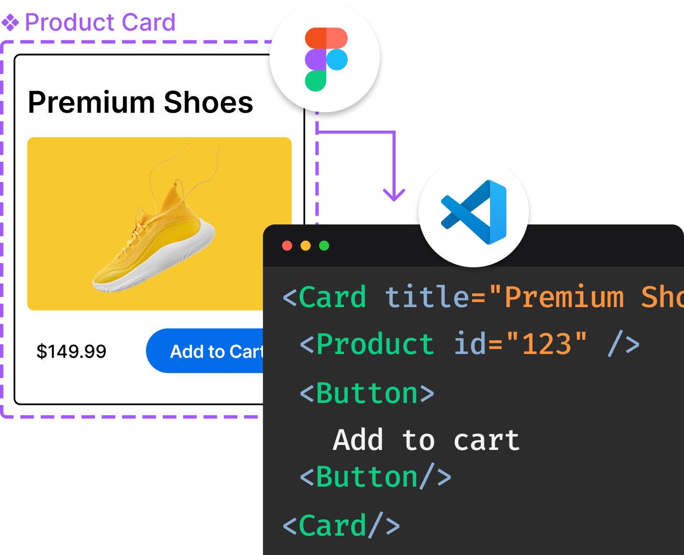
Introducing Visual Copilot: A new AI model to turn Figma designs to high quality code using your components.
Try Visual CopilotREADME
PrimeVue
[!WARNING] This repository is no longer under active development and receives security fixes only. PrimeVue continues as part of PrimeUI. Issues here are read-only. Bug reports and feature requests belong at PrimeUI; for security vulnerabilities, see SECURITY.md.
The next chapter has begun.
After years as an open source library, PrimeVue enters its next chapter as part of PrimeUI, a sustainable foundation for the libraries you rely on.
What this means
Existing MIT versions remain MIT, forever. Every release published under the MIT license stays exactly as it is. Your existing projects are unaffected. Nothing is taken away.
Security updates continue here. We keep publishing security fixes for the MIT-licensed releases. How to report one is in SECURITY.md.
Development continues at a new home. Active development, new releases, and everything ahead now live under PrimeUI.
â¡ï¸ Read the announcement: primeui.dev/nextchapter
â¡ï¸ The journey continues at: primevue.dev
Thank you
To everyone who used PrimeVue, filed an issue, opened a pull request, answered a question, or simply built something with it, thank you. This library reached hundreds of millions of downloads because of you.
The next chapter is just beginning, and we hope you'll be part of it.
The PrimeTek Team
Top Related Projects
🐉 Vue Component Framework
Quasar Framework - Build high-performance VueJS user interfaces in record time
🎉 A Vue.js 3 UI Library made by Element team
A Vue.js 2.0 UI Toolkit for Web
Lightweight UI components for Vue.js based on Bulma
Convert designs to code with AI
Introducing Visual Copilot: A new AI model to turn Figma designs to high quality code using your components.
Try Visual Copilot