 react-awesome-slider
A performant, lightweight React slider/carousel for media and content transitions, featuring 60fps animations, modular styling, optional HOCs, and fullpage navigation utilities. 🖥️📱
Top Related Projects

Most modern mobile touch slider with hardware accelerated transitions

the last carousel you'll ever need

React carousel component

Small, fast, and accessibility-first React carousel library with an easily customizable UI and behavior to fit your brand and site.

React.js Responsive Carousel (with Swipe)

A library to use idangerous Swiper as a ReactJs component which allows Swiper's modules custom build
Quick Overview
React Awesome Slider is a feature-rich, customizable slider/carousel component for React applications. It offers smooth transitions, touch swipe support, and various animation effects, making it ideal for creating engaging image galleries, product showcases, or fullscreen presentations.
Pros
- Highly customizable with numerous built-in transitions and animation effects
- Responsive design with support for mobile devices and touch gestures
- Supports media preloading for smoother user experience
- Extensible architecture allowing for custom plugins and components
Cons
- Learning curve may be steeper compared to simpler slider libraries
- Large bundle size due to extensive features, which may impact load times
- Limited documentation for advanced customization scenarios
- Some users report occasional performance issues with complex setups
Code Examples
- Basic usage with images:
import AwesomeSlider from 'react-awesome-slider';
import 'react-awesome-slider/dist/styles.css';

const slider = (
  <AwesomeSlider>
    <div data-src="/path/to/image-0.jpg" />
    <div data-src="/path/to/image-1.jpg" />
    <div data-src="/path/to/image-2.jpg" />
  </AwesomeSlider>
);
- Using custom animation and autoplay:
import AwesomeSlider from 'react-awesome-slider';
import withAutoplay from 'react-awesome-slider/dist/autoplay';
import 'react-awesome-slider/dist/styles.css';

const AutoplaySlider = withAutoplay(AwesomeSlider);

const slider = (
  <AutoplaySlider
    play={true}
    cancelOnInteraction={false}
    interval={6000}
    animation="cubeAnimation"
  >
    <div data-src="/path/to/image-0.jpg" />
    <div data-src="/path/to/image-1.jpg" />
    <div data-src="/path/to/image-2.jpg" />
  </AutoplaySlider>
);
- Adding custom content and navigation:
import AwesomeSlider from 'react-awesome-slider';
import 'react-awesome-slider/dist/styles.css';

const slider = (
  <AwesomeSlider
    bullets={false}
    organicArrows={true}
    infinite={false}
  >
    <div>
      <h1>Slide 1</h1>
      <p>Custom content here</p>
    </div>
    <div>
      <h1>Slide 2</h1>
      <p>More custom content</p>
    </div>
  </AwesomeSlider>
);
Getting Started
-
Install the package:
npm install react-awesome-slider -
Import the component and styles in your React application:
import AwesomeSlider from 'react-awesome-slider'; import 'react-awesome-slider/dist/styles.css'; -
Use the component in your JSX:
function MyComponent() {
  return (
    <AwesomeSlider>
      <div>Slide 1 content</div>
      <div>Slide 2 content</div>
      <div>Slide 3 content</div>
    </AwesomeSlider>
  );
}
Competitor Comparisons
Most modern mobile touch slider with hardware accelerated transitions
Pros of Swiper
- More comprehensive and feature-rich, offering a wider range of slider types and options
- Better cross-platform compatibility, including support for mobile touch events
- Larger community and more frequent updates, ensuring better long-term support
Cons of Swiper
- Steeper learning curve due to its extensive feature set
- Larger file size, which may impact page load times
- Less focused on React-specific implementation, requiring additional setup for React projects
Code Comparison
React Awesome Slider:
import AwesomeSlider from 'react-awesome-slider';

<AwesomeSlider>
  <div>Slide 1</div>
  <div>Slide 2</div>
  <div>Slide 3</div>
</AwesomeSlider>
Swiper:
import { Swiper, SwiperSlide } from 'swiper/react';

<Swiper>
  <SwiperSlide>Slide 1</SwiperSlide>
  <SwiperSlide>Slide 2</SwiperSlide>
  <SwiperSlide>Slide 3</SwiperSlide>
</Swiper>
Both libraries offer simple implementation, but Swiper requires additional import of styles and modules for advanced features. React Awesome Slider provides a more straightforward setup for basic React projects, while Swiper offers greater flexibility and customization options at the cost of slightly more complex configuration.
the last carousel you'll ever need
Pros of Slick
- More mature and widely adopted, with a larger community and ecosystem
- Supports a broader range of browsers, including older versions
- Offers more customization options and features out of the box
Cons of Slick
- Relies on jQuery, which may not be ideal for modern React applications
- Larger bundle size due to additional dependencies
- Less optimized for performance compared to React Awesome Slider
Code Comparison
Slick:
$('.slider').slick({
  dots: true,
  infinite: true,
  speed: 500,
  slidesToShow: 3,
  slidesToScroll: 1
});
React Awesome Slider:
import AwesomeSlider from 'react-awesome-slider';

<AwesomeSlider>
  <div>Slide 1</div>
  <div>Slide 2</div>
  <div>Slide 3</div>
</AwesomeSlider>
Summary
Slick is a more established and feature-rich slider library with broader browser support, but it comes with the overhead of jQuery dependency. React Awesome Slider is a modern, React-specific solution that offers better performance and a smaller bundle size, making it more suitable for React-based projects. The choice between the two depends on project requirements, target browsers, and whether jQuery is already part of the tech stack.
React carousel component
Pros of react-slick
- More mature and widely adopted, with a larger community and ecosystem
- Offers a wider range of customization options and features
- Better documentation and examples available
Cons of react-slick
- Larger bundle size due to its extensive feature set
- May require more setup and configuration for basic use cases
- Performance can be slower for complex slideshows with many elements
Code Comparison
react-slick:
import Slider from "react-slick";

<Slider dots={true} infinite={true} speed={500} slidesToShow={1} slidesToScroll={1}>
  <div><img src="image1.jpg" alt="Slide 1" /></div>
  <div><img src="image2.jpg" alt="Slide 2" /></div>
</Slider>
react-awesome-slider:
import AwesomeSlider from 'react-awesome-slider';

<AwesomeSlider>
  <div data-src="image1.jpg" />
  <div data-src="image2.jpg" />
</AwesomeSlider>
Both libraries offer easy-to-use components for creating image sliders. react-slick provides more granular control over slider behavior, while react-awesome-slider focuses on simplicity and performance. The choice between the two depends on the specific requirements of your project, such as the need for advanced features, performance considerations, and desired level of customization.
Small, fast, and accessibility-first React carousel library with an easily customizable UI and behavior to fit your brand and site.
Pros of Nuka Carousel
- More customizable with a wide range of props and options
- Better support for responsive design and mobile devices
- Extensive documentation and examples
Cons of Nuka Carousel
- Less visually appealing out-of-the-box compared to React Awesome Slider
- Requires more setup and configuration for advanced features
- Smaller community and fewer third-party extensions
Code Comparison
React Awesome Slider:
import AwesomeSlider from 'react-awesome-slider';

<AwesomeSlider>
  <div>Slide 1</div>
  <div>Slide 2</div>
  <div>Slide 3</div>
</AwesomeSlider>
Nuka Carousel:
import Carousel from 'nuka-carousel';

<Carousel>
  <img src="image1.jpg" alt="Slide 1" />
  <img src="image2.jpg" alt="Slide 2" />
  <img src="image3.jpg" alt="Slide 3" />
</Carousel>
Both libraries offer simple implementation, but Nuka Carousel provides more flexibility in terms of content types and customization options. React Awesome Slider focuses on pre-designed, visually appealing transitions, while Nuka Carousel allows for more granular control over carousel behavior and appearance.
React.js Responsive Carousel (with Swipe)
Pros of react-responsive-carousel
- More customizable with a wider range of options and settings
- Better documentation and examples for easier implementation
- Higher number of downloads and larger community support
Cons of react-responsive-carousel
- Less modern design and animations out of the box
- Slightly larger bundle size, which may impact performance
Code Comparison
react-responsive-carousel:
import { Carousel } from 'react-responsive-carousel';

<Carousel showArrows={true} infiniteLoop={true} autoPlay={true}>
  <div><img src="image1.jpg" alt="Image 1" /></div>
  <div><img src="image2.jpg" alt="Image 2" /></div>
</Carousel>
react-awesome-slider:
import AwesomeSlider from 'react-awesome-slider';

<AwesomeSlider>
  <div data-src="image1.jpg" />
  <div data-src="image2.jpg" />
</AwesomeSlider>
Both libraries offer similar basic functionality for creating image carousels in React applications. react-responsive-carousel provides more customization options and has a larger user base, while react-awesome-slider offers a more modern look with smoother animations out of the box. The choice between the two depends on specific project requirements and design preferences.
A library to use idangerous Swiper as a ReactJs component which allows Swiper's modules custom build
Pros of react-id-swiper
- Built on top of Swiper.js, providing a wide range of features and customization options
- Extensive documentation and examples for various use cases
- Supports both React and React Native
Cons of react-id-swiper
- Larger bundle size due to Swiper.js dependency
- May have a steeper learning curve for developers unfamiliar with Swiper.js
- Less focus on performance optimization compared to react-awesome-slider
Code Comparison
react-id-swiper:
import Swiper from 'react-id-swiper';

const SimpleSwiper = () => (
  <Swiper>
    <div>Slide 1</div>
    <div>Slide 2</div>
    <div>Slide 3</div>
  </Swiper>
);
react-awesome-slider:
import AwesomeSlider from 'react-awesome-slider';

const SimpleSlider = () => (
  <AwesomeSlider>
    <div>Slide 1</div>
    <div>Slide 2</div>
    <div>Slide 3</div>
  </AwesomeSlider>
);
Both libraries offer similar basic usage, but react-id-swiper provides more advanced configuration options through Swiper.js, while react-awesome-slider focuses on simplicity and performance. The choice between the two depends on specific project requirements and developer preferences.
Convert  designs to code with AI
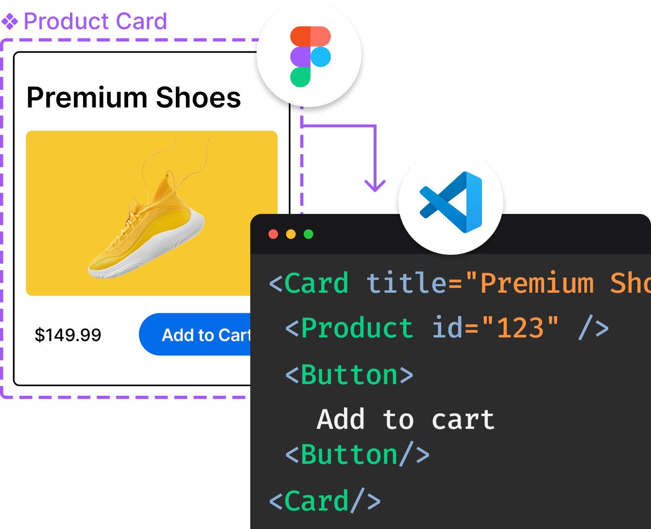
Introducing Visual Copilot: A new AI model to turn Figma designs to high quality code using your components.
Try Visual CopilotREADME
React <AwesomeSlider />
@rcaferati/react-awesome-slider provides a fast, production-ready slider/carousel with optional HOCs:
AwesomeSliderâ animated media/children sliderwithAutoplayâ autoplay wrapperwithCaptionedImagesâ caption overlay wrapperwithAnimatedLetteringâ âscreens â<p>linesâ wrapper- Navigation utilities â
Provider,Link,withNavigationContext,withNavigationHandlers
This README is updated for the current v5 patterns (functional core + CSS variables + optional CSS Modules support).
Preview

Installation
npm install @rcaferati/react-awesome-slider
Peer dependencies:
react >= 18react-dom >= 18
Quick Start
Plain CSS (no CSS Modules)
import React from 'react';
import AwesomeSlider from '@rcaferati/react-awesome-slider';
import '@rcaferati/react-awesome-slider/styles.css';

export default function Example() {
  return (
    <AwesomeSlider>
      <div data-src="https://picsum.photos/id/1018/1200/600" />
      <div data-src="https://picsum.photos/id/1015/1200/600" />
      <div data-src="https://picsum.photos/id/1019/1200/600" />
    </AwesomeSlider>
  );
}
Media prop (recommended for deterministic slides)
import React from 'react';
import AwesomeSlider from '@rcaferati/react-awesome-slider';
import '@rcaferati/react-awesome-slider/styles.css';

export default function Example() {
  return (
    <AwesomeSlider
      media={[
        { source: 'https://picsum.photos/id/1018/1200/600', slug: 'slide-1' },
        { source: 'https://picsum.photos/id/1015/1200/600', slug: 'slide-2' },
        { source: 'https://picsum.photos/id/1019/1200/600', slug: 'slide-3' },
      ]}
    />
  );
}
Animations
Default animation: sideAnimation
The default âsideâ animation ships in the base stylesheet:
import '@rcaferati/react-awesome-slider/styles.css';
Extra animation recipes
Load one of the extra animation stylesheets and set animation:
cubeAnimationfallAnimationfoldOutAnimationopenAnimationscaleOutAnimation
import React from 'react';
import AwesomeSlider from '@rcaferati/react-awesome-slider';

import '@rcaferati/react-awesome-slider/styles.css';
import '@rcaferati/react-awesome-slider/custom-animations/cube-animation.css';

export default function Example() {
  return (
    <AwesomeSlider animation="cubeAnimation">
      <div data-src="https://picsum.photos/id/1018/1200/600" />
      <div data-src="https://picsum.photos/id/1015/1200/600" />
      <div data-src="https://picsum.photos/id/1019/1200/600" />
    </AwesomeSlider>
  );
}
Tip: when using the default side animation, omit the
animationprop entirely.
Importing animation module objects
This package also exports animation subpaths such as:
@rcaferati/react-awesome-slider/custom-animations/cube-animation@rcaferati/react-awesome-slider/custom-animations/fall-animation
Those module exports are useful for cssModule setups because they provide the class-name mapping object.
Important: in current consumer setups such as Vite, the JS/MJS animation import alone should not be treated as enough to load the stylesheet into the page. You should still import the public CSS file as a side effect.
Plain CSS users
Use only the public CSS file:
import '@rcaferati/react-awesome-slider/custom-animations/cube-animation.css';
cssModule users
Import both:
- the public CSS file so the rules are actually injected
- the JS module export so you can pass the mapping object into
cssModule
import React from 'react';
import AwesomeSlider from '@rcaferati/react-awesome-slider';
import sliderStylesRaw from '@rcaferati/react-awesome-slider/styles';

import '@rcaferati/react-awesome-slider/styles.css';

import '@rcaferati/react-awesome-slider/custom-animations/cube-animation.css';
import cubeAnimationRaw from '@rcaferati/react-awesome-slider/custom-animations/cube-animation';

const sliderStyles = sliderStylesRaw?.default ?? sliderStylesRaw;
const cubeAnimation = cubeAnimationRaw?.default ?? cubeAnimationRaw;

export default function Example() {
  return (
    <AwesomeSlider
      animation="cubeAnimation"
      cssModule={[sliderStyles, cubeAnimation]}
    >
      <div data-src="https://picsum.photos/id/1018/1200/600" />
      <div data-src="https://picsum.photos/id/1015/1200/600" />
    </AwesomeSlider>
  );
}
In other words:
.cssimport â injects the stylesheet- JS/MJS import â provides the module mapping for
cssModule
For the widest compatibility, prefer the public CSS files whenever possible.
Styling
CSS variables (recommended)
The core stylesheet exposes CSS variables on the slider root element (default root key: awssld).
You can override them per instance using style:
import React from 'react';
import AwesomeSlider from '@rcaferati/react-awesome-slider';
import '@rcaferati/react-awesome-slider/styles.css';

export default function Example() {
  return (
    <AwesomeSlider
      style={{
        // arrows
        '--organic-arrow-color': 'rgba(255,255,255,0.9)',
        '--organic-arrow-height': '44px',
        '--organic-arrow-thickness': '4px',

        // bullets
        '--control-bullet-color': 'rgba(255,255,255,0.35)',
        '--control-bullet-active-color': 'rgba(255,255,255,0.9)',

        // content
        '--content-background-color': '#10131a',
      }}
      media={[
        { source: 'https://picsum.photos/id/1018/1200/600' },
        { source: 'https://picsum.photos/id/1015/1200/600' },
      ]}
    />
  );
}
CSS Modules (cssModule)
If your bundler emits CSS module maps, you can pass module objects via cssModule.
The package exports a styles entry:
import React from 'react';
import AwesomeSlider from '@rcaferati/react-awesome-slider';
import sliderStylesRaw from '@rcaferati/react-awesome-slider/styles';
import '@rcaferati/react-awesome-slider/styles.css';

const styles = sliderStylesRaw?.default ?? sliderStylesRaw;

export default function Example() {
  return (
    <AwesomeSlider cssModule={styles}>
      <div data-src="https://picsum.photos/id/1018/1200/600" />
      <div data-src="https://picsum.photos/id/1015/1200/600" />
    </AwesomeSlider>
  );
}
If you are also using a custom animation module export, combine them as an array and still import the corresponding CSS file:
import React from 'react';
import AwesomeSlider from '@rcaferati/react-awesome-slider';
import sliderStylesRaw from '@rcaferati/react-awesome-slider/styles';

import '@rcaferati/react-awesome-slider/styles.css';

import '@rcaferati/react-awesome-slider/custom-animations/cube-animation.css';
import cubeAnimationRaw from '@rcaferati/react-awesome-slider/custom-animations/cube-animation';

const core = sliderStylesRaw?.default ?? sliderStylesRaw;
const cube = cubeAnimationRaw?.default ?? cubeAnimationRaw;

export default function Example() {
  return (
    <AwesomeSlider animation="cubeAnimation" cssModule={[core, cube]}>
      <div data-src="https://picsum.photos/id/1018/1200/600" />
      <div data-src="https://picsum.photos/id/1015/1200/600" />
    </AwesomeSlider>
  );
}
In most consumer apps, plain CSS imports are simpler and more portable than CSS-module object imports.
AwesomeSlider
Common usage patterns
Children mode
import React from 'react';
import AwesomeSlider from '@rcaferati/react-awesome-slider';
import '@rcaferati/react-awesome-slider/styles.css';

export default function Example() {
  return (
    <AwesomeSlider>
      <div style={{ background: '#0b0f18', height: '100%' }}>
        <h2 style={{ color: 'white' }}>Slide A</h2>
      </div>
      <div style={{ background: '#f4f6fb', height: '100%' }}>
        <h2 style={{ color: '#111' }}>Slide B</h2>
      </div>
    </AwesomeSlider>
  );
}
Media mode
import React from 'react';
import AwesomeSlider from '@rcaferati/react-awesome-slider';
import '@rcaferati/react-awesome-slider/styles.css';

export default function Example() {
  return (
    <AwesomeSlider
      media={[
        { source: '/img/0.jpg', slug: 'a' },
        { source: '/img/1.jpg', slug: 'b' },
      ]}
    />
  );
}
AwesomeSlider Props (current)
| Prop | Type | Default | Description |
|---|---|---|---|
media | MediaItem[] | [] | Slides as objects ({ source, slug, preload? }). |
children | ReactNode | null | Slides as React children (supports data-src / data-slug). |
selected | number | string | 0 | Active slide index (number) or slug (string). |
name | string | 'awesome-slider' | Instance name (useful when multiple sliders are present). |
animation | string | null | null | Animation key (cubeAnimation, fallAnimation, etc). Omit for default side animation. |
buttons | boolean | true | Show next/prev buttons. |
bullets | boolean | true | Show bullets. |
organicArrows | boolean | true | Use the organic arrow shape styling. |
infinite | boolean | true | Wrap-around navigation. |
fillParent | boolean | false | Fill parent bounds (fullscreen layouts). |
startupScreen | ReactNode | null | Optional startup screen shown before first slide. |
startup | boolean | true | If startupScreen is set, whether to auto-start into the first slide. |
startupDelay | number | 0 | Delay before auto-start. |
transitionDelay | number | 0 | Delay before starting transition animation (ms). |
controlsReturnDelay | number | 0 | Delay to remove the âcontrols activeâ class after transitions (ms). |
mobileTouch | boolean | true | Enables touch/swipe navigation. |
cssModule | object | object[] | null | null | CSS module map(s) used to map class names. |
className | string | null | null | Extra className(s) added to the root element. |
style | React.CSSProperties | {} | Inline styles, including CSS variable overrides. |
onFirstMount | (info) => void | null | Called once after mount with getInfo() payload. |
onTransitionStart | (info) => void | null | Called on transition start. |
onTransitionEnd | (info) => void | null | Called on transition end. |
onTransitionRequest | (info) => void | null | Called when the user requests a transition (next/prev/bullet). |
onTransitionReject | (info) => void | null | Called when a transition is rejected (for example, busy/loading). |
onLoadStart | (payload) => void | null | Optional custom preload hook. Call payload.next() when ready. |
getInfo() payload (high level)
getInfo() is used by the event callbacks and includes, best-effort:
slidesâ slide countcurrentIndexâ current indexcurrentMediaâ current media itemcurrentSlideâ active slide element (when available)elementâ slider root element
HOCs
Autoplay
import React from 'react';
import AwesomeSlider from '@rcaferati/react-awesome-slider';
import withAutoplay from '@rcaferati/react-awesome-slider/autoplay';
import '@rcaferati/react-awesome-slider/styles.css';

const AutoplaySlider = withAutoplay(AwesomeSlider);

export default function Example() {
  return (
    <AutoplaySlider
      play={true}
      cancelOnInteraction={false}
      interval={6000}
      media={[
        { source: 'https://picsum.photos/id/1018/1200/600' },
        { source: 'https://picsum.photos/id/1015/1200/600' },
      ]}
    />
  );
}
Captioned Images
import React from 'react';
import AwesomeSlider from '@rcaferati/react-awesome-slider';
import withCaptionedImages from '@rcaferati/react-awesome-slider/captioned';
import '@rcaferati/react-awesome-slider/styles.css';
import '@rcaferati/react-awesome-slider/captioned.css';
const Captioned = withCaptionedImages(AwesomeSlider);
export default function Example() {
return (
<Captioned
screens={[
{
media: 'https://picsum.photos/id/1018/1200/600',
caption: 'The first captioned slide',
backgroundColor: '#ffffff',
},
{
media: 'https://picsum.photos/id/1015/1200/600',
caption: 'Second slide â caption overlay',
backgroundColor: '#ffffff',
},
]}
/>
);
}
Animated Lettering
import React from 'react';
import AwesomeSlider from '@rcaferati/react-awesome-slider';
import withAnimatedLettering from '@rcaferati/react-awesome-slider/lettering';

import '@rcaferati/react-awesome-slider/styles.css';
import '@rcaferati/react-awesome-slider/lettering.css';

const Lettering = withAnimatedLettering(AwesomeSlider);

export default function Example() {
  return (
    <Lettering
      screens={[
        {
          backgroundColor: '#ffffff',
          children: [
            'React Awesome Slider',
            'Animated Lettering',
            'Each line is a <p>',
          ],
        },
        {
          backgroundColor: '#f5f5f5',
          children: ['Transitions are slide-based', 'Text moves on change'],
        },
      ]}
    />
  );
}
Adaptive Controls
Adaptive Controls is currently part of the repository work and Storybook examples, but it is not listed as a public package export in the current package exports map.
That means:
- it is available in the source repository
- it is not currently documented here as a stable public import path from the npm package
If and when it becomes a public export, it should be documented with its exact import path.
Fullpage Navigation Utilities
These are designed for SPA / âslides-as-routesâ setups.
Provider
import React from 'react';
import { Provider } from '@rcaferati/react-awesome-slider/navigation';

export default function App({ children }) {
  return (
    <Provider slug={window.location.pathname} defaultSlug="home">
      {children}
    </Provider>
  );
}
Link
import React from 'react';
import { Link } from '@rcaferati/react-awesome-slider/navigation';

export default function Nav() {
  return (
    <nav>
      <Link href="/home">Home</Link>
      <Link href="/about">About</Link>
      <Link href="/contact">Contact</Link>
    </nav>
  );
}
withNavigationHandlers
Wrap a slider so URL â slider selection stays aligned.
import React from 'react';
import AwesomeSlider from '@rcaferati/react-awesome-slider';
import { withNavigationHandlers } from '@rcaferati/react-awesome-slider/navigation';

const SliderWithNav = withNavigationHandlers(AwesomeSlider);

export default function Page() {
  return <SliderWithNav />;
}
withNavigationContext
If you need raw navigation state + setter injected into a component:
import React from 'react';
import { withNavigationContext } from '@rcaferati/react-awesome-slider/navigation';

function Status(props) {
  const { fullpage } = props;
  return <pre>{JSON.stringify(fullpage.navigation, null, 2)}</pre>;
}

export default withNavigationContext(Status);
Recommended patterns (current)
â
Prefer media for stable routing
If you use slugs + navigation handlers, keep media entries stable and include slug.
â Keep animations modular
- Always load
styles.css - Load one extra animation CSS only when that animation is selected
- If you use animation module objects with
cssModule, still import the matching.cssfile
â Customize via CSS variables first
Theme, contrast, and visual polish are usually easiest via the exposed custom properties.
â Use CSS module exports only when your bundler supports them
For the widest compatibility:
- use
styles.css - use
captioned.css - use
lettering.css - use
custom-animations/*.css
Use @rcaferati/react-awesome-slider/styles or @rcaferati/react-awesome-slider/custom-animations/* module exports only when your bundler setup expects JS style-module entries, and pair them with the corresponding CSS file imports.
Author
Rafael Caferati
Website: https://caferati.dev
GitHub: https://github.com/rcaferati
License
MIT
Top Related Projects
Most modern mobile touch slider with hardware accelerated transitions
the last carousel you'll ever need
React carousel component
Small, fast, and accessibility-first React carousel library with an easily customizable UI and behavior to fit your brand and site.
React.js Responsive Carousel (with Swipe)
A library to use idangerous Swiper as a ReactJs component which allows Swiper's modules custom build
Convert designs to code with AI
Introducing Visual Copilot: A new AI model to turn Figma designs to high quality code using your components.
Try Visual Copilot