
Top Related Projects

The most popular HTML, CSS, and JavaScript framework for developing responsive, mobile first projects on the web.

A utility-first CSS framework for rapid UI development.

A lightweight and modular front-end framework for developing fast and powerful web interfaces

Semantic is a UI component framework based around useful principles from natural language.

The most advanced responsive front-end framework in the world. Quickly create prototypes and production code for sites that work on any kind of device.

Modern CSS framework based on Flexbox
Quick Overview
Shoelace is a forward-thinking library of web components and tools for building modern web interfaces. It provides a collection of customizable, accessible, and framework-agnostic UI components that can be used with any web framework or vanilla JavaScript. Shoelace aims to simplify the process of creating high-quality, consistent user interfaces across web applications.
Pros
- Framework-agnostic: Can be used with any JavaScript framework or vanilla JS
- Highly customizable: Offers extensive theming and styling options
- Accessible: Components are built with accessibility in mind
- Well-documented: Comprehensive documentation and examples
Cons
- Learning curve: Requires understanding of web components and custom elements
- Browser support: Older browsers may require polyfills
- Bundle size: Including all components can increase the overall bundle size
Code Examples
- Creating a simple button:
<sl-button>Click me</sl-button>
- Using a dialog component:
<sl-dialog label="Dialog" class="dialog-overview">
  This is a dialog.
  <sl-button slot="footer" variant="primary">Close</sl-button>
</sl-dialog>

<sl-button>Open Dialog</sl-button>

<script>
  const dialog = document.querySelector('.dialog-overview');
  const openButton = dialog.nextElementSibling;
  const closeButton = dialog.querySelector('sl-button[variant="primary"]');

  openButton.addEventListener('click', () => dialog.show());
  closeButton.addEventListener('click', () => dialog.hide());
</script>
- Creating a custom theme:
:root {
  --sl-color-primary-hue: 200;
  --sl-color-primary-saturation: 100%;
  --sl-color-primary-lightness: 50%;
  --sl-border-radius-medium: 0.5rem;
}
Getting Started
- Install Shoelace using npm:
npm install @shoelace-style/shoelace
- Import the components you need in your JavaScript file:
import '@shoelace-style/shoelace/dist/themes/light.css';
import '@shoelace-style/shoelace/dist/components/button/button.js';
import '@shoelace-style/shoelace/dist/components/input/input.js';
- Use the components in your HTML:
<sl-button>Click me</sl-button>
<sl-input placeholder="Enter your name"></sl-input>
Competitor Comparisons
The most popular HTML, CSS, and JavaScript framework for developing responsive, mobile first projects on the web.
Pros of Bootstrap
- Extensive documentation and large community support
- Comprehensive set of pre-built components and utilities
- Well-established and widely adopted in the industry
Cons of Bootstrap
- Larger file size and potential performance impact
- Less flexibility in customization without overriding styles
- Steeper learning curve for advanced customization
Code Comparison
Bootstrap:
<div class="container">
  <div class="row">
    <div class="col-md-6">Column 1</div>
    <div class="col-md-6">Column 2</div>
  </div>
</div>
Shoelace:
<sl-container>
  <sl-row>
    <sl-column md="6">Column 1</sl-column>
    <sl-column md="6">Column 2</sl-column>
  </sl-row>
</sl-container>
Key Differences
- Shoelace uses Web Components, while Bootstrap relies on traditional CSS classes
- Shoelace offers a more modern and customizable approach with shadow DOM encapsulation
- Bootstrap provides a more comprehensive set of pre-built components and utilities
- Shoelace has a smaller footprint and focuses on performance and flexibility
Use Cases
- Choose Bootstrap for rapid prototyping and projects requiring extensive pre-built components
- Opt for Shoelace when building custom, lightweight, and highly customizable interfaces
A utility-first CSS framework for rapid UI development.
Pros of Tailwind CSS
- Highly customizable utility-first CSS framework
- Extensive documentation and large community support
- Rapid prototyping and development with pre-built classes
Cons of Tailwind CSS
- Steeper learning curve for developers new to utility-first CSS
- Can lead to verbose HTML markup with multiple classes
- Requires additional build step to optimize for production
Code Comparison
Tailwind CSS:
<button class="bg-blue-500 hover:bg-blue-700 text-white font-bold py-2 px-4 rounded">
  Click me
</button>
Shoelace:
<sl-button variant="primary">
  Click me
</sl-button>
Tailwind CSS focuses on utility classes for styling, while Shoelace provides pre-built web components. Tailwind offers more granular control over styles but can result in longer class strings. Shoelace simplifies markup with custom elements but may be less flexible for custom designs. Tailwind is ideal for projects requiring unique designs and fine-grained control, while Shoelace is better suited for rapid development with consistent, accessible components out of the box.
A lightweight and modular front-end framework for developing fast and powerful web interfaces
Pros of UIkit
- More comprehensive set of components and utilities
- Extensive documentation with interactive examples
- Larger community and ecosystem
Cons of UIkit
- Larger file size and potential performance impact
- Less flexibility in customization compared to Shoelace
- Steeper learning curve for beginners
Code Comparison
Shoelace (Web Components):
<sl-button>Click me</sl-button>
<sl-input placeholder="Enter your name"></sl-input>
UIkit:
<button class="uk-button uk-button-default">Click me</button>
<input class="uk-input" type="text" placeholder="Enter your name">
Key Differences
- Shoelace uses Web Components, while UIkit relies on traditional HTML and CSS classes
- Shoelace offers more modern and customizable components
- UIkit provides a more complete UI framework with additional features like grid systems and JavaScript utilities
Use Cases
- Shoelace: Ideal for projects requiring lightweight, customizable components and modern web standards
- UIkit: Better suited for rapid prototyping and projects needing a full-featured UI framework with extensive pre-built components
Semantic is a UI component framework based around useful principles from natural language.
Pros of Semantic-UI
- Extensive collection of pre-built UI components and themes
- Comprehensive documentation and examples
- Large community and ecosystem
Cons of Semantic-UI
- Larger file size and potential performance impact
- Less flexibility for custom styling
- No built-in dark mode support
Code Comparison
Semantic-UI (CSS class-based approach):
<button class="ui primary button">
  Click me
</button>
Shoelace (Web Components approach):
<sl-button variant="primary">
  Click me
</sl-button>
Semantic-UI relies on CSS classes for styling and functionality, while Shoelace uses Web Components, providing a more encapsulated and customizable approach. Shoelace offers a smaller footprint and better performance, especially for projects that don't require all the features of Semantic-UI. However, Semantic-UI's extensive component library and established ecosystem may be advantageous for rapid development of complex UIs. Shoelace's use of Web Components also provides better browser support and easier integration with modern JavaScript frameworks.
The most advanced responsive front-end framework in the world. Quickly create prototypes and production code for sites that work on any kind of device.
Pros of Foundation
- More mature and established project with a larger community
- Comprehensive set of UI components and layout tools
- Extensive documentation and resources available
Cons of Foundation
- Larger file size and potential performance overhead
- Steeper learning curve for beginners
- Less focus on modern web standards and custom elements
Code Comparison
Shoelace (Web Component):
<sl-button>Click me</sl-button>
Foundation:
<a href="#" class="button">Click me</a>
Foundation relies more on traditional HTML and CSS classes, while Shoelace uses custom elements. This difference reflects their underlying philosophies: Foundation is a traditional CSS framework, while Shoelace is built on Web Components.
Foundation offers a grid system and more complex layout tools out of the box, which may be beneficial for larger projects. Shoelace, on the other hand, focuses on providing individual, customizable components that can be easily integrated into existing projects.
Both libraries have their strengths, and the choice between them depends on project requirements, team expertise, and desired development approach. Foundation may be better suited for larger, more complex projects, while Shoelace offers a more modern, component-based approach that aligns well with current web development trends.
Modern CSS framework based on Flexbox
Pros of Bulma
- Lightweight and modular CSS framework with no JavaScript dependencies
- Extensive documentation and a large community for support
- Flexbox-based grid system for responsive layouts
Cons of Bulma
- Less customizable compared to Shoelace's web component approach
- Lacks built-in JavaScript functionality for interactive components
- May require additional CSS overrides for more unique designs
Code Comparison
Bulma (CSS-based):
.button {
  background-color: #00d1b2;
  border: none;
  color: white;
  padding: 10px 20px;
}
Shoelace (Web Component):
<sl-button variant="primary">
  Click me
</sl-button>
Bulma relies on CSS classes for styling, while Shoelace uses web components with built-in customization options. Shoelace's approach offers more flexibility and encapsulation, but Bulma's CSS-only approach may be simpler for some projects.
Both frameworks provide responsive design capabilities, but they differ in implementation. Bulma uses a traditional CSS approach with classes, while Shoelace leverages the power of web components for a more modern and modular architecture.
Ultimately, the choice between Bulma and Shoelace depends on project requirements, developer preferences, and the desired level of customization and interactivity.
Convert  designs to code with AI
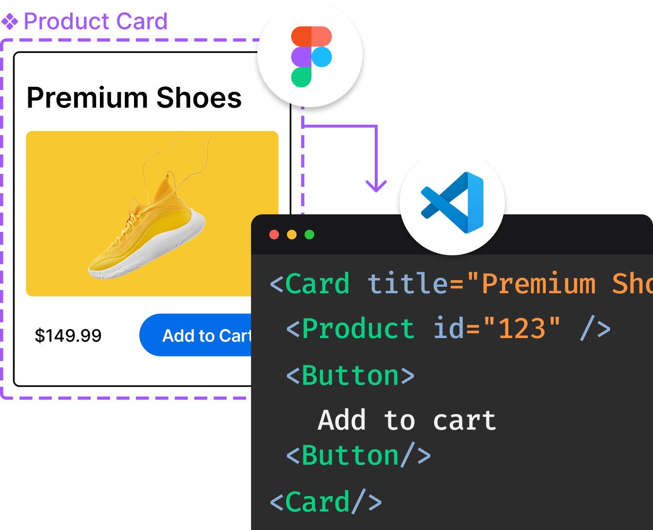
Introducing Visual Copilot: A new AI model to turn Figma designs to high quality code using your components.
Try Visual CopilotREADME

[!IMPORTANT]
Shoelace is sunset. There is no active development on this codebase. The library remains available under the MIT license for existing use, but please do not open issues, pull requests, or feature requests hereâdirect those to Web Awesome, the successor project, at github.com/shoelace-style/webawesome.
[!TIP]
Already using Shoelace? Follow the migration guide to move to Web Awesome, or point an AI coding agent at it for a faster path.
What âSunsetâ Means: Shoelace has no active development. Issues, pull requests, and feature requests belong on Web Awesome, not this repository. The published package remains available under the MIT license for existing use. Archiving this repo on GitHub (optional but recommended) is how you mark it read-only on the platformâsee For Repository Maintainers below.
Web Awesome, like Shoelace before it, offers an even larger library of free components, plus themes, utilities, patterns, and more.
Shoelace
A forward-thinking library of web components.
- Works with all frameworks ð§©
- Works with CDNs ð
- Fully customizable with CSS ð¨
- Includes an official dark theme ð
- Built with accessibility in mind â¿ï¸
- Open source ð¸
- Documentation: shoelace.style
- Shoelace source (sunset): github.com/shoelace-style/shoelace
- Web Awesome (active development): website · source
Shoemakers ð¥¾
The sections below are for historical referenceâfor example, running the docs or a build from source, auditing the codebase, or maintaining a private fork. New components and ongoing development belong on Web Awesome, not here. You will need Node >= 14.17 to build and run the project locally.
You do not need any of this to use Shoelace as a dependency. For installation and usage, see the documentation website.
What are you using to build Shoelace?
Components are built with LitElement, a custom elements base class that provides an intuitive API and reactive data binding. The build is a custom script with bundling powered by esbuild.
Forking the Repo
You can still fork the repo on GitHub for your own experiments, then clone it locally and install dependencies.
git clone https://github.com/YOUR_GITHUB_USERNAME/shoelace
cd shoelace
npm install
Developing
Once you've cloned the repo, run the following command.
npm start
This will spin up the dev server. After the initial build, a browser will open automatically. There is currently no hot module reloading (HMR), as browsers don't provide a way to reregister custom elements, but most changes to the source will reload the browser automatically.
Building
To generate a production build, run the following command.
npm run build
New Components
Develop new components on Web Awesome, not in this repository. If you maintain a private fork and still use the old tooling, the historical scaffold was npm run create <tag-name>âthat workflow is unsupported.
Contributing
Shoelace is open source under the MIT license, but this repository is not accepting contributions. For bug reports, features, and pull requests, use Web Awesome (repository). See CONTRIBUTING.md.
License
Shoelace is available under the terms of the MIT license.
Whether you are using Shoelace in a project or exploring this source tree â have fun creating! ð¥¾
Top Related Projects
The most popular HTML, CSS, and JavaScript framework for developing responsive, mobile first projects on the web.
A utility-first CSS framework for rapid UI development.
A lightweight and modular front-end framework for developing fast and powerful web interfaces
Semantic is a UI component framework based around useful principles from natural language.
The most advanced responsive front-end framework in the world. Quickly create prototypes and production code for sites that work on any kind of device.
Modern CSS framework based on Flexbox
Convert designs to code with AI
Introducing Visual Copilot: A new AI model to turn Figma designs to high quality code using your components.
Try Visual Copilot