
Top Related Projects

Tiny style-controlled SVG iconset (101 icons, 12kb)

:tangerine: Emoji searcher but as a menubar app.

:joy: :camera: :sparkler: Storage place for all mah gifs.

Pretty, minimal and fast ZSH prompt

💖💻 A little dashboard that tries to take care of you when you're using your terminal.
Quick Overview
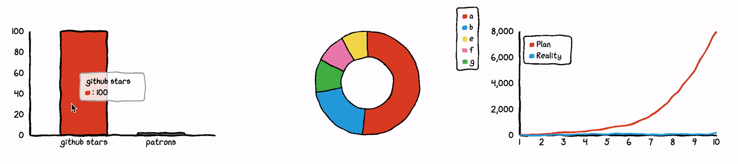
Chart.xkcd is a JavaScript library for creating charts with a hand-drawn, xkcd-style appearance. It's designed to make data visualization more fun and engaging, while still being easy to use and integrate into web projects.
Pros
- Unique and visually appealing hand-drawn style
- Easy to use and integrate with existing web projects
- Supports various chart types (line, bar, pie, XY)
- Customizable appearance and animations
Cons
- Limited chart types compared to more comprehensive charting libraries
- May not be suitable for professional or formal presentations
- Smaller community and fewer resources compared to mainstream charting libraries
- Performance may be slower for large datasets due to the rendering style
Code Examples
Creating a simple line chart:
const chartElement = document.getElementById('line-chart');
new chartXkcd.Line(chartElement, {
  title: 'Monthly income of an indie developer',
  xLabel: 'Month',
  yLabel: '$ Dollars',
  data: {
    labels: ['1', '2', '3', '4', '5', '6', '7', '8', '9', '10'],
    datasets: [{
      label: 'Plan',
      data: [30, 70, 200, 300, 500, 800, 1500, 2900, 5000, 8000]
    }, {
      label: 'Reality',
      data: [0, 1, 30, 70, 80, 100, 50, 80, 40, 150]
    }]
  }
});
Creating a pie chart:
const chartElement = document.getElementById('pie-chart');
new chartXkcd.Pie(chartElement, {
  title: 'What Tim spends time on',
  data: {
    labels: ['Sleep', 'Eating', 'TV', 'Coding', 'Cycling'],
    datasets: [{
      data: [30, 15, 10, 35, 10]
    }]
  }
});
Customizing chart appearance:
const chartElement = document.getElementById('custom-chart');
new chartXkcd.Bar(chartElement, {
  title: 'GitHub stars VS patron number',
  xLabel: 'Month',
  yLabel: 'Count',
  data: {
    labels: ['1', '2', '3', '4', '5', '6', '7', '8'],
    datasets: [{
      label: 'GitHub Stars',
      data: [100, 120, 180, 200, 300, 350, 500, 800]
    }, {
      label: 'Patreon Patrons',
      data: [2, 4, 8, 10, 15, 20, 25, 40]
    }]
  },
  options: {
    legendPosition: chartXkcd.config.positionType.upLeft,
    backgroundColor: 'lightblue',
    fontFamily: 'Comic Sans MS',
    unxkcdify: true
  }
});
Getting Started
-
Include the Chart.xkcd library in your HTML file:
<script src="https://cdn.jsdelivr.net/npm/chart.xkcd@1.1.13/dist/chart.xkcd.min.js"></script> -
Create a container element for your chart:
<div id="my-chart"></div> -
Initialize and render the chart in your JavaScript code:
const chartElement = document.getElementById('my-chart');
new chartXkcd.Line(chartElement, {
  title: 'My First Chart',
  data: {
    labels: ['A', 'B', 'C', 'D', 'E'],
    datasets: [{
      label: 'Data',
      data: [3, 7, 2, 9, 4]
    }]
  }
});
Competitor Comparisons
Tiny style-controlled SVG iconset (101 icons, 12kb)
Pros of bytesize-icons
- Lightweight and minimal SVG icon set, ideal for simple UI designs
- Easy to customize and scale without loss of quality
- Extensive collection of commonly used icons
Cons of bytesize-icons
- Limited to basic icons, lacking complex or specialized graphics
- No built-in animation or interactive features
- Less suitable for data visualization or charting purposes
Code comparison
bytesize-icons:
<svg id="i-search" xmlns="http://www.w3.org/2000/svg" viewBox="0 0 32 32" width="32" height="32" fill="none" stroke="currentcolor" stroke-linecap="round" stroke-linejoin="round" stroke-width="2">
    <circle cx="14" cy="14" r="12" />
    <path d="M23 23 L30 30" />
</svg>
chart.xkcd:
const chart = new chartXkcd.XY(svg, {
  title: 'Monthly income of an indie developer',
  data: {
    datasets: [{
      label: 'Plan',
      data: planData,
    }, {
      label: 'Reality',
      data: realData,
    }],
  },
  options: {
    xLabel: 'Month',
    yLabel: '$ Dollars',
  },
});
The code snippets demonstrate the fundamental differences between the two projects. bytesize-icons focuses on providing simple, customizable SVG icons, while chart.xkcd offers a more complex charting library for creating XKCD-style visualizations.
:tangerine: Emoji searcher but as a menubar app.
Pros of mojibar
- Focused on emoji search and insertion, providing a specific and useful functionality
- Lightweight and easy to use as a menubar application
- Cross-platform compatibility (macOS, Windows, Linux)
Cons of mojibar
- Limited to emoji functionality, less versatile than chart.xkcd
- Less active development and community engagement
- Fewer customization options compared to chart.xkcd's chart types
Code Comparison
mojibar (JavaScript):
const emojiNames = Object.keys(emojilib.lib)
const emojiKeys = emojiNames.map((name) => {
  return emojilib.lib[name][0]
})
chart.xkcd (JavaScript):
const svg = this.svg
  .append('g')
  .attr('transform', `translate(${this.config.yAxisWidth}, ${this.config.title.fontSize + 10})`)
Summary
mojibar is a specialized tool for emoji search and insertion, while chart.xkcd is a library for creating xkcd-style charts. mojibar offers simplicity and focused functionality, whereas chart.xkcd provides more versatility in data visualization. The code snippets demonstrate the different focuses of each project, with mojibar handling emoji data and chart.xkcd dealing with SVG manipulation for chart creation.
:joy: :camera: :sparkler: Storage place for all mah gifs.
Pros of gifs
- Simple and straightforward repository structure
- Easy to browse and find specific GIFs
- Useful for quickly accessing a curated collection of GIFs
Cons of gifs
- Limited functionality compared to chart.xkcd
- No charting or data visualization capabilities
- Less active development and fewer contributors
Code comparison
While a direct code comparison isn't relevant due to the different nature of these repositories, we can look at how they're structured:
gifs:
/
├── README.md
└── gifs/
    ├── image1.gif
    ├── image2.gif
    └── ...
chart.xkcd:
/
├── README.md
├── package.json
├── src/
│   ├── charts/
│   └── utils/
└── dist/
    └── chart.xkcd.min.js
chart.xkcd has a more complex structure typical of a JavaScript library, while gifs is a simple collection of image files.
Summary
gifs is a straightforward repository of GIF images, ideal for quick access to a curated collection. chart.xkcd, on the other hand, is a full-fledged charting library that offers XKCD-style visualizations. While gifs is easier to navigate for finding specific images, chart.xkcd provides more functionality for creating custom charts and graphs. The choice between them depends on whether you need a GIF collection or a charting library.
Pretty, minimal and fast ZSH prompt
Pros of pure
- Highly customizable and minimal Zsh prompt
- Extensive documentation and active community support
- Lightweight and fast, with asynchronous Git status updates
Cons of pure
- Limited to Zsh shell, not as versatile as chart.xkcd
- Requires more setup and configuration compared to chart.xkcd
- Focused on command-line interface, not data visualization
Code comparison
pure:
zstyle :prompt:pure:git:stash show yes
zstyle :prompt:pure:path color blue
prompt pure
chart.xkcd:
import { XY } from 'chart.xkcd';
const chart = new XY(svg, {
  title: 'Monthly income of an indie developer',
  data: { datasets: [{label: 'Plan', data: [30, 70, 200, 300]}] }
});
Summary
pure is a minimalist and customizable Zsh prompt, focusing on command-line aesthetics and performance. chart.xkcd, on the other hand, is a JavaScript library for creating xkcd-style charts and graphs. While pure enhances the terminal experience, chart.xkcd provides a unique way to visualize data in web applications. The choice between the two depends on whether you need a shell prompt enhancement or a data visualization tool.
💖💻 A little dashboard that tries to take care of you when you're using your terminal.
Pros of tiny-care-terminal
- Focuses on developer well-being and mental health
- Provides a unique, personalized terminal experience
- Integrates multiple data sources (weather, GitHub, etc.) in one view
Cons of tiny-care-terminal
- Limited to terminal use, not suitable for web or graphical applications
- Requires more setup and configuration compared to chart.xkcd
- Less versatile in terms of data visualization options
Code Comparison
tiny-care-terminal:
const config = {
  // ...
  twitterBot: 'tinycarebot',
  apiKeys: {
    // ...
  }
};
chart.xkcd:
import { XY } from 'chart.xkcd';

new XY(svg, {
  title: 'Monthly income of an indie developer',
  data: {
    datasets: [{
      label: 'Plan',
      data: [30, 70, 200, 300, 500, 800, 1500, 2900, 5000, 8000],
    }],
    // ...
  },
});
The code snippets highlight the different focus areas of the two projects. tiny-care-terminal emphasizes configuration for various data sources and personalization, while chart.xkcd showcases its straightforward API for creating xkcd-style charts.
While both projects aim to enhance developer experience, they do so in distinct ways. tiny-care-terminal provides a holistic, wellness-focused terminal dashboard, whereas chart.xkcd offers a specialized library for creating unique, hand-drawn-style charts for web applications.
Convert  designs to code with AI

Introducing Visual Copilot: A new AI model to turn Figma designs to high quality code using your components.
Try Visual CopilotREADME
About
Chart.xkcd is a chart library that plots âsketchyâ, âcartoonyâ or âhand-drawnâ styled charts.
Check out the documentation for more instructions and links, or try out the examples, or chat with us in Slack
Sponsors
çè´è¿ | Bytebase | Madao | SecondState
Quick start
Itâs easy to get started with chart.xkcd. All thatâs required is the script included in your page along with a single <svg> node to render the chart.
In the following example we create a line chart.
<svg class="line-chart"></svg>
<script src="https://cdn.jsdelivr.net/npm/chart.xkcd@1/dist/chart.xkcd.min.js"></script>
<script>
  const svg = document.querySelector('.line-chart')

  new chartXkcd.Line(svg, {
    title: 'Monthly income of an indie developer',
    xLabel: 'Month',
    yLabel: '$ Dollars',
    data: {
      labels:['1', '2', '3', '4', '5', '6','7', '8', '9', '10'],
      datasets: [{
        label: 'Plan',
        data: [30, 70, 200, 300, 500 ,800, 1500, 2900, 5000, 8000],
      }, {
        label: 'Reality',
        data: [0, 1, 30, 70, 80, 100, 50, 80, 40, 150],
      }]
    },
    options: {}
  });
</script>
Contributing
- Code: read the contributing.md file
- Financial:
- Become a patron - chart.xkcd is an MIT-licensed open source project with its ongoing development made possible entirely by the support of my patrons. If you like this tool, please consider supporting my work by becoming a patron.
- Fund issues on issuehunt - Issues on chart.xkcd can be funded by anyone and the money will be distributed to contributors.
Star History
Top Related Projects
Tiny style-controlled SVG iconset (101 icons, 12kb)
:tangerine: Emoji searcher but as a menubar app.
:joy: :camera: :sparkler: Storage place for all mah gifs.
Pretty, minimal and fast ZSH prompt
💖💻 A little dashboard that tries to take care of you when you're using your terminal.
Convert designs to code with AI
Introducing Visual Copilot: A new AI model to turn Figma designs to high quality code using your components.
Try Visual Copilot