
Top Related Projects

Universal icon framework. One syntax for FontAwesome, Material Design Icons, DashIcons, Feather Icons, EmojiOne, Noto Emoji and many other open source icon sets (over 200 icon sets and ~300k icons). SVG framework, React, Vue and Svelte components!

A set of over 6100 free MIT-licensed high-quality SVG icons for you to use in your web projects.

Simply beautiful open-source icons

A scalable set of icons handcrafted with ❤️ by GitHub

The iconic SVG, font, and CSS toolkit

Premium hand-crafted icons built by Ionic, for Ionic apps and web apps everywhere 🌎
Quick Overview
Unplugin-icons is a unified icon loader for popular icon sets, designed to work with various build tools and frameworks. It allows developers to easily use icons from multiple sources in their projects without the need for manual imports or additional configuration.
Pros
- Supports a wide range of icon sets and custom icons
- Works with multiple build tools (Vite, Webpack, Rollup, esbuild)
- On-demand icon loading for improved performance
- Easy integration with popular frameworks (Vue, React, Svelte)
Cons
- Requires additional setup compared to using icon fonts
- May increase build complexity for simple projects
- Limited customization options for some icon sets
- Potential performance impact if not used carefully with large icon sets
Code Examples
- Basic usage in Vue 3:
<template>
  <IconMdiAccount />
</template>

<script setup>
import { IconMdiAccount } from '~icons'
</script>
- Custom icon component with props:
<template>
  <Icon name="mdi:account" :size="24" color="red" />
</template>

<script setup>
import { Icon } from '~icons'
</script>
- Using icons in React:
import { IconMdiAccount } from '~icons'

function MyComponent() {
  return (
    <div>
      <IconMdiAccount />
    </div>
  )
}
Getting Started
- Install the package:
npm i -D @iconify/json unplugin-icons
- Add the plugin to your build tool configuration (e.g., Vite):
// vite.config.js
import Icons from 'unplugin-icons/vite'

export default {
  plugins: [
    Icons({
      compiler: 'vue3',
      autoInstall: true,
    }),
  ],
}
- Use icons in your components:
<template>
  <IconMdiAccount />
</template>

<script setup>
import { IconMdiAccount } from '~icons'
</script>
Competitor Comparisons
Universal icon framework. One syntax for FontAwesome, Material Design Icons, DashIcons, Feather Icons, EmojiOne, Noto Emoji and many other open source icon sets (over 200 icon sets and ~300k icons). SVG framework, React, Vue and Svelte components!
Pros of Iconify
- Larger icon set with over 100,000 icons from various collections
- Framework-agnostic, can be used with any JavaScript framework or vanilla JS
- Offers both SVG framework and icon components for popular frameworks
Cons of Iconify
- Requires additional setup and configuration compared to Unplugin Icons
- May have a larger bundle size due to the extensive icon library
- Less integrated with build tools, requiring manual import of icons
Code Comparison
Iconify:
import { Icon } from '@iconify/react';

function MyComponent() {
  return <Icon icon="mdi-light:home" />;
}
Unplugin Icons:
import HomeIcon from '~icons/mdi-light/home';

function MyComponent() {
  return <HomeIcon />;
}
Key Differences
- Unplugin Icons focuses on integrating with build tools for automatic imports
- Iconify provides a more extensive icon library but requires manual imports
- Unplugin Icons offers a simpler setup process for supported frameworks
- Iconify provides more flexibility for use across different environments
Both projects aim to simplify icon usage in web development, but they approach the problem from different angles. The choice between them depends on specific project requirements and developer preferences.
A set of over 6100 free MIT-licensed high-quality SVG icons for you to use in your web projects.
Pros of Tabler Icons
- Large collection of over 3,200 open-source SVG icons
- Consistent design style across all icons
- Easy to use and customize with CSS
Cons of Tabler Icons
- Limited to a single icon set
- Requires manual import and usage in projects
Code Comparison
Tabler Icons usage:
<svg xmlns="http://www.w3.org/2000/svg" class="icon icon-tabler icon-tabler-user" width="24" height="24" viewBox="0 0 24 24" stroke-width="2" stroke="currentColor" fill="none" stroke-linecap="round" stroke-linejoin="round">
  <path stroke="none" d="M0 0h24v24H0z" fill="none"/>
  <circle cx="12" cy="7" r="4" />
  <path d="M6 21v-2a4 4 0 0 1 4 -4h4a4 4 0 0 1 4 4v2" />
</svg>
Unplugin Icons usage:
<template>
  <IconCustom icon="mdi:home" />
</template>
Summary
Tabler Icons provides a comprehensive set of SVG icons with a consistent design, while Unplugin Icons offers a more flexible approach by supporting multiple icon sets and providing an easier integration with various frameworks. Tabler Icons requires manual implementation, whereas Unplugin Icons simplifies the process with its plugin system and component-based usage.
Simply beautiful open-source icons
Pros of Feather
- Simple and lightweight icon set with a consistent design style
- Easy to use and integrate directly into HTML or CSS
- Provides SVG and JavaScript versions for flexibility
Cons of Feather
- Limited to a fixed set of icons (currently 287)
- Requires manual updates to get new icons
- Less customization options compared to Unplugin Icons
Code Comparison
Feather:
<i data-feather="circle"></i>
<script>
  feather.replace()
</script>
Unplugin Icons:
<template>
  <IconCircle />
</template>

<script>
import { IconCircle } from '@iconify/vue'
</script>
Key Differences
Feather is a standalone icon library with a specific set of icons, while Unplugin Icons is a plugin that provides access to multiple icon sets, including Feather. Unplugin Icons offers more flexibility and customization options, such as on-demand icon loading and tree-shaking. However, Feather's simplicity and lightweight nature make it a good choice for projects that only need a basic set of icons.
Unplugin Icons supports various frameworks and build tools, making it more versatile for different development environments. It also allows for easier icon management and updates through the Iconify ecosystem. On the other hand, Feather's straightforward implementation might be preferable for smaller projects or developers who prefer a more direct approach to icon usage.
A scalable set of icons handcrafted with ❤️ by GitHub
Pros of Octicons
- Comprehensive set of GitHub-specific icons
- Maintained by GitHub, ensuring consistency with their design system
- Available in multiple formats (SVG, PNG, font)
Cons of Octicons
- Limited to GitHub's icon set, less versatile for general-purpose use
- Requires manual import and management in projects
- May have a larger bundle size if using the entire icon set
Code Comparison
Octicons usage:
import { MarkGithubIcon } from '@primer/octicons-react'

function App() {
  return <MarkGithubIcon size={24} />
}
Unplugin Icons usage:
function App() {
  return <i-mdi-github />
}
Unplugin Icons offers a more streamlined approach, automatically importing icons on-demand without explicit imports. It supports multiple icon sets and provides a unified syntax for using icons across different frameworks.
Octicons is ideal for projects closely aligned with GitHub's design language, while Unplugin Icons offers greater flexibility and ease of use for a wide range of icon sets and project types.
The iconic SVG, font, and CSS toolkit
Pros of Font-Awesome
- Extensive library of pre-designed icons
- Well-established and widely recognized in the web development community
- Supports both CSS and JavaScript implementations
Cons of Font-Awesome
- Larger file size, potentially impacting page load times
- Limited customization options for individual icons
- Requires including the entire icon set, even if only a few icons are used
Code Comparison
Font-Awesome (CSS implementation):
<link rel="stylesheet" href="https://cdnjs.cloudflare.com/ajax/libs/font-awesome/5.15.3/css/all.min.css">
<i class="fas fa-user"></i>
unplugin-icons:
<script setup>
import IconUser from '~icons/fa/user'
</script>

<template>
  <IconUser />
</template>
Key Differences
unplugin-icons offers:
- On-demand icon loading, reducing bundle size
- Integration with various icon sets beyond Font Awesome
- Tree-shaking support for better performance optimization
Font-Awesome provides:
- A consistent and familiar icon set across many websites
- Easy implementation with CSS classes
- Regular updates and additions to the icon library
Both tools serve different needs, with unplugin-icons focusing on flexibility and performance, while Font-Awesome offers a comprehensive, ready-to-use icon solution.
Premium hand-crafted icons built by Ionic, for Ionic apps and web apps everywhere 🌎
Pros of Ionicons
- Comprehensive set of pre-designed icons
- Easy integration with Ionic Framework
- Supports multiple file formats (SVG, WebFont, PNG)
Cons of Ionicons
- Limited to a specific icon set
- Requires manual updates for new icons
- Larger bundle size when using the entire icon set
Code Comparison
Ionicons usage:
<ion-icon name="heart"></ion-icon>
Unplugin Icons usage:
<template>
  <IconMdiHeart />
</template>
Key Differences
Unplugin Icons offers:
- On-demand icon loading from multiple icon sets
- Automatic tree-shaking for unused icons
- Integration with various build tools and frameworks
Ionicons provides:
- A curated set of icons designed specifically for mobile apps
- Consistent styling across all icons
- Built-in support for iOS and Material Design styles
Use Case Considerations
Choose Ionicons when:
- Developing Ionic Framework applications
- Needing a cohesive, pre-designed icon set
Choose Unplugin Icons when:
- Requiring icons from multiple sources
- Optimizing for minimal bundle size
- Working with various frontend frameworks and build tools
Both solutions offer easy integration, but Unplugin Icons provides more flexibility in icon selection and optimization, while Ionicons excels in providing a unified design language for mobile applications.
Convert  designs to code with AI
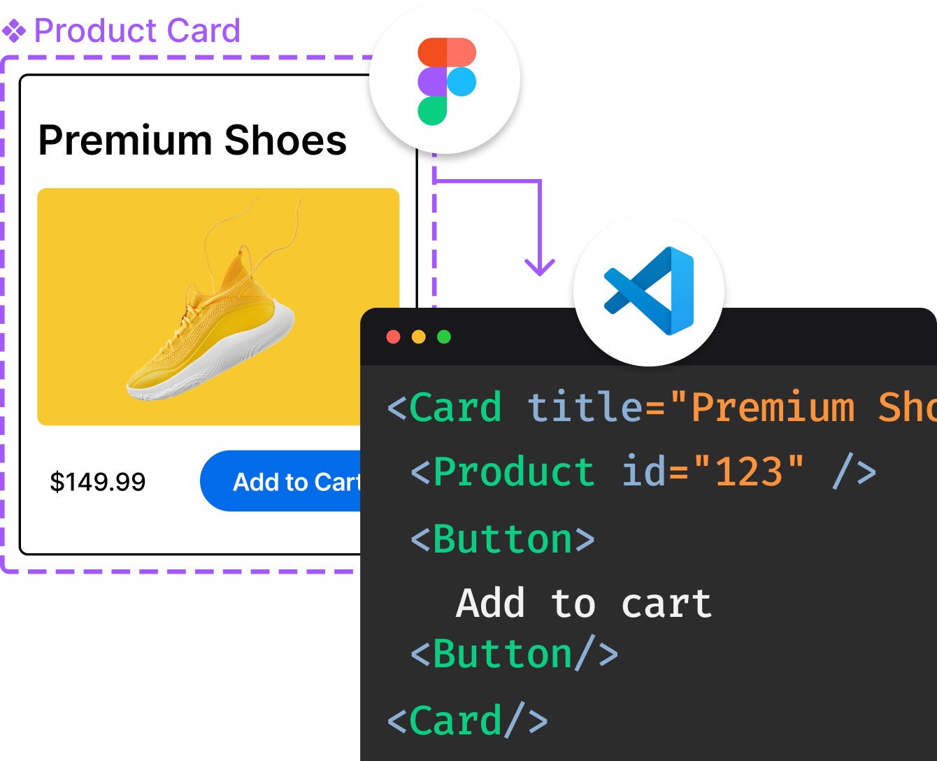
Introducing Visual Copilot: A new AI model to turn Figma designs to high quality code using your components.
Try Visual CopilotREADME
unplugin-icons

Access thousands of icons as components on-demand universally.
Features
- ð Universal
- 𤹠Any icon sets - ~150 popular sets with over 200,000 icons, logos, emojis, etc. Powered by Iconify.
- ð¦ Major build tools - Vite, Webpack, Rollup, Nuxt, Rspack, etc. Powered by unplugin.
- ð Major frameworks - Vanilla, Web Components, React, Vue 3, Solid, Svelte, and more. Contribute.
- ð± Any combinations of them!
- âï¸ On-demand - Only bundle the icons you really use, while having all the options.
- ð¨ SSR / SSG friendly - Ship the icons with your page, no more FOUC.
- ð Stylable - Change size, color, or even add animations as you would with styles and classes.
- ð¥ Custom icons - load your custom icons to get universal integrations at ease.
- ð² Auto Importing - Use icons as components directly in your template.
- 𦾠TypeScript support.
- ð Browse Icons
ð¡ Story behind this tool: Journey with Icons Continues - a blog post by Anthony |
vite-plugin-iconshas been renamed tounplugin-icons, see the migration guide
Quick Start
Basic Usage
Import icons using the convention ~icons/{collection}/{icon} and use them as components. Auto importing is also supported.
React Example:
import IconAccessibility from '~icons/carbon/accessibility'
import IconAccountBox from '~icons/mdi/account-box'

function App() {
  return (
    <div>
      <IconAccessibility />
      <IconAccountBox style={{ fontSize: '2em', color: 'red' }} />
    </div>
  )
}
Vue Example:
<script setup>
import IconAccessibility from '~icons/carbon/accessibility'
import IconAccountBox from '~icons/mdi/account-box'
</script>

<template>
  <icon-accessibility />
  <icon-account-box style="font-size: 2em; color: red" />
</template>
Installation
Note: This package is ESM-only. Make sure your project uses ES modules (
"type": "module"inpackage.jsonor.mjsfile extensions).
Step 1: Install the Plugin
npm i -D unplugin-icons
Step 2: Install Icon Data
We use Iconify as the icons data source (supports 100+ icon sets).
[!TIP] ⨠VS Code Users: Install the Iconify IntelliSense extension for inlay preview, auto-completion, and hover information.
Option A: Install Full Collection (Recommended for flexibility)
npm i -D @iconify/json
This installs all icon sets (~120MB). Only icons you actually use will be bundled in production.
Option B: Install Individual Icon Sets
Install only the icon sets you need:
npm i -D @iconify-json/mdi @iconify-json/carbon
Option C: Auto Install (Experimental)
Let unplugin-icons automatically install icon sets when you import them:
Icons({
  autoInstall: true, // Auto-detects npm/yarn/pnpm
})
Examples
Check out the playgrounds page to try examples online in StackBlitz.
Available examples:
- Vite + Vue 3
- Vite + React
- Next.js
- Nuxt 4
- SvelteKit
- Astro
- And more...
Configuration
This section covers how to configure unplugin-icons for different build tools and frameworks.
Build Tools
Vite
// vite.config.ts
import Icons from 'unplugin-icons/vite'

export default defineConfig({
  plugins: [
    Icons({ /* options */ }),
  ],
})
Rollup
// rollup.config.js
import Icons from 'unplugin-icons/rollup'

export default {
  plugins: [
    Icons({ /* options */ }),
  ],
}
Webpack
// webpack.config.mjs
import Icons from 'unplugin-icons/webpack'

export default {
  /* ... */
  plugins: [
    Icons({ /* options */ }),
  ],
}
Nuxt
Nuxt 2 and Nuxt Bridge
// nuxt.config.ts
export default {
  buildModules: [
    ['unplugin-icons/nuxt', { /* options */ }],
  ],
}
Nuxt 3/4
// nuxt.config.ts
export default defineNuxtConfig({
  modules: [
    ['unplugin-icons/nuxt', { /* options */ }]
  ],
})
Or work with unplugin-vue-components resolvers
import IconsResolver from 'unplugin-icons/resolver'
import ViteComponents from 'unplugin-vue-components/vite'

// nuxt.config.ts
export default defineNuxtConfig({
  modules: [
    'unplugin-icons/nuxt',
  ],
  vite: {
    plugins: [
      ViteComponents({
        resolvers: [
          IconsResolver({/* options */}),
        ],
      }),
    ],
  },
})
See the Nuxt example for a working example project.
Rspack
import Icons from 'unplugin-icons/rspack'

// rspack.config.mjs
export default defineConfig({
  plugins: [
    // ...
    Icons({/* options */}),
  ]
})
Vue CLI
Note: This package is ESM-only. You need to use
vue.config.mjswith ES module syntax (requires@vue/cli-service ^5.0.8).
// vue.config.mjs
import Icons from 'unplugin-icons/webpack'

export default {
  configureWebpack: {
    plugins: [
      Icons({ /* options */ }),
    ],
  },
}
SvelteKit
Add to your vite.config.ts:
import { sveltekit } from '@sveltejs/kit/vite'
import Icons from 'unplugin-icons/vite'
import { defineConfig } from 'vite'

export default defineConfig({
  plugins: [
    sveltekit(),
    Icons({
      compiler: 'svelte',
    })
  ]
})
Check instructions in the Frameworks -> Svelte section below if you faced module import errors.
See the SvelteKit example for a working example project.
Svelte + Vite
Svelte support requires the @sveltejs/vite-plugin-svelte plugin:
npm i -D @sveltejs/vite-plugin-svelte
Add to your vite.config.ts:
import { svelte } from '@sveltejs/vite-plugin-svelte'
import Icons from 'unplugin-icons/vite'
import { defineConfig } from 'vite'

export default defineConfig({
  plugins: [
    svelte(),
    Icons({
      compiler: 'svelte',
    }),
  ],
})
Check instructions in the Frameworks -> Svelte section below if you faced module import errors.
See the Svelte + Vite example for a working example project.
Next.js
Note: This package is ESM-only. You need to use
next.config.mjswith ES module syntax.
Add to your next.config.mjs:
// next.config.mjs
import Icons from 'unplugin-icons/webpack'

/** @type {import('next').NextConfig} */
export default {
  reactStrictMode: true,
  webpack(config) {
    config.plugins.push(
      Icons({
        compiler: 'jsx',
        jsx: 'react'
      })
    )

    return config
  }
}
Check instructions in the Frameworks -> React section below if you faced module import errors.
â ï¸ Warning: to import an icon is necessary to explicitly add the .jsx extension to the import path, so that Next.js knows how to load it, by example:
import IconArrowRight from '~icons/dashicons/arrow-right.jsx';
                                                     // ^-- write `.jsx` to avoid
                                                     // https://github.com/antfu/unplugin-icons/issues/103
// ...some code later
<IconArrowRight />
See the Next.js example for a working example project.
esbuild
// esbuild.config.js
import { build } from 'esbuild'
import Icons from 'unplugin-icons/esbuild'

build({
  /* ... */
  plugins: [
    Icons({
      /* options */
    }),
  ],
})
Astro
// astro.config.mjs
import { defineConfig } from 'astro/config'
import Icons from 'unplugin-icons/vite'

// https://astro.build/config
export default defineConfig({
  vite: {
    plugins: [
      Icons({
        compiler: 'astro',
      }),
    ],
  },
})
See the Astro example for a working example project.
Astro + Vue
Required @astrojs/vue installed.
import Vue from '@astrojs/vue'
// astro.config.mjs
import { defineConfig } from 'astro/config'
import Icons from 'unplugin-icons/vite'

// https://astro.build/config
export default defineConfig({
  integrations: [
    Vue(),
  ],
  vite: {
    plugins: [
      Icons({
        compiler: 'vue3',
      }),
    ],
  },
})
See the Astro + Vue example for a working example project.
Frameworks
Configure the compiler option based on your framework. Some frameworks may require additional peer dependencies.
Vue 3
Configuration:
Icons({ compiler: 'vue3' })
Peer Dependency:
Note: As of Vue 3.2.13+,
@vue/compiler-sfcis included in the mainvuepackage, so no additional installation is needed.
If you're using an older version:
npm i -D @vue/compiler-sfc
TypeScript Support:
Add to your tsconfig.json:
{
  "compilerOptions": {
    "types": [
      "unplugin-icons/types/vue"
    ]
  }
}
See the Vue 3 example for a complete setup.
React
Configuration:
Icons({ compiler: 'jsx', jsx: 'react' })
Peer Dependencies:
npm i -D @svgr/core @svgr/plugin-jsx
TypeScript Support:
Add to your tsconfig.json:
{
  "compilerOptions": {
    "types": [
      "unplugin-icons/types/react"
    ]
  }
}
See the React example for a complete setup.
Preact
Configuration:
Icons({ compiler: 'jsx', jsx: 'preact' })
Peer Dependencies:
npm i -D @svgr/core @svgr/plugin-jsx
TypeScript Support:
Add to your tsconfig.json:
{
  "compilerOptions": {
    "types": [
      "unplugin-icons/types/preact"
    ]
  }
}
See the Preact example for a complete setup.
Solid
Configuration:
Icons({ compiler: 'solid' })
TypeScript Support:
Add to your tsconfig.json:
{
  "compilerOptions": {
    "types": [
      "unplugin-icons/types/solid"
    ]
  }
}
See the Solid example for a complete setup.
Svelte
Configuration:
Icons({ compiler: 'svelte' })
TypeScript Support:
For SvelteKit, add to src/app.d.ts:
import 'unplugin-icons/types/svelte'
For Svelte + Vite, add to src/vite-env.d.ts:
/// <reference types="svelte" />
/// <reference types="vite/client" />
/// <reference types="unplugin-icons/types/svelte" />
For Svelte 4, use:
/// <reference types="unplugin-icons/types/svelte4" />
For Svelte 3, use:
/// <reference types="unplugin-icons/types/svelte3" />
See the Svelte example for a complete setup.
Astro
Configuration:
Icons({ compiler: 'astro' })
TypeScript Support:
Add to your tsconfig.json:
{
  "compilerOptions": {
    "types": [
      "unplugin-icons/types/astro"
    ]
  }
}
See the Astro example for a complete setup.
Astro + Vue
Configuration:
Icons({ compiler: 'vue3' })
Requirements:
Requires @astrojs/vue to be installed.
TypeScript Support:
Add to your tsconfig.json:
{
  "compilerOptions": {
    "types": [
      "unplugin-icons/types/vue"
    ]
  }
}
See the Astro + Vue example for a complete setup.
Qwik
Option 1: Native Qwik Compiler (Recommended)
Configuration:
Icons({ compiler: 'qwik' })
Peer Dependency:
npm i -D @svgx/core
Option 2: JSX Compiler
Configuration:
Icons({ compiler: 'jsx', jsx: 'qwik' })
Peer Dependencies:
npm i -D @svgr/core @svgr/plugin-jsx
TypeScript Support:
Add to your tsconfig.json:
{
  "compilerOptions": {
    "types": [
      "unplugin-icons/types/qwik"
    ]
  }
}
See the Qwik example for a complete setup.
Ember
Configuration:
Icons({ compiler: 'ember' })
Build Tool Support:
Ember works with either Webpack or Vite.
For Vite applications, add to vite.config.mjs:
import { ember, extensions } from '@embroider/vite'
import { babel } from '@rollup/plugin-babel'
import Icons from 'unplugin-icons/vite'
import { defineConfig } from 'vite'

export default defineConfig({
  plugins: [
    ember(),
    Icons({
      compiler: 'ember',
    }),
    babel({
      babelHelpers: 'runtime',
      extensions,
    }),
  ],
})
TypeScript Support:
Add to your tsconfig.json:
{
  "compilerOptions": {
    "types": [
      "unplugin-icons/types/ember"
    ]
  }
}
Ember + Webpack
Assuming your app was generated with --embroider, or manually migrated to embroider following the instructions on the old embroider readme
Add the Icon plugin to the webpack plugins array in ember-cli-build.js:
import { compatBuild } from '@embroider/compat'
import Icons from 'unplugin-icons/webpack'

return compatBuild(app, Webpack, {
    packagerOptions: {
      webpackConfig: {
        plugins: [
          Icons({
            compiler: 'ember',
          }),
        ],
      },
    },
    // ...other options
See the Ember (with Webpack) or Ember vite example for a working example project.
Raw SVG Import
Available from
v0.13.2+
Import icons as raw SVG strings by adding ?raw to the import path. Useful for embedding SVG directly in HTML templates.
Example (Vue 3):
<script setup lang='ts'>
import RawMdiAlarmOff from '~icons/mdi/alarm-off?raw&width=4em&height=4em'
import RawMdiAlarmOff2 from '~icons/mdi/alarm-off?raw&width=1em&height=1em'
</script>

<template>
  <!-- raw example -->
  <pre>
    import RawMdiAlarmOff from '~icons/mdi/alarm-off?raw&width=4em&height=4em'
    {{ RawMdiAlarmOff }}
    import RawMdiAlarmOff2 from '~icons/mdi/alarm-off?raw&width=1em&height=1em'
    {{ RawMdiAlarmOff2 }}
  </pre>
  <!-- svg example -->
  <span v-html="RawMdiAlarmOff" />
  <span v-html="RawMdiAlarmOff2" />
</template>
Custom Icons
Load your own custom icons and use them with the same universal API.
import { promises as fs } from 'node:fs'

// loader helpers
import { FileSystemIconLoader } from 'unplugin-icons/loaders'

Icons({
  customCollections: {
    // key as the collection name
    'my-icons': {
      account: '<svg><!-- ... --></svg>',
      // load your custom icon lazily
      settings: () => fs.readFile('./path/to/my-icon.svg', 'utf-8'),
      /* ... */
    },
    'my-other-icons': async (iconName) => {
      // your custom loader here. Do whatever you want.
      // for example, fetch from a remote server:
      return await fetch(`https://example.com/icons/${iconName}.svg`).then(res => res.text())
    },
    // a helper to load icons from the file system
    // files under `./assets/icons` with `.svg` extension will be loaded as it's file name
    // you can also provide a transform callback to change each icon (optional)
    'my-yet-other-icons': FileSystemIconLoader(
      './assets/icons',
      svg => svg.replace(/^<svg /, '<svg fill="currentColor" '),
    ),
  },
})
Then use as
import IconAccount from '~icons/my-icons/account'
import IconFoo from '~icons/my-other-icons/foo'
import IconBar from '~icons/my-yet-other-icons/bar'
ð¡ SVG Authoring Tips:
- To make your icons color adaptable, set
fill="currentColor"orstroke="currentColor"in your SVG.- Leave the
heightandwidthunspecified, we will set them for you.
Auto-Import with Resolver
When using auto-importing, register your custom collection names:
IconResolver({
  customCollections: [
    'my-icons',
    'my-other-icons',
    'my-yet-other-icons',
  ],
})
See the Vue 3 example for a complete setup.
External Collection Packages
Load icons from third-party packages that follow the Iconify format.
Requirements:
External packages must include an icons.json file in IconifyJSON format. See Exporting icon set as JSON package for details.
For example, you can use an-awesome-collection or @my-awesome-collections/some-collection to load your custom or third party icons:
// loader helpers
import { ExternalPackageIconLoader } from 'unplugin-icons/loaders'

Icons({ customCollections: ExternalPackageIconLoader('my-awesome-collection') })
When using with resolvers for auto-importing, remember you will need to tell it your custom collection names:
IconResolver({
  customCollections: [
    'my-awesome-collection',
  ],
})
You can also combine it with FileSystemIconLoader or with other custom icon loaders:
// loader helpers
import { ExternalPackageIconLoader, FileSystemIconLoader } from 'unplugin-icons/loaders'

Icons({
  customCollections: {
    ...ExternalPackageIconLoader('an-awesome-collection'),
    ...ExternalPackageIconLoader('@my-awesome-collections/some-collection'),
    ...ExternalPackageIconLoader('@my-awesome-collections/some-other-collection'),
    'my-yet-other-icons': FileSystemIconLoader(
      './assets/icons',
      svg => svg.replace(/^<svg /, '<svg fill="currentColor" '),
    ),
  },
})
See the Vue 3 example for a complete setup.
Icon Customization
Customize individual icons or entire collections using iconCustomizer in your config or query parameters when importing.
Precedence: Query params > iconCustomizer > default configuration
Works with all icon sources: custom loaders, inlined collections, and Iconify collections.
For example, you can configure iconCustomizer to change all icons for a collection or individual icons on a collection:
import { promises as fs } from 'node:fs'

// loader helpers
import { FileSystemIconLoader } from 'unplugin-icons/loaders'

Icons({
  customCollections: {
    // key as the collection name
    'my-icons': {
      account: '<svg><!-- ... --></svg>',
      // load your custom icon lazily
      settings: () => fs.readFile('./path/to/my-icon.svg', 'utf-8'),
      /* ... */
    },
    'my-other-icons': async (iconName) => {
      // your custom loader here. Do whatever you want.
      // for example, fetch from a remote server:
      return await fetch(`https://example.com/icons/${iconName}.svg`).then(res => res.text())
    },
    // a helper to load icons from the file system
    // files under `./assets/icons` with `.svg` extension will be loaded as it's file name
    // you can also provide a transform callback to change each icon (optional)
    'my-yet-other-icons': FileSystemIconLoader(
      './assets/icons',
      svg => svg.replace(/^<svg /, '<svg fill="currentColor" '),
    ),
  },
  iconCustomizer(collection, icon, props) {
    // customize all icons in this collection
    if (collection === 'my-other-icons') {
      props.width = '4em'
      props.height = '4em'
    }
    // customize this icon in this collection
    if (collection === 'my-icons' && icon === 'account') {
      props.width = '6em'
      props.height = '6em'
    }
    // customize this @iconify icon in this collection
    if (collection === 'mdi' && icon === 'account') {
      props.width = '2em'
      props.height = '2em'
    }
  },
})
or you can use query params to apply to individual icons:
<script setup lang='ts'>
import MdiAlarmOff from 'virtual:icons/mdi/alarm-off?width=4em&height=4em'
import MdiAlarmOff2 from 'virtual:icons/mdi/alarm-off?width=1em&height=1em'
</script>

<template>
  <!-- width=4em and height=4em -->
  <mdi-alarm-off />
  <!-- width=4em and height=4em -->
  <MdiAlarmOff />
  <!-- width=1em and height=1em -->
  <MdiAlarmOff2 />
</template>
See the Vue 3 example for a complete implementation.
Global Icon Transformation
Apply transformations to all custom icons during loading. Useful for adding default attributes like fill="currentColor".
Icons({
  customCollections: {
    // key as the collection name
    'my-icons': {
      account: '<svg><!-- ... --></svg>',
      /* ... */
    },
  },
  transform(svg, collection, icon) {
    // apply fill to this icon on this collection
    if (collection === 'my-icons' && icon === 'account')
      return svg.replace(/^<svg /, '<svg fill="currentColor" ')

    return svg
  },
})
Advanced Custom Icon Set Cleanup
When using this plugin with your custom icons, consider using a cleanup process similar to that done by Iconify for any icons sets. All the tools you need are available in Iconify Tools.
You can check this repo, using unplugin-icons on a SvelteKit project: https://github.com/iconify/tools/tree/main/%40iconify-demo/unplugin-svelte.
Read Cleaning up icons article from Iconify for more details.
Migration from vite-plugin-icons
If you're upgrading from vite-plugin-icons, follow these steps:
1. Update package.json:
{
  "devDependencies": {
-   "vite-plugin-icons": "*",
+   "unplugin-icons": "^0.7.0",
  }
}
2. Update your config file:
import Components from 'unplugin-vue-components/vite'
- import Icons, { ViteIconsResolver } from 'vite-plugin-icons'
+ import Icons from 'unplugin-icons/vite'
+ import IconsResolver from 'unplugin-icons/resolver'

export default {
  plugins: [
    Vue(),
    Components({
      resolvers: [
        IconsResolver()
      ],
    }),
    Icons(),
  ],
}
3. Update import paths:
- import IconComponent from 'virtual:vite-icons/collection/name'
+ import IconComponent from '~icons/collection/name'
Note: The
virtual:iconsprefix still works in Vite, but~iconsis recommended for consistency across all build tools.
Options
Configure default styling and behavior for all icons:
Icons({
  // Icon sizing
  scale: 1.2,              // Scale factor relative to 1em (default: 1.2)

  // Default styling
  defaultStyle: '',        // CSS styles applied to all icons
  defaultClass: '',       // CSS classes applied to all icons

  // Compiler configuration
  compiler: null,         // Framework compiler: 'vue3', 'jsx', 'svelte', 'solid', etc.
  jsx: 'react',           // JSX framework: 'react' or 'preact' (when compiler: 'jsx')

  // Custom collections
  customCollections: {},  // See [Custom Icons](#custom-icons)

  // Advanced
  iconCustomizer: () => {}, // See [Icon Customization](#icon-customization)
  transform: undefined,   // See [Global Icon Transformation](#global-icon-transformation)
  autoInstall: false,    // Auto-install icon sets on import
})
Auto Importing
Vue 3
Use with unplugin-vue-components
For example in Vite:
// vite.config.ts
import Vue from '@vitejs/plugin-vue'
import IconsResolver from 'unplugin-icons/resolver'
import Icons from 'unplugin-icons/vite'
import Components from 'unplugin-vue-components/vite'

export default {
  plugins: [
    Vue(),
    Components({
      resolvers: [
        IconsResolver(),
      ],
    }),
    Icons(),
  ],
}
Then you can use any icons as you want without explicit importing. Only the used icons will be bundled.
<template>
  <i-carbon-accessibility/>
  <i-mdi-account-box style="font-size: 2em; color: red"/>
</template>
React & Solid
Use with unplugin-auto-import
For example in Vite:
// vite.config.ts
import AutoImport from 'unplugin-auto-import/vite'
import IconsResolver from 'unplugin-icons/resolver'
import Icons from 'unplugin-icons/vite'

export default {
  plugins: [
    AutoImport({
      resolvers: [
        IconsResolver({
          prefix: 'Icon',
          extension: 'jsx',
        }),
      ],
    }),
    Icons({
      compiler: 'jsx', // or 'solid'
    }),
  ],
}
Then you can use any icons with the prefix Icon as you want without explicit importing. Type declarations will be generated on the fly.
export function Component() {
  return (
    <div>
      <IconCarbonApps />
      <IconMdiAccountBox style="font-size: 2em; color: red" />
    </div>
  )
}
Component Naming
Icons are auto-imported following this naming pattern:
{prefix}-{collection}-{icon}
prefix: Component name prefix (default:i)collection: Iconify collection ID (e.g.,mdi,carbon,fa-solid)icon: Icon name (kebab-case)
Custom Prefix:
IconsResolver({
  prefix: 'icon', // Use 'icon' instead of 'i'
})
<template>
  <icon-mdi-account />
</template>
No Prefix:
IconsResolver({
  prefix: false,
  enabledCollections: ['mdi'], // Optional: limit to specific collections
})
<template>
  <mdi-account />
</template>
Collection Aliases
Create shorter aliases for long collection names:
IconsResolver({
  alias: {
    park: 'icon-park',  // Use <icon-park-* /> instead of <icon-icon-park-* />
    fas: 'fa-solid',    // Use <icon-fas-* /> instead of <icon-fa-solid-* />
  }
})
Both the alias and full collection name work:
<template>
  <icon-park-abnormal />      <!-- Using alias -->
  <icon-icon-park-abnormal /> <!-- Using full name -->
</template>
Sponsors
This project is part of my Sponsor Program

License
MIT License © 2020-PRESENT Anthony Fu
Top Related Projects
Universal icon framework. One syntax for FontAwesome, Material Design Icons, DashIcons, Feather Icons, EmojiOne, Noto Emoji and many other open source icon sets (over 200 icon sets and ~300k icons). SVG framework, React, Vue and Svelte components!
A set of over 6100 free MIT-licensed high-quality SVG icons for you to use in your web projects.
Simply beautiful open-source icons
A scalable set of icons handcrafted with ❤️ by GitHub
The iconic SVG, font, and CSS toolkit
Premium hand-crafted icons built by Ionic, for Ionic apps and web apps everywhere 🌎
Convert designs to code with AI
Introducing Visual Copilot: A new AI model to turn Figma designs to high quality code using your components.
Try Visual Copilot