
Top Related Projects

An easy, flexible way to add a shimmering effect to any view in an Android app.

:balloon: Modernized and sophisticated tooltips, fully customizable with an arrow and animations for Compose and Kotlin Multiplatform.

An Android Animation library which easily add itemanimator to RecyclerView items.

Render After Effects animations natively on Android and iOS, Web, and React Native

Android loading animations

A library provides an easy way to show skeleton loading view like Facebook and Alipay
Quick Overview
Compose Shimmer is a lightweight Jetpack Compose library that provides an easy way to add shimmer effects to your Android UI. It offers a simple API to create loading placeholder animations, enhancing the user experience during data loading processes.
Pros
- Easy integration with Jetpack Compose projects
- Customizable shimmer effect (color, direction, speed)
- Lightweight and efficient implementation
- Supports both simple and complex UI layouts
Cons
- Limited to Jetpack Compose projects (not compatible with traditional Android Views)
- May require additional setup for complex shimmer patterns
- Documentation could be more extensive
- Potential performance impact on older devices with complex shimmer layouts
Code Examples
- Basic shimmer effect on a Box:
Box(
    modifier = Modifier
        .size(100.dp)
        .shimmer()
)
- Customizing shimmer effect:
Box(
    modifier = Modifier
        .size(200.dp)
        .shimmer(
            shimmerBounds = ShimmerBounds.Window,
            theme = ShimmerTheme(
                animationSpec = infiniteRepeatable(
                    animation = tween(1000, easing = LinearEasing),
                    repeatMode = RepeatMode.Restart
                ),
                blendMode = BlendMode.DstIn,
                rotation = 45f,
                shaderColors = listOf(
                    Color.Unspecified.copy(alpha = 0.25f),
                    Color.Unspecified.copy(alpha = 1f),
                    Color.Unspecified.copy(alpha = 0.25f),
                ),
            )
        )
)
- Applying shimmer to a list item:
@Composable
fun ShimmerListItem() {
    Row(
        modifier = Modifier
            .fillMaxWidth()
            .padding(16.dp)
            .shimmer()
    ) {
        Box(
            modifier = Modifier
                .size(50.dp)
                .background(Color.LightGray, CircleShape)
        )
        Spacer(modifier = Modifier.width(16.dp))
        Column {
            Box(
                modifier = Modifier
                    .height(20.dp)
                    .fillMaxWidth(0.7f)
                    .background(Color.LightGray)
            )
            Spacer(modifier = Modifier.height(8.dp))
            Box(
                modifier = Modifier
                    .height(20.dp)
                    .fillMaxWidth(0.9f)
                    .background(Color.LightGray)
            )
        }
    }
}
Getting Started
- Add the dependency to your
build.gradlefile:
dependencies {
    implementation 'com.valentinilk.shimmer:compose-shimmer:1.0.3'
}
- Import the shimmer modifier in your Compose file:
import com.valentinilk.shimmer.shimmer
- Apply the shimmer effect to your Composable:
@Composable
fun MyShimmerUI() {
    Box(
        modifier = Modifier
            .size(200.dp)
            .shimmer()
    ) {
        // Your content here
    }
}
Competitor Comparisons
An easy, flexible way to add a shimmering effect to any view in an Android app.
Pros of shimmer-android
- More mature and battle-tested, having been developed by Facebook
- Supports older Android versions and traditional View-based layouts
- Extensive documentation and examples available
Cons of shimmer-android
- No longer actively maintained (archived repository)
- Not designed for Jetpack Compose, requiring additional work for integration
- May have performance overhead when used with Compose
Code Comparison
shimmer-android:
<com.facebook.shimmer.ShimmerFrameLayout
    android:id="@+id/shimmer_view_container"
    android:layout_width="wrap_content"
    android:layout_height="wrap_content">
    <!-- Add shimmer placeholder layout here -->
</com.facebook.shimmer.ShimmerFrameLayout>
compose-shimmer:
ShimmerBox(
    modifier = Modifier.size(200.dp),
    shimmerColor = Color.LightGray,
    contentColor = Color.Gray
) {
    // Add shimmer content here
}
Summary
While shimmer-android offers a mature solution for traditional Android development, compose-shimmer is specifically designed for Jetpack Compose, providing a more seamless integration for modern Android projects. The choice between the two depends on the project's requirements, target Android versions, and whether Jetpack Compose is being used.
:balloon: Modernized and sophisticated tooltips, fully customizable with an arrow and animations for Compose and Kotlin Multiplatform.
Pros of Balloon
- More comprehensive tooltip/popup library with extensive customization options
- Supports both Android Views and Jetpack Compose
- Includes features like arrow positioning, animations, and lifecycle management
Cons of Balloon
- Larger library size due to more features, potentially impacting app size
- Steeper learning curve for basic use cases compared to Compose Shimmer
- May require more setup and configuration for simple shimmer effects
Code Comparison
Balloon (creating a simple tooltip):
val balloon = Balloon.Builder(context)
    .setArrowSize(10)
    .setBackgroundColor(ContextCompat.getColor(context, R.color.colorPrimary))
    .setLifecycleOwner(lifecycleOwner)
    .build()

balloon.showAlignBottom(anchor)
Compose Shimmer (adding shimmer effect):
ShimmerBounds(
    contentAlignment = Alignment.Center,
) {
    Box(
        modifier = Modifier
            .size(128.dp)
            .shimmer()
    )
}
While Balloon offers a feature-rich tooltip solution for both Android Views and Jetpack Compose, Compose Shimmer provides a simpler, more focused approach for adding shimmer effects in Jetpack Compose. Balloon's extensive customization options come at the cost of increased complexity and library size, whereas Compose Shimmer offers a lightweight solution specifically for shimmer animations in Compose-based projects.
An Android Animation library which easily add itemanimator to RecyclerView items.
Pros of recyclerview-animators
- Supports a wide range of pre-built animations for RecyclerView items
- Compatible with older Android versions and traditional XML-based layouts
- Offers fine-grained control over individual item animations
Cons of recyclerview-animators
- Limited to RecyclerView and not applicable to other UI components
- Requires more boilerplate code compared to Compose-based solutions
- May have performance overhead for complex animations on large lists
Code Comparison
recyclerview-animators:
val animator = SlideInLeftAnimator()
animator.addDuration = 300
recyclerView.itemAnimator = animator
compose-shimmer:
ShimmerBox(
    modifier = Modifier.fillMaxWidth(),
    shimmerColor = Color.LightGray
) {
    // Content here
}
Summary
recyclerview-animators is a versatile library for adding animations to RecyclerView items in traditional Android development. It offers a wide range of pre-built animations and fine-grained control but is limited to RecyclerView.
compose-shimmer, on the other hand, is specifically designed for creating shimmer effects in Jetpack Compose. It's more focused in scope but integrates seamlessly with Compose-based UIs and requires less boilerplate code.
The choice between these libraries depends on the project's requirements, target Android versions, and whether the app uses Jetpack Compose or traditional XML layouts.
Render After Effects animations natively on Android and iOS, Web, and React Native
Pros of Lottie-Android
- Supports complex animations with vector graphics
- Widely adopted and maintained by Airbnb
- Extensive documentation and community support
Cons of Lottie-Android
- Larger library size and potential performance overhead
- Requires external tools (After Effects) for creating animations
- Steeper learning curve for designers and developers
Code Comparison
Compose-Shimmer:
ShimmerBox(
    modifier = Modifier.size(200.dp),
    shimmerColor = Color.LightGray,
    contentColor = Color.White
) {
    Text("Loading...")
}
Lottie-Android:
LottieAnimation(
    composition = composition,
    progress = { progress },
    modifier = Modifier.size(200.dp)
)
Summary
Compose-Shimmer is a lightweight library specifically designed for creating shimmer effects in Jetpack Compose. It's easy to use and integrate into existing projects. Lottie-Android, on the other hand, is a more comprehensive animation library that supports complex animations created with After Effects. While Lottie offers more flexibility and power, it comes with a steeper learning curve and larger footprint. Compose-Shimmer is ideal for simple loading animations, while Lottie-Android is better suited for rich, detailed animations throughout an app.
Android loading animations
Pros of Android-SpinKit
- Offers a wide variety of pre-built loading animations
- Supports older Android versions and traditional View-based layouts
- Includes XML-based configuration options
Cons of Android-SpinKit
- Not specifically designed for Jetpack Compose
- May require additional setup for integration with Compose-based projects
- Limited customization options compared to Compose-native solutions
Code Comparison
Android-SpinKit (XML-based):
<com.github.ybq.android.spinkit.SpinKitView
    android:id="@+id/spin_kit"
    style="@style/SpinKitView.Large.Circle"
    android:layout_width="wrap_content"
    android:layout_height="wrap_content"
    android:layout_gravity="center" />
compose-shimmer (Kotlin with Compose):
ShimmerBox(
    modifier = Modifier.size(100.dp),
    shimmerColor = Color.LightGray,
    contentColor = Color.Gray
) {
    // Content goes here
}
Summary
Android-SpinKit is a versatile library for creating loading animations in traditional Android development, offering a wide range of pre-built options. However, it may not be the best choice for Jetpack Compose projects. compose-shimmer, on the other hand, is specifically designed for Compose and provides a more integrated solution for creating shimmer effects in modern Android development.
A library provides an easy way to show skeleton loading view like Facebook and Alipay
Pros of Skeleton
- Supports both XML and programmatic creation of skeleton views
- Offers a wider range of customization options for skeleton appearance
- Provides built-in support for different view types (e.g., ImageView, TextView)
Cons of Skeleton
- Not specifically designed for Jetpack Compose
- May require more setup and configuration compared to Compose-specific libraries
- Less integrated with modern Android development practices
Code Comparison
Skeleton:
Skeleton.bind(recyclerView)
    .shimmer(true)
    .count(10)
    .color(R.color.shimmer_color)
    .show()
Compose-shimmer:
ShimmerBox(
    modifier = Modifier.size(200.dp),
    shimmerColor = Color.LightGray
) {
    // Content goes here
}
Summary
While Skeleton offers more flexibility for traditional Android views, Compose-shimmer is tailored for Jetpack Compose, providing a more streamlined experience for modern Android development. Skeleton's broader customization options come at the cost of additional setup, whereas Compose-shimmer integrates seamlessly with Compose's declarative UI paradigm.
Convert  designs to code with AI
Introducing Visual Copilot: A new AI model to turn Figma designs to high quality code using your components.
Try Visual CopilotREADME
Shimmer for Jetpack Compose & Compose Multiplatform
A library which offers a shimmering effect for Compose.

Setup
The library is available on mavenCentral().
dependencies {
    implementation("com.valentinilk.shimmer:compose-shimmer:1.5.0")
}
Multiplatform Targets
Supported CMP targets are: Android, iOS, JVM (Desktop), JS (Browser) and Wasm (WebAssembly).
Compose Multiplatform Version
In case of compatibility issues, select a library version that is based on the same compose version as your project.
| Shimmer Version | Based on Compose |
|---|---|
| 1.5.0 | 1.11 |
| 1.4.0 | 1.10.3 |
| 1.3.3 | 1.8.1 |
| 1.3.2 | 1.7.3 |
Quick Start
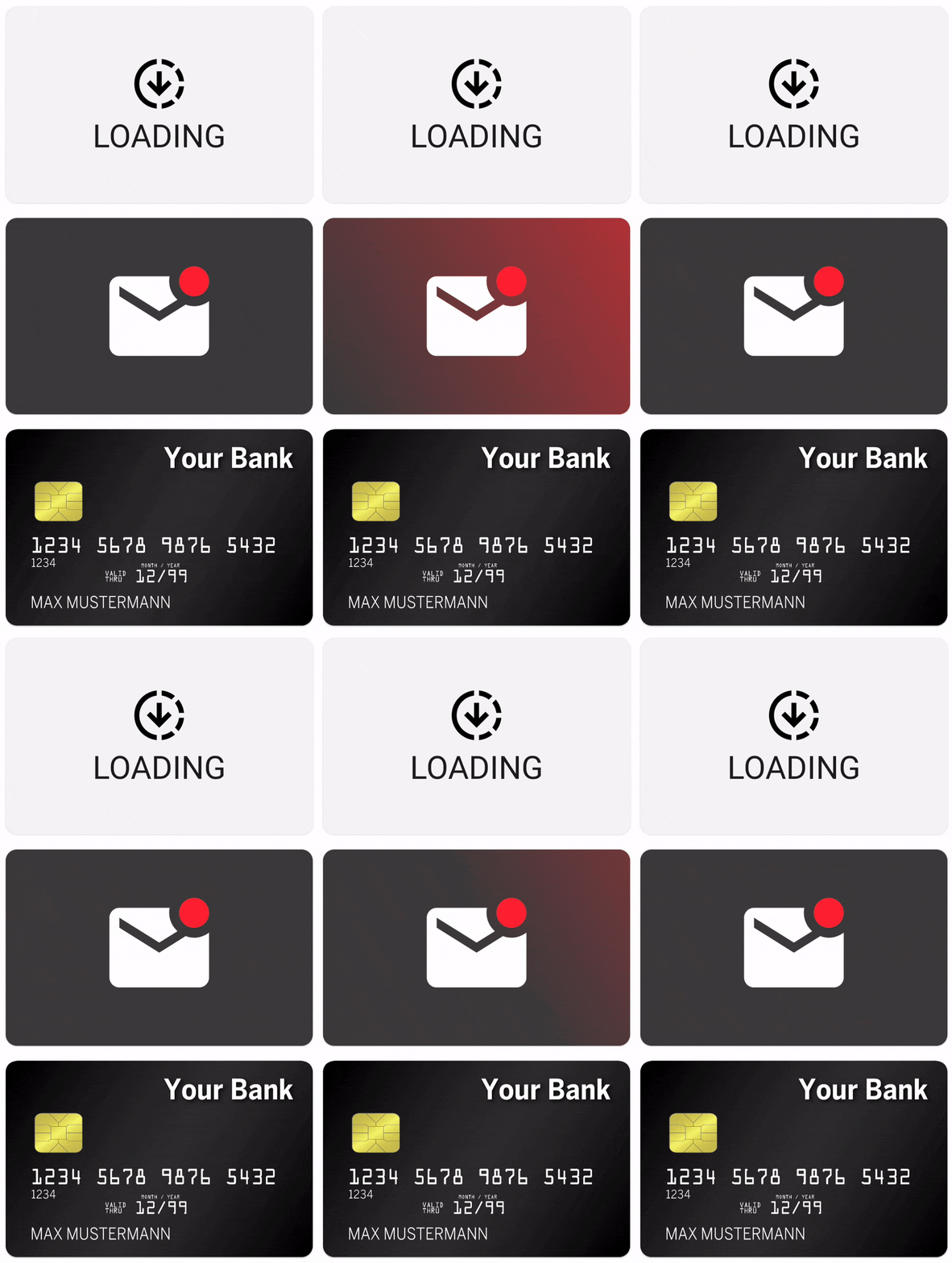
Simply apply the shimmer modifier to any UI of your choice. The code below will emit the shimmering UI that can be
seen in the GIF above.
@Composable
fun ShimmeringPlaceholder() {
    Row(
        modifier = Modifier
            .shimmer() // <- Affects all subsequent UI elements
            .fillMaxWidth()
            .padding(16.dp),
        horizontalArrangement = Arrangement.spacedBy(16.dp),
    ) {
        Box(
            modifier = Modifier
                .size(80.dp, 80.dp)
                .background(Color.LightGray),
        )
        Column(
            verticalArrangement = Arrangement.spacedBy(16.dp),
        ) {
            Box(
                modifier = Modifier
                    .fillMaxWidth()
                    .height(24.dp)
                    .background(Color.LightGray),
            )
            Box(
                modifier = Modifier
                    .size(120.dp, 20.dp)
                    .background(Color.LightGray),
            )
        }
    }
}
Modifier placement
As usual with modifiers the order
matters.
Every UI component defined after the shimmer modifier will be affected by the animation. This includes child views
and other modifiers:
The first example demonstrates that only the inner Box is shimmering, even though the shimmer has been added to
the outer Box's modifier stack. The blue background is not shimmering, as it's sitting above the shimmer modifier.
Box(
    modifier = Modifier
        .size(128.dp)
        .background(Color.Blue)
        .shimmer(),
    contentAlignment = Alignment.Center
) {
    Box(
        modifier = Modifier
            .size(64.dp)
            .background(Color.Red)
    )
}

If the modifier, however, is applied earlier, the outer Box's background modifier is affected by the
shimmer as well.
Box(
    modifier = Modifier
        .size(128.dp)
        .shimmer()
        .background(Color.Blue),
    contentAlignment = Alignment.Center
) {
    Box(
        modifier = Modifier
            .size(64.dp)
            .background(Color.Red)
    )
}

Theming
The library includes a ShimmerTheme which can be provided as
a local composition.
A good practice would be to integrate the theming into
your customized MaterialTheme.
There is no need to wrap every single shimmer into a CompositionLocalProvider.
val yourShimmerTheme = defaultShimmerTheme.copy(/* Set your desirable values */)

CompositionLocalProvider(
    LocalShimmerTheme provides yourShimmerTheme
) {
    /* content */
}
The theme can also be passed as a parameter by using the rememberShimmer(...) function, which is
explained further down below.
The theme itself offers a few simple configurations like the shimmer's rotation or width.
Additionally, a few unabstracted objects like an AnimationSpec or BlendMode are exposed. While
this violates the principles
of information hiding, it allows for some great
customizations.
For further information have a look at documentation in data class itself and have a look at
the ThemingSamples in the sample app.
Advanced Usage
The default shimmer() modifier creates a shimmering animation, which will traverse over the view
in a certain time. That means that the animation will have a different velocity, depending on the
size of the view.
If you apply the modifier to multiple views, each of a different size, then each shimmer will have its own velocity. This effect can be seen in the following GIF:

That might not always be the desired effect, that's why the library offers a way to set the boundaries for the animation:
val shimmerInstance = rememberShimmer(shimmerBounds = ShimmerBounds.XXX)
Box(modifier = Modifier.shimmer(shimmerInstance))
ShimmerBounds.View (default)
The view's height and width will be used as the boundaries for the animation. This option was used to create the GIFs shown above and should be sufficient for most use cases.
ShimmerBounds.Window
This option uses the window's height, with and coordinate system for the calculations. It will create a shimmer that travels over the whole window instead of only the views. But only views that have the shimmer modifier attached will be affected.
Be aware that this option might look odd on scrollable content, because the shimmer will be positioned relative to the window. So the shimmer will not be moved together with the content.
Column {
    val shimmerInstance = rememberShimmer(shimmerBounds = ShimmerBounds.Window)
    Text("Shimmering Text", modifier = Modifier.shimmer(shimmerInstance))
    Text("Non-shimmering Text")
    Text("Shimmering Text", modifier = Modifier.shimmer(shimmerInstance))
}

ShimmerBounds.Custom
The downsides of the Window option is why the ShimmerBounds.Custom option exists.
By using this option, the shimmer and its content will not be drawn until the bounds are set
manually by using the updateBounds method on the Shimmer.
This can be used to attach the shimmer to a scrollable list for example. Or simply use the default
ShimmerBounds.View option.
val shimmerInstance = rememberShimmer(ShimmerBounds.Custom)
Column(
    modifier = Modifier
        .fillMaxSize()
        .verticalScroll(rememberScrollState())
        .onGloballyPositioned { layoutCoordinates ->
            // Util function included in the library
            val position = layoutCoordinates.unclippedBoundsInWindow()
            shimmerInstance.updateBounds(position)
        },
) {
    Text("Shimmering Text", modifier = Modifier.shimmer(shimmerInstance))
    Text("Non-shimmering Text")
    Text("Shimmering Text", modifier = Modifier.shimmer(shimmerInstance))
}
Sample Apps
Sample apps for different platforms are included in the project. To use them, clone the repository into a folder locally.
Android
To run the Android app, simply open the project in Android Studio. Select the sample configuration and run it.
iOS
The iOS app can be build and launched by using XCode. Open the iosApp folder with XCode as a project. Adapt the
signing in XCode to match your needs and launch the app on an emulator or iOS device.
Desktop
The desktop app can be launched by using the sample.desktop configuration in Android Studio. Or run
./gradlew :sample:run in the terminal.
Browser
To run the sample in the browser, simply use the sample.browser configuration in Android Studio. Or run
./gradlew :sample:jsBrowserDevelopmentRun in the terminal.
WebAssembly (Wasm)
To run the Wasm sample use the sample.wasm configuration in Android Studio or run
./gradlew :sample:wasmJsBrowserDevelopmentRun in the terminal.
License
Copyright 2026 Valentin Ilk

Licensed under the Apache License, Version 2.0 (the "License");
you may not use this file except in compliance with the License.
You may obtain a copy of the License at

   http://www.apache.org/licenses/LICENSE-2.0

Unless required by applicable law or agreed to in writing, software
distributed under the License is distributed on an "AS IS" BASIS,
WITHOUT WARRANTIES OR CONDITIONS OF ANY KIND, either express or implied.
See the License for the specific language governing permissions and
limitations under the License.
Top Related Projects
An easy, flexible way to add a shimmering effect to any view in an Android app.
:balloon: Modernized and sophisticated tooltips, fully customizable with an arrow and animations for Compose and Kotlin Multiplatform.
An Android Animation library which easily add itemanimator to RecyclerView items.
Render After Effects animations natively on Android and iOS, Web, and React Native
Android loading animations
A library provides an easy way to show skeleton loading view like Facebook and Alipay
Convert designs to code with AI
Introducing Visual Copilot: A new AI model to turn Figma designs to high quality code using your components.
Try Visual Copilot