
Top Related Projects

Composable, accessible components with thoughtful defaults. Build your own component library with code you can customize, extend, and make your own.

Mosaic Lite is a free admin dashboard template built on top of Tailwind CSS and fully coded in React. Made by

Free and open-source admin dashboard template built with Tailwind CSS and Flowbite
Quick Overview
Next-shadcn-dashboard-starter is a modern, customizable dashboard template built with Next.js 13, Tailwind CSS, and Shadcn UI components. It provides a solid foundation for creating responsive and visually appealing admin panels or dashboards with minimal setup.
Pros
- Ready-to-use dashboard layout with sidebar navigation and responsive design
- Integration of popular libraries like Next.js, Tailwind CSS, and Shadcn UI for rapid development
- Dark mode support out of the box
- TypeScript implementation for improved type safety and developer experience
Cons
- Limited customization options for those seeking highly unique designs
- Dependency on specific versions of libraries may require updates over time
- Learning curve for developers unfamiliar with Next.js or Shadcn UI
- Lack of extensive documentation or examples for advanced use cases
Code Examples
- Creating a new page with layout:
import { DashboardHeader } from "@/components/header"
import { DashboardShell } from "@/components/shell"

export default function DashboardPage() {
  return (
    <DashboardShell>
      <DashboardHeader
        heading="Dashboard"
        text="Welcome to your dashboard"
      />
      {/* Your dashboard content here */}
    </DashboardShell>
  )
}
- Using a Shadcn UI component:
import { Button } from "@/components/ui/button"

export function MyComponent() {
  return (
    <Button variant="outline" size="sm">
      Click me
    </Button>
  )
}
- Implementing dark mode toggle:
import { useTheme } from "next-themes"
import { Button } from "@/components/ui/button"
import { Moon, Sun } from "lucide-react"

export function ThemeToggle() {
  const { setTheme, theme } = useTheme()

  return (
    <Button
      variant="ghost"
      size="sm"
      onClick={() => setTheme(theme === "light" ? "dark" : "light")}
    >
      <Sun className="rotate-0 scale-100 transition-all dark:-rotate-90 dark:scale-0" />
      <Moon className="absolute rotate-90 scale-0 transition-all dark:rotate-0 dark:scale-100" />
      <span className="sr-only">Toggle theme</span>
    </Button>
  )
}
Getting Started
-
Clone the repository:
git clone https://github.com/Kiranism/next-shadcn-dashboard-starter.git -
Install dependencies:
cd next-shadcn-dashboard-starter npm install -
Run the development server:
npm run dev -
Open
http://localhost:3000in your browser to see the dashboard.
Competitor Comparisons
Composable, accessible components with thoughtful defaults. Build your own component library with code you can customize, extend, and make your own.
Pros of ui
- More comprehensive UI component library with a wider range of components
- Highly customizable and flexible, allowing for easy theming and styling
- Active development and frequent updates from the community
Cons of ui
- Requires more setup and configuration to get started
- Less opinionated, which may lead to more decision-making for developers
- Lacks pre-built dashboard layouts and templates
Code Comparison
next-shadcn-dashboard-starter:
import { Button } from "@/components/ui/button"
import { Card } from "@/components/ui/card"

export default function Dashboard() {
  return (
    <Card>
      <Button>Dashboard Action</Button>
    </Card>
  )
}
ui:
import { Button } from "@/components/ui/button"

export default function Example() {
  return (
    <Button variant="outline">Click me</Button>
  )
}
The next-shadcn-dashboard-starter provides a more structured approach with pre-built components like Card, while ui offers more flexibility in component usage and customization.
Mosaic Lite is a free admin dashboard template built on top of Tailwind CSS and fully coded in React. Made by
Pros of tailwind-dashboard-template
- More comprehensive UI components and layouts
- Includes additional pages like pricing, sign-in, and sign-up
- Offers both light and dark mode themes out of the box
Cons of tailwind-dashboard-template
- Less integration with modern React frameworks (e.g., Next.js)
- Fewer customization options for individual components
- May require more manual setup for state management and routing
Code Comparison
next-shadcn-dashboard-starter:
import { Button } from "@/components/ui/button"
import {
  Card,
  CardContent,
  CardDescription,
  CardFooter,
  CardHeader,
  CardTitle,
} from "@/components/ui/card"
tailwind-dashboard-template:
<div class="flex flex-col col-span-full sm:col-span-6 xl:col-span-4 bg-white shadow-lg rounded-sm border border-slate-200">
  <div class="px-5 pt-5">
    <header class="flex justify-between items-start mb-2">
      <!-- Header content -->
    </header>
    <h2 class="text-lg font-semibold text-slate-800 mb-2">Acme Advanced</h2>
    <div class="text-xs font-semibold text-slate-400 uppercase mb-1">Sales</div>
    <div class="flex items-start">
      <div class="text-3xl font-bold text-slate-800 mr-2">$17,489</div>
      <div class="text-sm font-semibold text-white px-1.5 bg-green-500 rounded-full">+29%</div>
    </div>
  </div>
  <!-- Card body -->
</div>
The code comparison shows that next-shadcn-dashboard-starter uses more modular and reusable components, while tailwind-dashboard-template relies on inline Tailwind classes for styling and structure.
Free and open-source admin dashboard template built with Tailwind CSS and Flowbite
Pros of flowbite-admin-dashboard
- More comprehensive UI components and pre-built pages
- Includes dark mode functionality out of the box
- Better documentation and examples for customization
Cons of flowbite-admin-dashboard
- Less modern tech stack (uses Tailwind CSS instead of Next.js and Shadcn)
- Potentially steeper learning curve for developers unfamiliar with Flowbite
Code Comparison
next-shadcn-dashboard-starter:
import { Button } from "@/components/ui/button"
import { Input } from "@/components/ui/input"

export default function LoginForm() {
  return (
    <form>
      <Input type="email" placeholder="Email" />
      <Button type="submit">Log in</Button>
    </form>
  )
}
flowbite-admin-dashboard:
<form>
  <input type="email" class="bg-gray-50 border border-gray-300 text-gray-900 sm:text-sm rounded-lg focus:ring-primary-600 focus:border-primary-600 block w-full p-2.5 dark:bg-gray-700 dark:border-gray-600 dark:placeholder-gray-400 dark:text-white dark:focus:ring-blue-500 dark:focus:border-blue-500" placeholder="name@company.com" required="">
  <button type="submit" class="w-full text-white bg-primary-600 hover:bg-primary-700 focus:ring-4 focus:outline-none focus:ring-primary-300 font-medium rounded-lg text-sm px-5 py-2.5 text-center dark:bg-primary-600 dark:hover:bg-primary-700 dark:focus:ring-primary-800">Sign in</button>
</form>
Convert  designs to code with AI
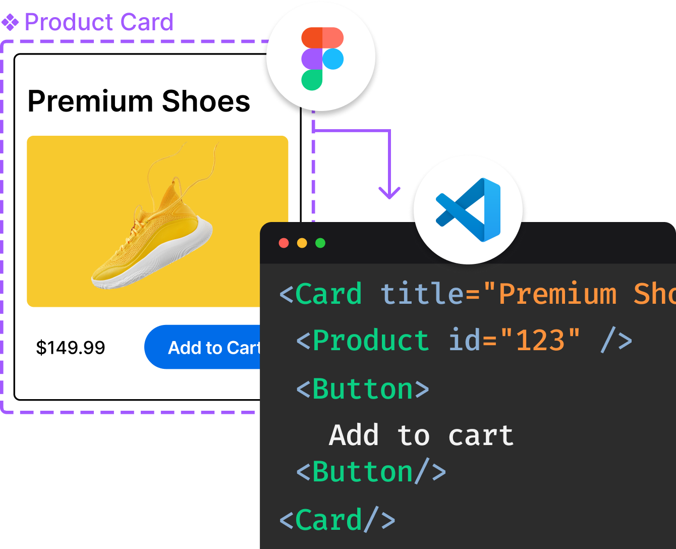
Introducing Visual Copilot: A new AI model to turn Figma designs to high quality code using your components.
Try Visual CopilotREADME
Overview
This is a starter template using the following stack:
- Framework - Next.js 15
- Language - TypeScript
- Auth - Clerk
- Error tracking -

- Styling - Tailwind CSS v4
- Components - Shadcn-ui
- Schema Validations - Zod
- State Management - Zustand
- Search params state manager - Nuqs
- Tables - Tanstack Data Tables ⢠Dice table
- Forms - React Hook Form
- Command+k interface - kbar
- Linting - ESLint
- Pre-commit Hooks - Husky
- Formatting - Prettier
If you are looking for a Tanstack start dashboard template, here is the repo.
Pages
| Pages | Specifications |
|---|---|
| Signup / Signin | Authentication with Clerk provides secure authentication and user management with multiple sign-in options including passwordless authentication, social logins, and enterprise SSO - all designed to enhance security while delivering a seamless user experience. |
| Dashboard (Overview) | Cards with Recharts graphs for analytics. Parallel routes in the overview sections feature independent loading, error handling, and isolated component rendering. |
| Product | Tanstack tables with server side searching, filter, pagination by Nuqs which is a Type-safe search params state manager in nextjs |
| Product/new | A Product Form with shadcn form (react-hook-form + zod). |
| Profile | Clerk's full-featured account management UI that allows users to manage their profile and security settings |
| Kanban Board | A Drag n Drop task management board with dnd-kit and zustand to persist state locally. |
| Not Found | Not Found Page Added in the root level |
| Global Error | A centralized error page that captures and displays errors across the application. Integrated with Sentry to log errors, provide detailed reports, and enable replay functionality for better debugging. |
Feature based organization
src/
âââ app/ # Next.js App Router directory
â âââ (auth)/ # Auth route group
â â âââ (signin)/
â âââ (dashboard)/ # Dashboard route group
â â âââ layout.tsx
â â âââ loading.tsx
â â âââ page.tsx
â âââ api/ # API routes
â
âââ components/ # Shared components
â âââ ui/ # UI components (buttons, inputs, etc.)
â âââ layout/ # Layout components (header, sidebar, etc.)
â
âââ features/ # Feature-based modules
â âââ feature/
â â âââ components/ # Feature-specific components
â â âââ actions/ # Server actions
â â âââ schemas/ # Form validation schemas
â â âââ utils/ # Feature-specific utilities
â â
âââ lib/ # Core utilities and configurations
â âââ auth/ # Auth configuration
â âââ db/ # Database utilities
â âââ utils/ # Shared utilities
â
âââ hooks/ # Custom hooks
â âââ use-debounce.ts
â
âââ stores/ # Zustand stores
â âââ dashboard-store.ts
â
âââ types/ # TypeScript types
âââ index.ts
Getting Started
[!NOTE]
We are using Next 15 with React 19, follow these steps:
Clone the repo:
git clone https://github.com/Kiranism/next-shadcn-dashboard-starter.git
pnpm install( we have legacy-peer-deps=true added in the .npmrc)- Create a
.env.localfile by copying the example environment file:cp env.example.txt .env.local - Add the required environment variables to the
.env.localfile. pnpm run dev
Environment Configuration Setup
To configure the environment for this project, refer to the env.example.txt file. This file contains the necessary environment variables required for authentication and error tracking.
You should now be able to access the application at http://localhost:3000.
[!WARNING] After cloning or forking the repository, be cautious when pulling or syncing with the latest changes, as this may result in breaking conflicts.
Cheers! ð¥
Top Related Projects
Composable, accessible components with thoughtful defaults. Build your own component library with code you can customize, extend, and make your own.
Mosaic Lite is a free admin dashboard template built on top of Tailwind CSS and fully coded in React. Made by
Free and open-source admin dashboard template built with Tailwind CSS and Flowbite
Convert designs to code with AI
Introducing Visual Copilot: A new AI model to turn Figma designs to high quality code using your components.
Try Visual Copilot